HOME | DD
 theCHAMBA — A and B

Published: 2008-10-17 08:24:43 +0000 UTC; Views: 22804; Favourites: 513; Downloads: 0
Redirect to original
Description
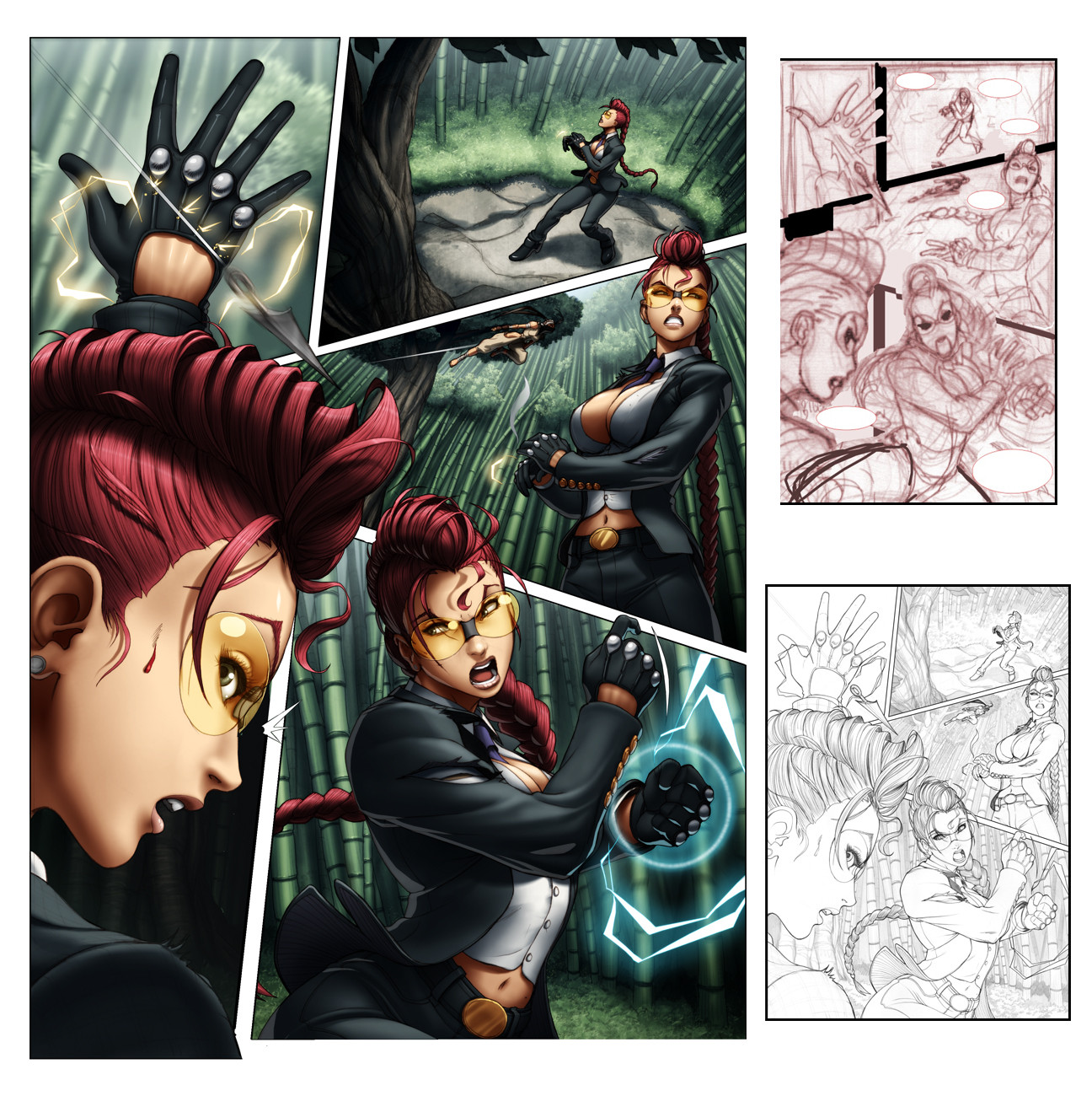
So this is page 7 off 1st issue of Street Fighter II Turbo (which is out now, BUY IT!)I'm just posting it up as an example of how I'm a moron.
See, (A) was my first colour attempt, which was both fun and challenging to colour (light setting etc, lots of playing around). Re-read the script and realized that I had coloured it showing the wrong time of day (I'm a moron)
So yeah, There went a few hours work down the drain, fortunatly the flats were layed out and it was all about re-lighting.
(B) is how It was supposed to look like and how it was printed.
Thought I'd share this.
Related content


Comments: 276

Who cares, your version (A) is more dramatic!
")
👍: 0 ⏩: 0

hehe.. nobody's perfect ^_^
but I like picture A a lot more than B
great job anyways
👍: 0 ⏩: 0

D'oh! Well at least as you said, you had the flats. So it wasn't a total waste.
I like A better, if it means anything.
👍: 0 ⏩: 0

Love you animation coloring style, it is very sweet.
👍: 0 ⏩: 0

I really dig the lighting on both (one looks very nice and warm while the other looks cold and sterile.)
Interesting to see such dramatic changes in how a page is perceived just from the lighting.
Good work! Shame on having lost the original one though.
👍: 0 ⏩: 0

Definitely like the first one a bit more. It added a great mood  (Smile)")
Awesome job!
👍: 0 ⏩: 0

Lol, nice to know even the professionals fuck up from time to time. xD Still, it's cool seeing the same scene in two different types of lighting. Very interesting, and good job as always.
👍: 0 ⏩: 0

You should have told your bosses, "Re-write the story, this one looks better!" And then get fired for doing that.
But seriously, A looks a whole lot better, because of the reasons you mentioned: atmosphere, lighting, coloration. The red hue is much better than the blue one. Much, much better.
👍: 0 ⏩: 0

Boy, look at that... The first one has so much more atmosphere, thats really interesting.
👍: 0 ⏩: 0


I really like the feel of A...but B is nice too...a bit bright @_@
👍: 0 ⏩: 0

This is an interesting display of lighting and contrast. My favorite is A. It has a more mysterious feel to it.
👍: 0 ⏩: 0

i kinda liked the first one better... more moody
👍: 0 ⏩: 0

very nice work
this shows how much importance lighting has
👍: 0 ⏩: 0


ha ha.... Such things happens, my friend. But anyway, both versions look very good. Great job!
👍: 0 ⏩: 0

they both look sweet, but i still like "a" better.
👍: 0 ⏩: 0

should have left it dark, maybe she was in a there a really long time...
👍: 0 ⏩: 0


I see what you mean.. you're a moron really...... I'm just agreeing with you!
Tho this makes me realize that one of the part of painting that took long was the base colors... so I've been finding a way to speed it up!
In this case I see how important it is to do it separately! just in case something has to be changed!
👍: 0 ⏩: 1

yeah i'm actually real glad i didn't have to re colourflat it. Coz then i would've been really ticked off at myself.
👍: 0 ⏩: 0

That's too bad. I really love what you did with the sunlight in A.
👍: 0 ⏩: 0


These things happen. What a difference a color change makes.
👍: 0 ⏩: 0

Between the 3rd and 4th panel, there is a line connecting from the lower right corner of the 3rd panel to the ceiling of the 4th, don't know if that's part of the ceiling design or just an extra line.
On another not,e the envelope in the 4th panel reminds me of 'the king of fighters'.
👍: 0 ⏩: 0

I like the warmth in the first one more, but both look awesome.
👍: 0 ⏩: 0

Actually, your mistake can teach lots of other people (including myself) the importance of colouring for different times of the day. This is excellent work. No offense to the script....but it should've been during the day cuz it looks cooler.
👍: 0 ⏩: 0


You are no moron. You are a very talented artist. I love the lighting differences. It really shows how a scene can change during the day or night.
👍: 0 ⏩: 0

Just a little critic : The decors look very bare an empty. A lack of personality maybe. Was that in the brief, or don't you like backgrounds much ? ^_^
👍: 0 ⏩: 1
yeah, it was mentioned by another commenter.
actually the reference of the office in question was really bare, and that was what I was following.
If i had seen the more recent version of the location (office) I would've added more detail.
I guess something to take note of in future issues.
👍: 0 ⏩: 0

jeez, too bad the script called for night time.
they both look fantastic, but A has more of a mood to it than B does.
👍: 0 ⏩: 0

wow, this is so cool, it is awesome to see the difference in between the light sources
👍: 0 ⏩: 0

you´re a workoholic
that´s not normal
great work man!
👍: 0 ⏩: 0

Lol! That’s sad. But I’m sure that, at least, it was a great exercise.
👍: 0 ⏩: 0

I much prefer your original lighting. It adds a bit more atmosphere and a sense of drama to the scene than the harder-lit version that was required.
👍: 0 ⏩: 0


wow thats so amazing how colors can really change the time of day. lol. Its pretty cool Get to see to versions of it. I don't think i'd like to be left in the dark with that guy. XD
👍: 0 ⏩: 0

"A" is way more dramatic. "B" looks like a job interview. Great colouring on both pieces. I'd take "A" in a vote.
Shawn
👍: 0 ⏩: 0

A looks much more impressive than B, but nice job overall on that comic. Know when the next one'll be out?
👍: 0 ⏩: 0

They both look fantastic, but I prefer A~
I like he darker lighting and colors~
:}
👍: 0 ⏩: 0

Oh that's too bad, the coloring in A has a much more dynamic and moody feel to it. B feels a little too stark.
👍: 0 ⏩: 0

night and noon
trust me people would not have noticed
👍: 0 ⏩: 0

well happens
but how did you do the first coloring? special tool or something?
👍: 0 ⏩: 0
| Next =>