HOME | DD
 theCHAMBA — A and B

Published: 2008-10-17 08:24:43 +0000 UTC; Views: 22807; Favourites: 513; Downloads: 0
Redirect to original
Description
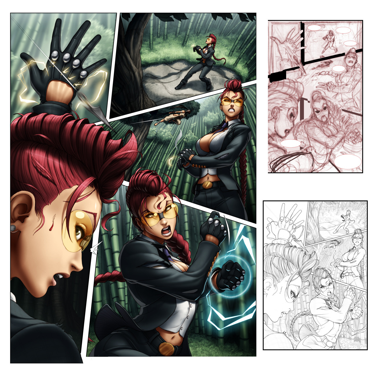
So this is page 7 off 1st issue of Street Fighter II Turbo (which is out now, BUY IT!)I'm just posting it up as an example of how I'm a moron.
See, (A) was my first colour attempt, which was both fun and challenging to colour (light setting etc, lots of playing around). Re-read the script and realized that I had coloured it showing the wrong time of day (I'm a moron)
So yeah, There went a few hours work down the drain, fortunatly the flats were layed out and it was all about re-lighting.
(B) is how It was supposed to look like and how it was printed.
Thought I'd share this.
Related content


Comments: 276

B's too cold... i like the warmth of A but what can you do... script says we do...!
👍: 0 ⏩: 0

o reshade it! I trhink it looked better with the extreme shading on the "A" thing D:
It had some kind of a better atmosphere i think : O
👍: 0 ⏩: 0

You're still a beast J! Both versions are sick, and just show how good you are with color and lighting.
Cheers!
~Chad
👍: 0 ⏩: 0

Too bad they didn't change the script. I bought the issue. I like 'A' better! Keep up the amazing work!
👍: 0 ⏩: 0

eh they should just keep the first one. nightime is never really a good dramatic time for an office scene. you should pitch that first one to them.
👍: 0 ⏩: 0

i just buy the street fighter 2 turbo, you are amaster, and thad little error... only is proof of your amazing skills.
👍: 0 ⏩: 0

Yay! I'm not the only one that does that!
Its too bad, 'cause I kinda like A better than B.
👍: 0 ⏩: 0

this makes me hungry.... it's like candy in art form. mmmmmm
👍: 0 ⏩: 1

ya know what they say.
too much candy canlead to rotten teeth
👍: 0 ⏩: 0

hahaha...things happen things happen..bunnys happenn..and bears....
really nice how much we can learn with our mistakes!!!....great ligthing...
...as usuaaal
👍: 0 ⏩: 0

man...you really ARE a moron.
KIDDING!
I picked this sucker u at the comic store yesterday simply because of your art sir. Love the clean slick artwork and youre very good at capturing motion. Do you ever use any 3d programs when setting up your scenes?
👍: 0 ⏩: 0

Major difference. Love Panel A. Totally great. Keep up the good work.
👍: 0 ⏩: 0

I actually prefer the first attempt, it has a lot more depth and atmosphere, but I suppose that when you're drawing for yourself you can do what you like, but when you're part of a greater production unit you have to do what you're told!
👍: 0 ⏩: 0

oh, ")
 (Smile)")
👍: 0 ⏩: 0


I actually like the A more than B (but they're both good, no doubt) It must be the dramatic effect the light plays off and all.
👍: 0 ⏩: 0

Hi just bought the comics. Love your work in it.
Though i must admit i like version A better than B though. It's had a more moody and somber feel to it.
👍: 0 ⏩: 0

alas, I have to say the first is more my taste as well. Great job on both though!
👍: 0 ⏩: 0


Cool man. Screw the script, I like the first one you did better. Much more interesting time of day and coloring, anyway. Nice job on both though, I'm sure they were happy.
👍: 0 ⏩: 0

Personally I like the "golden hour" version. I remember a comic page I made recently, the character said "it's almost 10 o'clock!" and I drew the watch indicating 3 o'clock, LOL
Great as usual chamba
👍: 0 ⏩: 1
3 and 10 are so far off
goes to show that you too were paying attention to the script!
hah
👍: 0 ⏩: 1
that's the worst thing...I also wrote the script LOL
👍: 0 ⏩: 1
hahaha
now that's just gold!
👍: 0 ⏩: 0

wow, nice! i love the way they are totally distinct in their color temps and mood. even if it's a mistake, i learned a lot from this and i'll probably take from it a bit by my own color choices.
thanks!
👍: 0 ⏩: 0

nice color and effects(takin notes!!).And yea im gettin that issue too!hope to more
👍: 0 ⏩: 0

I actually like A better... more mood, and it seems to be more exciting getting something (a job?) before the day's out then having to come in after 8pm to pick something up... A is like a Tony Scott film, while B seems boring and flat
👍: 0 ⏩: 0


A perfect example of daylight and night-indoor lighting
👍: 0 ⏩: 0

how depressing! i love A, if it makes you feel any better

👍: 0 ⏩: 0

Ironically I like the first attempt. It brings about an atmosphere that seemed fitting.
👍: 0 ⏩: 0


wow, this really shows of your coloring skills, I like the one set in the day time better though
👍: 0 ⏩: 0

I understand the complications of fitting the script and such, but wouldn't it also matter that you changed the colour of her clothes altogether.
I'm just considering the continuity here. Or did you like change the colour of her clothes on all the corresponding pages?
I'm not trying to make you look like a dumbass by the way. I'm just asking.
👍: 0 ⏩: 1
the colour change of clothes didn;t matter for this instance.
this (along w/ a single panel fromt the previous page) are the only pages held within that scene.
👍: 0 ⏩: 1
Oh I see. Of course.
That's so cool. Your job I mean. Freaking awesome stuff dude.
👍: 0 ⏩: 0

You're not a moron. It happens to everyone at least 7 times a day. Your lines are ace and the colouring for both versions is lovely.
👍: 0 ⏩: 0


Hehe, i found it slightly humorous to compare the 2...
Dude, you have superior lines 0.o
👍: 0 ⏩: 0

I would have to say, despite the script, I like the lighting in example "A" better. You did a great job on both, but that one stands out a bit more for me.
👍: 0 ⏩: 0

though i haven't read it yet, i like the lighting in "a" better.
👍: 0 ⏩: 0


Both are great, but the "day" lighted version is more dynamic!

👍: 0 ⏩: 0


I think if you put yourself in the position, you could be a great animator
👍: 0 ⏩: 0


I went to the comic store the other day and saw one of the SF comics you'd worked on and was like YAY I WISH I HAD MONEY SO I COULD BUY IT D8
Also, it's a shame that A is incorrect as it's so cool looking. :< I love the back lighting.
👍: 0 ⏩: 1
| Next =>