HOME | DD
 theCHAMBA — A and B

Published: 2008-10-17 08:24:43 +0000 UTC; Views: 22808; Favourites: 513; Downloads: 0
Redirect to original
Description
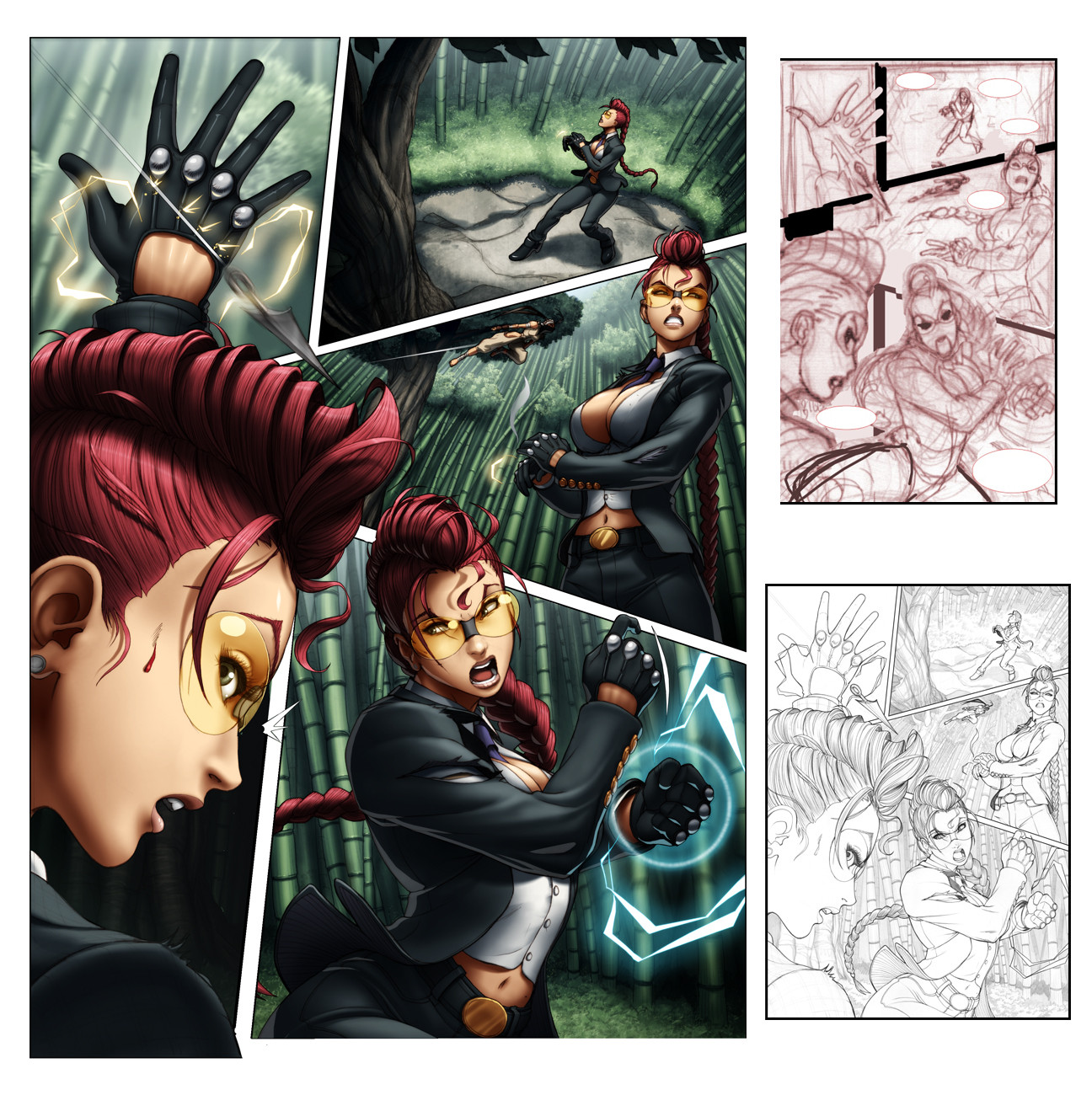
So this is page 7 off 1st issue of Street Fighter II Turbo (which is out now, BUY IT!)I'm just posting it up as an example of how I'm a moron.
See, (A) was my first colour attempt, which was both fun and challenging to colour (light setting etc, lots of playing around). Re-read the script and realized that I had coloured it showing the wrong time of day (I'm a moron)
So yeah, There went a few hours work down the drain, fortunatly the flats were layed out and it was all about re-lighting.
(B) is how It was supposed to look like and how it was printed.
Thought I'd share this.
Related content


Comments: 276

The guy looks just like Stone Cold Steve Austin. >.>'
It's a good thing you re-read that script, though.
👍: 0 ⏩: 0

i kind of like the mood setting on A.
i'm so thrilled i can't wait for work to get done so i can rape the local comic shop for it.
lol
👍: 0 ⏩: 0

I think the sunset version is more interesting. Wish they'd altered the script instead!
👍: 0 ⏩: 1

they couldn't as it would've had to shift a few other scenes.
it's in the past, so it's all good.
👍: 0 ⏩: 0

well, they SHOULD CHANGE the bloody script now!
cause that looks awesome!
👍: 0 ⏩: 0

well you're now more experienced for it in two ways! (experienced colorist that reads the instructions!)
👍: 0 ⏩: 1
hahah
i think i wouldb't of made this mistake if i had clearly read the script before i did the lighting/shading, heh
👍: 0 ⏩: 0

Ahhh...i see, looks beautiful either way, but i can understand the frustration.
👍: 0 ⏩: 1
no frustration, not a slight annoyance due to my own carelessness.
👍: 0 ⏩: 0

you draw the chair round on the upper end in the first picture and straight in the last  (Smile)")
i always think such details are funny...
loving scenes in films like
Scene A: Door window of the car is closed
Scene B 2 seconds later the window is open P
👍: 0 ⏩: 1
yep
minor continuity errors like that tend to happen every now and then.
hard to catch them all.
👍: 0 ⏩: 1
but they make a comic or a film more interesting to look at it another time
")
👍: 0 ⏩: 0


it's neat to see 2 finished versions like this. i keep keeping my eyes open trying to find this stuff, only 1 'bad' comic store in my area.
👍: 0 ⏩: 0

Awww, you're not a moron 
👍: 0 ⏩: 1
no, i am a moron.
as my own moronic act made me use up more time on something that would've been done if i had read the script carefully.
but it's done, so all good
👍: 0 ⏩: 0

aw, shame.....but A looks so dang fabulous!
Props to you, they're both great.
A- being my favorite....
👍: 0 ⏩: 0


i wonder when this'll come ot in germany... i'll be on the look out for it!
👍: 0 ⏩: 0

damn I hate when shit like that happens!! .. that's why I always read the script first!!  (Wink)")
")
it's a shame cos I actually love the atmos you've made in A ... still, guess you've got to adhere to the laws of the script!
great work as always, thanks for sharing!
👍: 0 ⏩: 1
oddly enough i always have the script on hand.
but skimping onone line of the script can botch it up for the days work, heh.
👍: 0 ⏩: 1
yeah I know... 
👍: 0 ⏩: 0

You gotta hate that! I love both of them, the one with the sunlight is wonderful.
👍: 0 ⏩: 0

I always find it interesting to see how lighting affects the mood of a piece. A nice contrast between the two light schemes. Thanks for sharing.
👍: 0 ⏩: 0

yeah, it's a bitch when that happens. one thing good thing about it though is that you can already add what little you want previously.
👍: 0 ⏩: 1
very very true!
in this case, it wasn't so bad as all the flats were already layed down.
And if I had to do all those again then I would've been really annoyed at myself.
👍: 0 ⏩: 0


Aw man, I hate when that happens X( Looks class in both versions, although I must say I really like the light bouncing at the corner in the bottom daytime one.
👍: 0 ⏩: 0

The 1st one looks like as if it's sundown, while the second looks like it's already nighttime. Awesome-ness, sir.
👍: 0 ⏩: 0

ahah a good lesson for everybody!
👍: 0 ⏩: 0

If it were me I woulda said "Screw this" and just changed the color and claimed it was a neon bilboard or something outside XD
But also....I'm kinda lazy like that. I really do like 'A' but 'B' still gives the right feeling for what's going on. Kudos anyways man ^__^
👍: 0 ⏩: 0

I LOVE the lighting on the first one. It's a shame this scene had to be a night though, the evening one looks so nice
👍: 0 ⏩: 0

Just goes to show how much lighting affects the mood of the scene.
You seem to have made both of them work. Too bad for the extra working hours though. I bet you had fun nonetheless.
👍: 0 ⏩: 1
yeah, the extra hours was really what was the let down in this whole ordeal.
But it was fun colouring it and seeing the varying sides of how it could be lit.
👍: 0 ⏩: 0

I really like seeing the difference in lighting and color
👍: 0 ⏩: 0


Hahaha good one. Lucky you to have the layers. I had a similar situation situation but I have everything flat (who is bigger moron ?")
👍: 0 ⏩: 1
yep, looks like you won the Bigger Moron award on that account, heh.
dang that must've blown hard..
I feel your pain!
👍: 0 ⏩: 0

I do like the lighting in sample A, as it gives a more dynamic and interesting read.
👍: 0 ⏩: 0

you da man dude
both of 'em are looking great
great job
👍: 0 ⏩: 0


I like the twilight shading better. The fluorescent lighting in the printed version is so harsh on the eyes...
👍: 0 ⏩: 0

Dang. Before reading your description I had chosen between the two and actually like A better. A shame it was the wrong time of day.
Thanks for sharing this. It kinda makes you more human but still no less an awesome-machine.
👍: 0 ⏩: 0


Gotta agree, pitty it wasn't set for that time of the day!
👍: 0 ⏩: 0
<= Prev | | Next =>