HOME | DD
 theCHAMBA — A and B

Published: 2008-10-17 08:24:43 +0000 UTC; Views: 22807; Favourites: 513; Downloads: 0
Redirect to original
Description
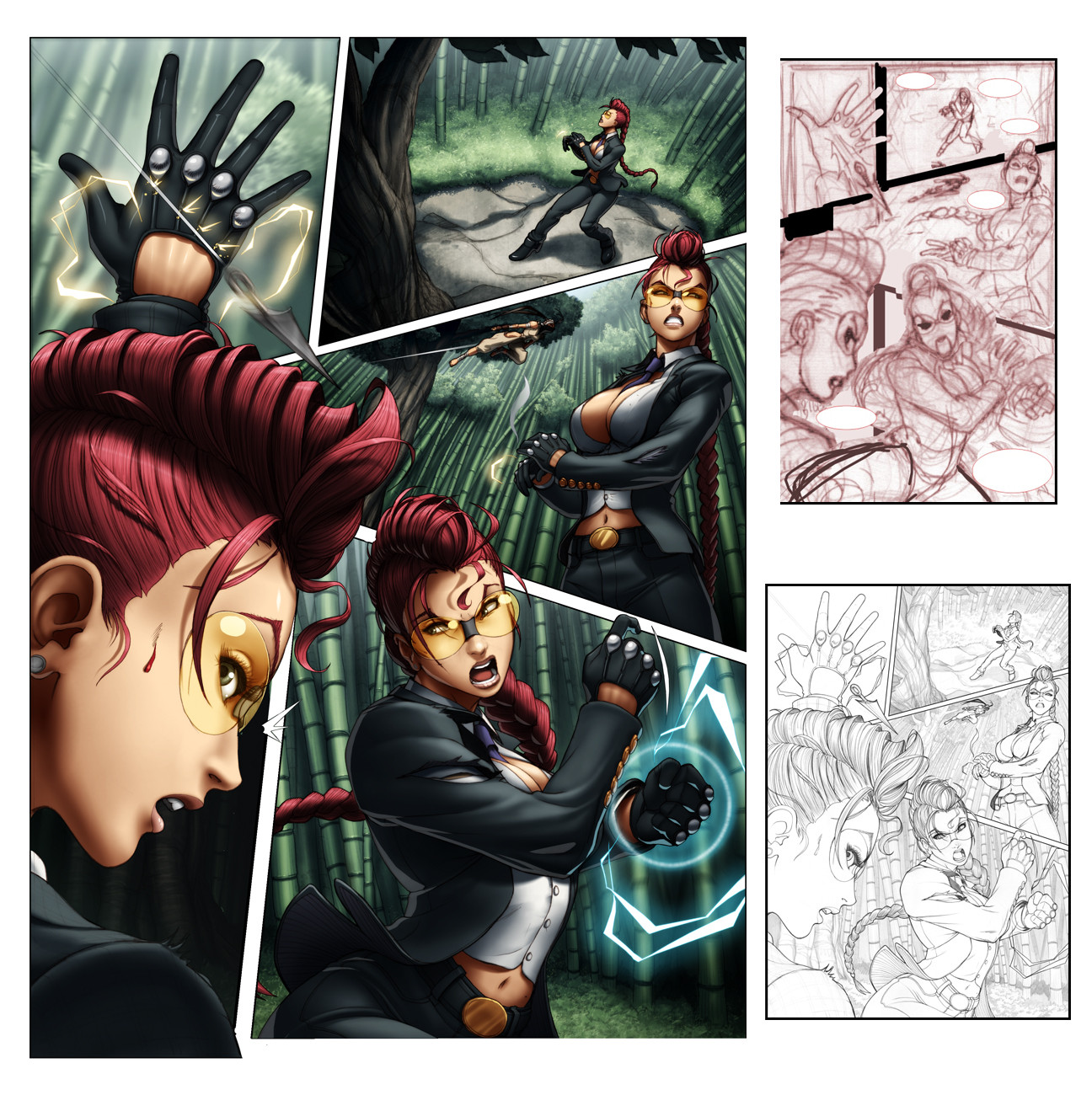
So this is page 7 off 1st issue of Street Fighter II Turbo (which is out now, BUY IT!)I'm just posting it up as an example of how I'm a moron.
See, (A) was my first colour attempt, which was both fun and challenging to colour (light setting etc, lots of playing around). Re-read the script and realized that I had coloured it showing the wrong time of day (I'm a moron)
So yeah, There went a few hours work down the drain, fortunatly the flats were layed out and it was all about re-lighting.
(B) is how It was supposed to look like and how it was printed.
Thought I'd share this.
Related content


Comments: 276


Well that sucks! That first panel's lighting does look really great though!
👍: 0 ⏩: 0


Hooray for lighting changes! I had to fav. This is too good.
👍: 0 ⏩: 0

the lighting one the first I like a lot more. Sucks you worked so hard on it. Either way great page!
 (Smile)")
👍: 0 ⏩: 0

Even if it was the right time of day... nobody sits in their office when it's all dark like that.
👍: 0 ⏩: 0

Oh man I've done that kind of thing before I like them both but the first one is way more dynamic.
👍: 0 ⏩: 0

Aww Jeff, you're not a moron, we all make mistakes, with all your posts lately, it's understandable, your works are great, please don't bully yourself.
")
👍: 0 ⏩: 0

I like the first one better!
Too bad this should be happeing at night
But it came out nicely anyway!
👍: 0 ⏩: 0


B tiene el look de que es serio, de que son guardias secretos o algo y tienen el money por que en la oficina hay luz y se ve elegante, el otro parese que no hay luz en la oficina y eso esta misterioso.
Son profesionales, nose, estan buenos.
👍: 0 ⏩: 0

That's neat. It's amazing how much lighting can affect the feel to the picture. In the first, it seems a lot more ominous and uncomfortable for the girl. In the second, it seems a lot more relaxed and closer to them being equals, instead of the guy being her superior.
👍: 0 ⏩: 0


The lighting is outrageous... In the thumbnail view I seriously thought these were photographs.
👍: 0 ⏩: 0

If I were the writer, I would have at least tried to alter the script to keep A in, because it looks so much better. I love the light pouring in from under the shade.
👍: 0 ⏩: 1

wouldn't of worked if it was changed.
it was best that I corrected my own error
👍: 0 ⏩: 1
Too bad. Well, thanks for posting the older one. Like I said, it's really cool.
👍: 0 ⏩: 0

I actually think the colours on the left create a better atmosphere, but obviously, you can't publish something that doesn't go with the script. xD
Great work.
👍: 0 ⏩: 0


the wall and window frame in B look like a photo. Amazing
👍: 0 ⏩: 0


You are a generous god, -with a two days beard-
There's a fat lot to learn from something like this... not only about lining, but also about working conciousness... 
But seriously, your generosity as a professional artist is just stunning... there's not a day I regret having you in the top of my admiration list....
👍: 0 ⏩: 0


lol
Aww...poor Chamba. ^^ At least you made the correction quickly enough.
And I prefer A, personally.
👍: 0 ⏩: 0

Ouch. A looks so good and everything. I woulda just thrown something about a time machine in there.
👍: 0 ⏩: 0

Looks great, but the office needs some plants  (Wink)")
👍: 0 ⏩: 1
haha i was gonna say the same thing.
but there is one offscreen (which can be seen in the page before) heh
👍: 0 ⏩: 0

Dumbass.. lol
I kid.
The first one rules, so much infact they should've re-wrote the script to accomodate for you mistake haha
👍: 0 ⏩: 1
nah, t'was my mistake
my mistake to fix.
👍: 0 ⏩: 0

This is still a great example on how well you can display lighting dawn - dusk :] gj. I really don't think it's time wasted if you really had put effort and skill into it. They should changed the time of day to fit your first pic anyways XP.
👍: 0 ⏩: 1
my fault for not clearly reading the script (and only one line did it describe it, the one line i missed, hah)
still yeah, it was fun seeing the outcome of a scene lit in two different ways.
👍: 0 ⏩: 0

I like your first one better - your instincts were on point!!
👍: 0 ⏩: 1
instincts maybe, but didn't follow script
so instinct for the 2nd and proper version was more corect
👍: 0 ⏩: 1
yes, yes I know. But I have a problem with authority. heh. Both of them are dope though!
👍: 0 ⏩: 0

That's a little tragic, and a little funny. It's also pretty damn cool.
I personally might've thrown this in the resources bin. To a beginnier in this style, it'd be a great PSD to look at in order to learn how to create different kinds of light. But a rose is a rose, yeah?
👍: 0 ⏩: 1
and in this case, the different lighting's smell differently (if they're both roses that is)
👍: 0 ⏩: 1
Well, I was really just saying that about categorizing it differently (a rose by any other name would smell as sweet - recategorizing doesn't really change what it is), but as far as misdirected applications of a metaphor go, that one was pretty good. lol
👍: 0 ⏩: 1
(I said "misdirected applications of a metaphor" before noon. I feel like an egghead.) Xd
👍: 0 ⏩: 0

I still like the (A) better. I sets that a little bit better.
:#
👍: 0 ⏩: 0

lol. Everyone has their 'duh' moments. It's alright XD both look good though.
👍: 0 ⏩: 0

ah sounds annoying
I like A better though so it wasn't for nothing
")
👍: 0 ⏩: 0

i really like your first version XD
ahhh sucks that you had to redo it, but it looks good
👍: 0 ⏩: 0

<= Prev | | Next =>