HOME | DD
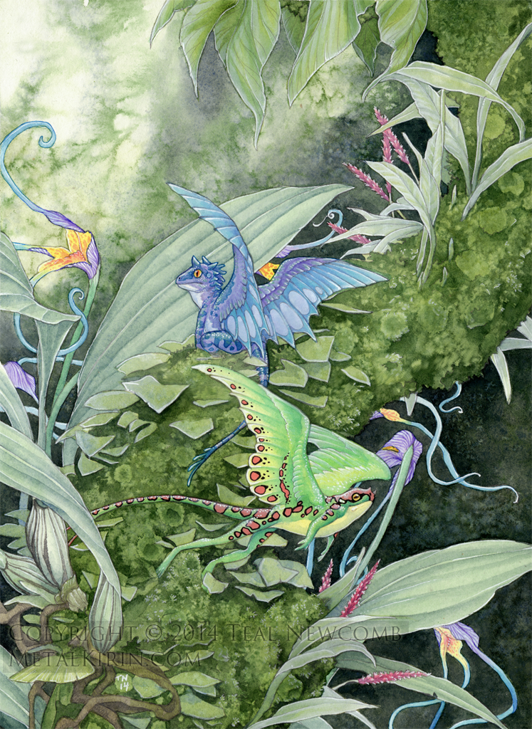
 thedancingemu — rainbow wyvern

Published: 2008-09-27 15:26:48 +0000 UTC; Views: 6392; Favourites: 393; Downloads: 142
Redirect to original
Description
Website | Store | Patreon
being jobless and having restricted internet access at the moment motivated me to sit down and put together something really nice, so i'm quite happy with this. took a long ass time though, bleurrrrrrrrg.
hopefully we'll get the internet hooked up at home soon, then i can read more comments and clean out my devwatch and stuff, this comp's too damn slow :<
marker, paint and gel pen
Related content


Comments: 55


this is fantastic. I love working with mixed media like paint charcoal and gel pens.
👍: 0 ⏩: 0

Wow. You amaze me. I've always wanted to be able to do that, so I got a tablet. And I still can't do that. So cool! I love it.
👍: 0 ⏩: 0
Ahhh, my eeeeeeeeeeeyes !!
Burned by awesomeness !!
👍: 0 ⏩: 0

Great colors here!
By the way, you have great skilly for drawing jungles!
👍: 0 ⏩: 0

Lovely colors, and I adore the little details in the scales and patterning!
👍: 0 ⏩: 0

This is amazing! Great detail and awesome colours.
👍: 0 ⏩: 0


Your dragons remind me of large birds, like ostriches or emus...In the shape of their head, that is.
")
Nice work
 (Smile)")
👍: 0 ⏩: 0

...OH EM GEEEEE~ THE COLORS! DETAIL! ITS ... SO AMAZINGLY NEAT I WANT TO EAT IT - I mean.. uh... FAVE IT xD ? -shot-
👍: 0 ⏩: 0


Oh wow, I just came across your page and saw this. It is amazing. I love the colours; I could never dream of creating something this gorgeous 8D
👍: 0 ⏩: 0


Wow so much detail. I'm so amazed you did this in pen and markers.
👍: 0 ⏩: 0


Gorgeous!
I love the amount of detail you've put in to this picture. I could ever do anything like this traditionally.
Just keep up the great work
 (Wink)")
👍: 0 ⏩: 0


The amount of detail and creativity you put into your foilage amazes me every time. There is no leafe shape or shade of green that seems doubled or boring. Everything looks so vivid and credible.
Not to mention your seemingly endless patience for little nicknacks like the butterly, the dragon's scales. Absolutely beautiful!
👍: 0 ⏩: 0

The background, I love.
The shading, I love.
The branches, I love.
As for everything else...I love them as well :3
👍: 0 ⏩: 0

Wonderful! The colours are amazing, and you drew it perfectly
👍: 0 ⏩: 0

Beautiful background and colouring. The detail is magnificent.
👍: 0 ⏩: 0


The colours you used go beautifully together, especially the earth tones of the forest. Excellent job with the shading and the details.
👍: 0 ⏩: 0

He is pretty. I love all the details. Well done!
👍: 0 ⏩: 0


It is lovely! But I have one or two little suggestions, I hope that is ok. (art director in training) xD
You may know these things and are not doing them because of your style. But I want to mention them just in case because I mentioned these two things to one of my friends recently and she was like "OMG why didn't anyone tell me!" xD
Both traditional media and digital media can benefit from these techniques. (I actually learned this in a painting class.)
- I see you already include some purply/blueish tint in your shadows. That effect also works wonderfully when applied to objects/landscape that are in further away. As things recede into the distance they become a bluish/purplish grayed out color because of the atmosphere. The further away they get, the more definition they lose, and the more grayed out they become.
- Your transitions into lighter colors works very well. But perhaps if you push your shadows/dark areas more it would make the lighter colors pop even more and give a feeling of more depth.
👍: 0 ⏩: 1

thanks for the input, i've been thinking my colors were probably a bit flat so it's good to get a second opinion
i'll probably go back and darken them up a bit more in this one, but not too much because i'm afraid of screwing it up at this point
but i will try to work of my shading a bit more in my next drawing/painting/whatever i do next
")
👍: 0 ⏩: 1
I am glad it helped! Feel free to have me art direct you anytime. xD
👍: 0 ⏩: 0

Your attention to detail astounds me. I love the colors.
👍: 0 ⏩: 0

woah! this looks sow beautiful with the colors!! i especially like the scales and how you blended those colors so well!!
👍: 0 ⏩: 0


Instafav-worthy or instafav-worthiest? Either way, it's awesome!
👍: 0 ⏩: 0


very lovely as always
what medium did you use? The background looks like a paint, while the foreground could be marker or watercolor o_0
+fav for giving me inspiration
👍: 0 ⏩: 1
| Next =>