HOME | DD
 TheHarlequinHatter — Oracle of Ages Minimalist

Published: 2012-02-15 21:19:54 +0000 UTC; Views: 980; Favourites: 15; Downloads: 0
Redirect to original
Description
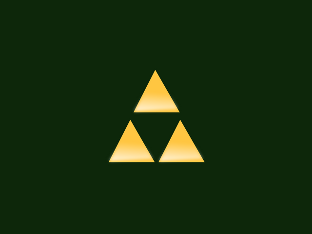
The Legend of Zelda MinimalistThe goal of this project was to capture the title of each game using minimalism, so that the title wouldn't have to be written directly on the poster.
Textures edited by
Texture by
Please do not distribute without my permission.
Related content
Comments: 6

I love how the poster for Seasons uses the same colors, flipped between the background and the actual image. These are all great. ♥
👍: 0 ⏩: 1

Thanks a million!
👍: 0 ⏩: 2

One thing I'm curious about, though: Why did you choose the images you did for Ages and Seasons? The symbol for Seasons resembles musical notes and waves so strongly that I thought it would be Ages. And I guess I haven't played the games recently enough to know what this design for this poster is, with the three enclosed circles. Help? xD
👍: 0 ⏩: 1

They are muted versions of the colors of Din and Nayru.
👍: 0 ⏩: 1

....OHHHHHH. Okay now I get it, makes way more sense. xD Thanks!
👍: 0 ⏩: 0

You're welcome! :3
👍: 0 ⏩: 0


