HOME | DD
 theIntensePlayer — Improving iOS 7 #1: An Uncluttered Control Centre
by-nd

Published: 2013-06-29 09:03:49 +0000 UTC; Views: 2784; Favourites: 27; Downloads: 50
Redirect to original
Description
In a world of design embracing flatter, simpler interfaces (even in certain App Store apps), Apple's embrace of a flatter interface in iOS 7 is a welcome change. However, this is its first iteration, and as with every first, it requires constant improvement and refining.Changes to iOS 7's current Control Centre:
- Music player scrubber has been removed. The scrubber isn't needed in an instant and you can tap on the song name/album to go to the Music app and scrub from there.
- Divider weight has been reduced to 2 pixels, the same weight as toggle borders above.
- The functionality of posting to Facebook or Tweeting has been returned to iOS 7 in Control Centre.
- The bottom row of icons has been merged with the toggles at the top, with toggles as circles and shortcuts as rounded rectangles. Icon sizes have been slightly tweaked.
- Tweaked spacing between some elements.
- Deviated a way to allow the user to know what there are extra toggles when you swipe, the same as the Share controls.
- Toggles & Shortcuts are customisable, but only ten can be there at a time: a reasonable compromise. This is a control centre after all, and you don't want to swipe through ten pages just to get to a toggle.
- Flashlight toggle is actually formatted as a toggle.
- AirDrop & AirPlay buttons have been put back since the original concept.
Read more about my concept on my original post on The Verge Forums .
Acknowledgements:
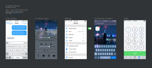
iOS 7 GUI PSDs from Teehan+Lax , Andreas Hellqvist , and Applidium
COMING SOON
Improving iOS 7 #2: An Uncluttered Status Bar
Related content
Comments: 11

I love this!! Wow, hopefully that would be a nice feature for iOS 7.
👍: 0 ⏩: 0

iOS 7 looks ugly anyway. Some people call it the "gay" iOS
👍: 0 ⏩: 2

By gay, you're referring to the colour choices on the icons?
👍: 0 ⏩: 1

Yep, and also the control center blur effect makes it worse.
👍: 0 ⏩: 0

I like the design... but I don't like it as an OS - as in it's not customisable enough. Actually, I haven't used it or Android much (remember my phone) but I think Android seems better. Until FFX OS comes out...
👍: 0 ⏩: 2

It's never going to be customisable. Then you jailbreak.
👍: 0 ⏩: 0

The design is a bit cheesy, the icons look unconsistent and awful. The new features are good, but I like android better (I have an android phone). Firefox OS is great, but the only problem is there's not much apps since it's new like Windows Phone.
👍: 0 ⏩: 2

I think it's mainly the icons that are making people seriously dislike iOS 7.
👍: 0 ⏩: 1

Not just that, the whole design, but the main problems are the icons and the control center blur.
👍: 0 ⏩: 0

When you say there aren't many apps... the whole point is that it runs webapps! So you can just open the browser and open anything can't you? Only difference is it doesn't have an icon and it shows the address etc. So it kinda has got a lot of apps. Also on the dev preview for Firefox desktop you can add your own apps e.g. QuickDesk
👍: 0 ⏩: 0


