HOME | DD
 TheK40 — Scruballz Room: Draw It Again

Published: 2012-09-17 17:50:11 +0000 UTC; Views: 35196; Favourites: 1382; Downloads: 132
Redirect to original
Description
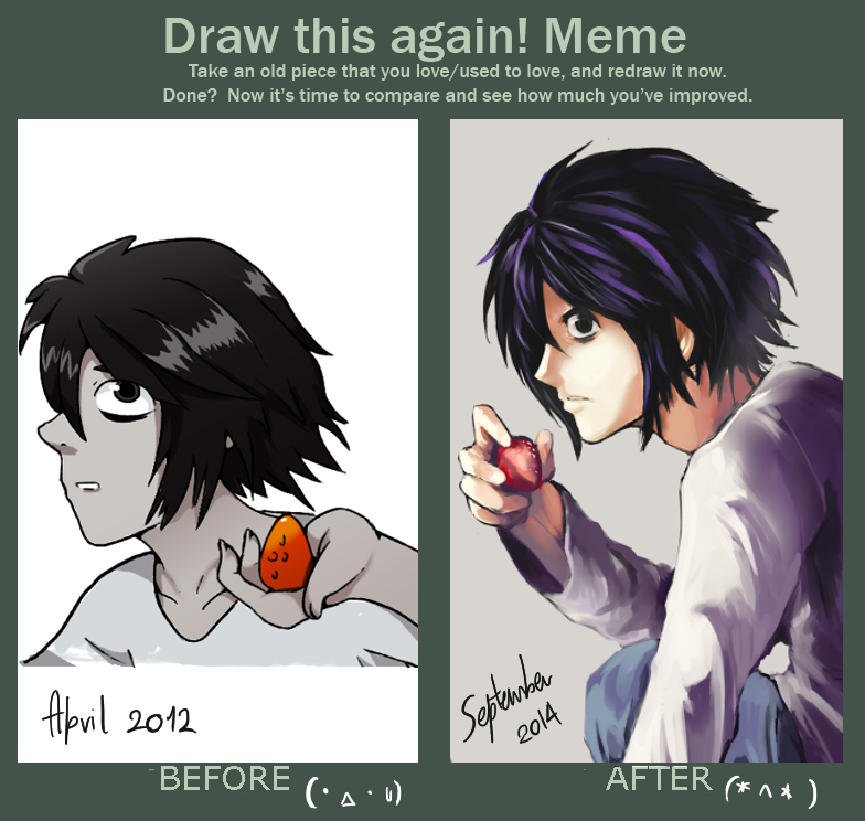
My original character Scruballz in my room again.Old Version: [link]
This was one of the first piece I submitted to dA back in 2009. It was my best piece at the time and I still think it's a pretty good one. I was almost afraid I wouldn't show any improvement but I at last I did and I'm proud of it.
New Version: [link]
Related content


Comments: 205

actually ... i like the old one more. the character looks more "human", more like an ordinary boy. although there are definite improvements in the second one, i overall like the style of the old one also.
👍: 0 ⏩: 1

That looks like my room... only considerably cleaner.
👍: 0 ⏩: 0

Ahh, they're both so awesome!~
To be honest I have to say my room's just about as messy as his...(^v^;)
👍: 0 ⏩: 1

Thank you ")
lol my room is that messy uvu;;
👍: 0 ⏩: 0


Great job! I think it's hard to show improvement when it's in black and white, but you have clearly improved.
👍: 0 ⏩: 1
thanks! yeah theres a lot you can do without color but of course color can always enhance it  (Smile)")
👍: 0 ⏩: 0


I like this, I like it quite a bit. You have done several things that convey more confidence in your own drawing abilities. On the plus side you used the exact same medium (from what I can tell) as before. While there is a difference in the character and the room itself, it is definitely a remake of the same drawing, a few of the entries I saw did not even have characters in the same relative position...
This shows more depth, more shading and better techniques to create a better resulting image there are even more objects in the room than the last one including a cat!
The last one is beautiful by all rights, and the new one is amazing and I think shows more improvement then you realize.
I do like the position of the character in the first one though, seems more of a focused busy type, then the lost bored one on the new.
👍: 0 ⏩: 1
THank you! This is the best comment/constructive criticism I ever got on this piece and you noticed the cat too! xD -shakes your hand digitally-
👍: 0 ⏩: 1
Your welcome. I've been going to school for graphic design so it was awesome to see such a wonderful piece.
👍: 0 ⏩: 0

If his hair wasn't so dark in the latest picture and other mistakes I see well, I would like it better.
I prefer the old one. The facial expression and black and white mesh better.
👍: 0 ⏩: 1

the state of the guy's room hasn't. i think it got worse?but this is awesome!
👍: 0 ⏩: 1

Really great improvement! Shading looks brilliant, well in the first piece too, but especially in the new version.
👍: 0 ⏩: 1

Amazing how, despite having more things and being technically messier, the new design seems much more organized and cleaner.
👍: 0 ⏩: 1
haha that's how I explain the state of my room. Messy but organized.
👍: 0 ⏩: 0

They both look great. Congratulations on the contest!
👍: 0 ⏩: 1


I love both
Both stand out in their own way..
Amazing!
I think I may even prefer the first one for its simplicity against the newest version, but both are amazing.


👍: 0 ⏩: 1

I do actually really like both drawings, but prefer the newest one, a lot more detail put in ^^ but still love both
👍: 0 ⏩: 1


For the shading and other technique,I think the newest one are the best
but still,I like the oldest one better with that drawing style,I really did like it XD
👍: 0 ⏩: 1


In my opinion, the first one is a little better in the whole view, because it's a little more "messier" and fits with the room. But of course, it's only my opinion ;D
But I love the second too x3 The whole shading is soo amazing x3
👍: 0 ⏩: 1


It looks like the character got older- like from a 13 or 14 yr old to a 17 or 18 yr old. I love that!
👍: 0 ⏩: 1
yup the character is growin up with me 8D
👍: 0 ⏩: 0
| Next =>