HOME | DD
 TheK40 — Scruballz Room: Draw It Again

Published: 2012-09-17 17:50:11 +0000 UTC; Views: 35197; Favourites: 1382; Downloads: 132
Redirect to original
Description
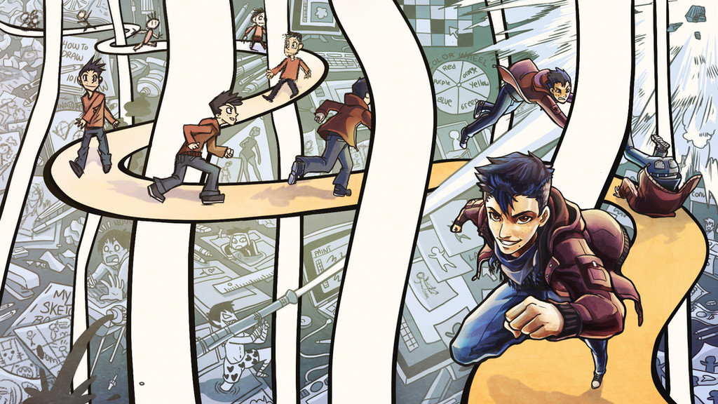
My original character Scruballz in my room again.Old Version: [link]
This was one of the first piece I submitted to dA back in 2009. It was my best piece at the time and I still think it's a pretty good one. I was almost afraid I wouldn't show any improvement but I at last I did and I'm proud of it.
New Version: [link]
Related content


Comments: 205

Nice improvement. ^_^ It looks a lot more 3D now.
👍: 0 ⏩: 1


did you use pencilsfor the second one too? or like grey copic or something? cause if so your shading is AMAZINGGGG
👍: 0 ⏩: 1

I mainly used ink and warm grey copic markers.
👍: 0 ⏩: 1
oh wow you are so talented !
👍: 0 ⏩: 1

Wow both versions are amazing *-*
👍: 0 ⏩: 1

Three years later and the kid's room is still in a mess.  (Wink)")
👍: 0 ⏩: 1
Lol in fact I think it got even messier. Thanks!
👍: 0 ⏩: 0

Wow this was a contest~
And you made the finals?
XD thats freaking awesome!
👍: 0 ⏩: 1
yushh! Thank you! haha yeah i'm so psyched right now. I have high doubts i'd even make the final three but I'm just really happy I made the semi-finals ; u;
👍: 0 ⏩: 1
Just keep telling yourself you will make it!
Because words have power! I know you will make the top three!
Because I just do! XP
👍: 0 ⏩: 0


I think their both great! Though I think I like the first one's hair more than the second. There is something raw about it.
👍: 0 ⏩: 1
probably the strands? thanks ^^
👍: 0 ⏩: 0

Omg you're right! The old one is soo amazing. And OMG you're right again! The second one is even better 
")
👍: 0 ⏩: 1

Waaaaaaaaaaaaaah. And I thought the first one was amazing; the second one definitely shows the improvement though! Amazing job as always, Scru! <33333 MISS YOU
👍: 0 ⏩: 1
THanks Kyandii ; u; -hugs&Squeezes- it's always good to hear from you x3 <3
👍: 0 ⏩: 0

Oh my goodness! D8 What a difference!
👍: 0 ⏩: 0

wow this is an amazing transformation!!
👍: 0 ⏩: 1

These are both really good. The second definitely has more depth and perspective, its got a lot of "character"... but the first one has its own appeal with the heavy use of black ink and the concentration more on the guy than on his room. I would say the "better" picture depends more on what you would prefer to focus on.
👍: 0 ⏩: 1
Thanks Animeshen : )
I think what my new one lacks is like you said the use of black ink that kind of gave the piece its own "character". I think that was due from the crosshatching, a technique I ended up not using because of the new medium {shades of grey} I used for the new piece.
👍: 0 ⏩: 0

He gained more clutter!!! xDDD nah man it looks really good! good job.
👍: 0 ⏩: 1
lol thats usually how it goes right? gain more stuff as the years go bye.
👍: 0 ⏩: 1
yep yep. and then you clean/move and are like 'omg why do I have so much stuff'
👍: 0 ⏩: 0

I like the old one better, more character
👍: 0 ⏩: 1
aw, what did the newer one lack that made it less of a character? D:
👍: 0 ⏩: 1
The strong contrast is a big plus in the first one and I also find the style more original than the second one. Also I do not like the unnecessary "cool bandages", but I generally dislike things that serve absolutely no purpose. There is clear technical improvement though, can't deny that.
👍: 0 ⏩: 2

Looks great overall, but I kinda of agree with Illuusion. The quality of the line and rendering is much better in the new piece for sure. No question there. However, you added so much more stuff that the composition is imbalanced. There isn't much negative space to help define your subject. Also the characters left leg runs into the negative space and visual plane of the cup of pens, making it appear longer than it is. He is anime, you will remain in the Deviant fan-art realm forever. haha. I kid. Send it over if you want a paint-over.
👍: 0 ⏩: 0
oh I see, thanks for taking the time to explain. ^^
👍: 0 ⏩: 0


And Scru's boxers 
 (Cool)")
👍: 0 ⏩: 1
thank you. lol i thought it was time for him to get bigger boxers
👍: 0 ⏩: 1

And do you have/ wear similar boxers (in real life)?
sry for asking. >.<


👍: 0 ⏩: 1
nah they would stay more or less the size of short pants. And I do have similar boxers but they a bit small on me now.
👍: 0 ⏩: 1
do it like Scru does: Buy bigger ones.
👍: 0 ⏩: 1
Heart boxers are actually hard to find. Haven't really tried looking online though
👍: 0 ⏩: 1
I know, I know. I only got a pair of blue ones with red hearts, but no white ones. I bought them about nine years ago, but still like to wear them and they still look good/ don't fall apart.
👍: 0 ⏩: 1
yeah, I know: it's not the authentic original style.
")
👍: 0 ⏩: 0

great job scru
👍: 0 ⏩: 1
You should still enter. You improved a lot and that is what they are looking for.
👍: 0 ⏩: 1

that is a great improvement!!! you should do a third one with color!!!
👍: 0 ⏩: 1
<= Prev | | Next =>