HOME | DD
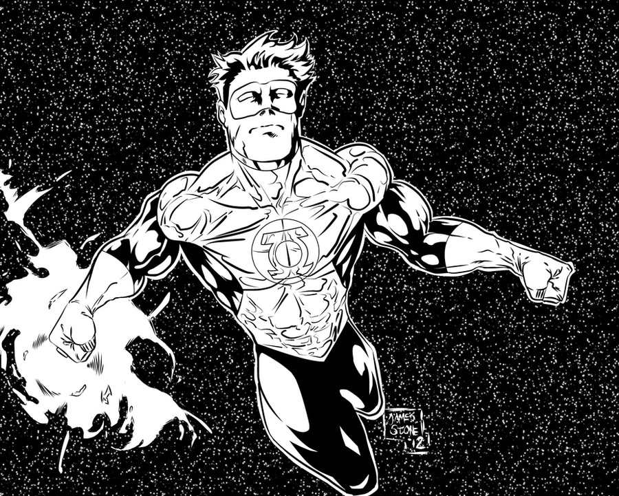
 thelearningcurv — Hal Jordan inks

Published: 2009-03-09 09:20:11 +0000 UTC; Views: 1360; Favourites: 34; Downloads: 46
Redirect to original
Description
this is for a jelly I am doing over at I am pretty proud of this piece because as much as I am not happy with the brush work [ALL of the inks are done with a micron brush") ] I did everything by hand with no computer help (of course cleaning after scanning doesn't count).... I DID add a gradient to the planets and moons to give them some depth, but that will be done next time if necessary and I'll add washes to the whole piece to create it.
] I did everything by hand with no computer help (of course cleaning after scanning doesn't count).... I DID add a gradient to the planets and moons to give them some depth, but that will be done next time if necessary and I'll add washes to the whole piece to create it. The more I am using these micron brushes (they suck, they splinter and it's extremely hard to control when you get a fine fine line) the more I want to buy a real Windsor newton brush with some India Ink .....
..... too late to color this for the jelly, but it'll be done soon enough.
EDIT: I know you guys are tired of this image (I'm sorry:[) but every time I've looked at this image, with the legs looking as stumpy and as bad as they were i've been getting pretty angry when looking at what should be one of my best illustrations (damnit, I actually did something original here! lol) so I've finally fixed his legs!
Related content


Comments: 54


i think it looks fine,way better then how draw thats 4 sure.
LOVE the backround
")
👍: 0 ⏩: 1

ah thanks for that=] it was a fun piece to create so i am glad anyone likes it=]
👍: 0 ⏩: 0

The legs do look better, but I think they are a little fat at the thighs. Only by a hair though.
👍: 0 ⏩: 1
I think you're right, but only with his left leg, i think more light should be seen on that leg.... Thanks for the comments=]
👍: 0 ⏩: 0


👍: 0 ⏩: 1
thanks so much=] I don't know how much better I can make his feat right now, maybe they will eventually get better=]
now back to practice for me=]
👍: 0 ⏩: 1

lol one day=] gotta fix his legs first=]
👍: 0 ⏩: 0

 (Smile)")
:-D why thank ya=]
👍: 0 ⏩: 0

Brushes are SO hard to use! All the ones I've ever tried to use splinter too so I know what you had to of gone thru.. I stick with my micron 02's and 03s' (faves) even tho they get blunt quick.
Great work!
👍: 0 ⏩: 1
I love Master Splinter, hate splinters.... blah
glad you liked this=]
👍: 0 ⏩: 0


yea man!!!! =] heheh thats what I'm talking about=]
👍: 0 ⏩: 1

you brought it on this one. The bg is so ambitious with all that black and the rendering of all the stars and such. Looks like you are gettin a lot of crits on the bottom half of gl's anatomy. The foreshortening can be tough to pull off but I think it's very close. In this case I think if his feet are drawn a little more pointy it would go a long way. still Over all this guy is ready to go put a boot in Synestro's bottom half!
👍: 0 ⏩: 1
lol Sinestro now knows fear after seeing this=] I still wanna do more with this, some guardians in the background, a hand from every corp with their ring on in the foreground.... i wanna really go all out on this, so you can expect to see more from this=]
👍: 0 ⏩: 1
cool man. we'll be lookin out for the updates
👍: 0 ⏩: 0

:-D *bow* thank you much sir=]
👍: 0 ⏩: 0
this is dope! the legs could use a little work though!
👍: 0 ⏩: 1
lol I am going to just refreaking draw the legs! lol everyone hates the legs! lol
👍: 0 ⏩: 1
other than that, this is pretty dope. nice strong composition.
👍: 0 ⏩: 1
thank you much sir=] would love to see how you would have handled this=] you do some fun stuff=]
👍: 0 ⏩: 1
hey thanks amigo! im postin up a greenlantern pic in a couple days! so u will indeed hopefully be able to see said drawing!
👍: 0 ⏩: 1
that works man=]
👍: 0 ⏩: 0

The legs look a little awkward, but from the waist up it came out really well. How did you mask the piece so you could splash white onto the background?
Looking forward to the colored version.
👍: 0 ⏩: 1
well since this was the first time I have done this, i did it on a different paper, and then scanned it and slopped them together in PS.... next time what I may do is cut out some paper that I could use to lay on top of what can't be splashed on.... OR just reink over what gets white on it.... I think the first option sounds better=]
👍: 0 ⏩: 1
I thought you might have inked and splattered the background first then inked the pencils for GL and the planets. But the technique you used for this worked out fine. Probably should have gone the same route insteaf of the silver sharpie over black sharpie which needed 3 or 4 more layers.
👍: 0 ⏩: 1
yea man the splatter speeds things up so well.... I used my water color kit though since i don't have any other real paints. they're posting them tonight hehehhehe I can't wait to see all of them=]
👍: 0 ⏩: 0

*bow* thank you sir=]
👍: 0 ⏩: 0
So much in the universe yet, so much empty space.
Nice abs on GL: HJ.
👍: 0 ⏩: 1
hehehhe ain't it crazy, like Dr. Manhattan said, we could destroy ourselves and the Universe wouldn't even notice..... glad you like this=]
👍: 0 ⏩: 0
thats good to hear man=] I want to do the colors on it, but i don't want to rush them and they don't turn out how they should.... thanks for the compliments man=]
👍: 0 ⏩: 1

yeah rushing colors always goes bad
👍: 0 ⏩: 0

i love the way you've done the space BG by the way. good energy to it.
👍: 0 ⏩: 1
thanks a lot=] it was something that was in my head that i've learned before but never actually tried, and it felt good to actually accomplish it=]
👍: 0 ⏩: 0
I agreee, great job on the inks but his lowehalf does look a little odd.. its worth usuing perspective techniques to make foreshortening a little easier.
👍: 0 ⏩: 1
i will definitely be working on this so it doesn't happen again. Thanks for taking the time to comment=]
👍: 0 ⏩: 1

Nice job, just a nitpick: his feet look really weird, especially his right foot.
👍: 0 ⏩: 1
I've been getting a lot of flack for the lower half, I got a book that will hopefully help me understand how to do it better..... I am glad you dig it regardless=]
👍: 0 ⏩: 0

great job on the inks. Ive got the green lantern Revamp on my to do list now
I did Aquaman this weekend [link]
")
👍: 0 ⏩: 1
| Next =>