HOME | DD
 themightyfro — Comics Lettering Tutorial

Published: 2005-05-11 23:25:45 +0000 UTC; Views: 66795; Favourites: 974; Downloads: 8924
Redirect to original
Description
This is a tutorial I created that gives a basic overview on how to lettering a comic book page. I've had quite a few questions on lettering lately, so I figured I would just write down how I work.Please visit www.balloontales.com for the most comprehensive collection of lettering advice online. You should definately read the entire site if you want to letter. Also, www.digitalwebbing.com/forums is a forum where some great letterers hang out, and they are always willing to share advice. These are the two sites I used when first starting out, and continue to use.
I would like for this tutorial to be a work in progress, so please leave comments, suggests, and further questions!
To check out the actual page featured in this tutorial, go to Black Rose #2, page 15 .
Be sure to check out , who did the lineart featured in this tutorial.
I do mostly writing and lettering, so if you need someone or want to toss around ideas, please drop me a note! I'd love to see more comics action happening around Deviantart, even beyond just posting stuff!
Related content
Comments: 136

Hello from Colombia!!
cool tutorial, I have one question... you can help me? I want to create comic book but i dont have the temple, you cant sent the temple... please
Linda Andrea
[link]
[link]
laej777@hotmail.com
Laej777@gmail.com
Bogotá - Colombia
Skype: linda.andrea
👍: 0 ⏩: 0

i never knew u could do that in illustrator, thank you
👍: 0 ⏩: 0

damn nice work
wish it more photoshop related so it could be part of the club.
drop by.. see if you can give pointers.
cheers
jaako
👍: 0 ⏩: 0

um. this is gonna sound snobby, but is anyone else put off by computer lettering in comics? I think it always looks artificial and shitty, like the artist is just trying to rush the thing out and doesnt care how it looks. totally sterile. Its seems like computer lettering is a given around here. It's kind of too bad
👍: 0 ⏩: 1

Yeah, I think it can be problematic. A lot of people do things to try and keep variation in it - for example, a lot of good comics fonts actually come with two sets of characters, so if you have two of the same letter in a row (i.e. 'book') then you can use the two different versions and it won't look as mechanical. On the other hand, though, hand lettering can easily look just as bad if someone doesn't care...sloppy calligraphy and bad placement is a problem no matter how you get the words on the page. I do agree with you at least in indy books...lots of people just know they have to get words on there somehow, and the computer seems the quickest and easiest way, so it does get slopped on.
Computer lettering might not look like somebody with awesome lettering techniques and letterforms like Dave Sim or Bill Watterson, but there's a lot of benefits, too. I think sometimes to coolest stuff is a combination of the two. Computer lettering will definately stick, though, just because of how quickly it can be done, if nothing else.
👍: 0 ⏩: 1

oops, forgot to say, I don't think it's snobby...especially depending on the comics you read, some of them definitely look artificial and shitty.
👍: 0 ⏩: 0

This is definitely one of the most helpful tutorials I've read it awhile, and it sure beats looking for pre-made bubbles. Thanks
👍: 0 ⏩: 0

Freakin' wicked! ...and helpful! ^_~
👍: 0 ⏩: 0

I've been looking for this tutorial for AGES. I loved it the first time I saw it but forgot to add it to my faves... v_v thank you so much for such an awesome tutorial. I'm starting work on a comic soon so it will be incredibly useful!
👍: 0 ⏩: 1

You're very welcome! Let me know if you have more questions!
👍: 0 ⏩: 1

ah! thank you so much! I'll probably have some soon enough
👍: 0 ⏩: 0

Wow, really interesting. And here I thought it was all voodoo magic...
👍: 0 ⏩: 1

There actually is a surprising amount of voodoo, but this was just supposed to be an introduction.
👍: 0 ⏩: 0

Hey Mighty Fro,
Pretty good beginners tutorial you have here... click and faved... I caught you off of one of Sean "Cheeks" Galloway's journals... so... you do writing & lettering for comics as well... I'm in the same boat... scope my gallery to check me out... I think I'll be droppin' a DA watch on you...
Peace,
P
👍: 0 ⏩: 1

Thanks! I'll be sure to stop by!
👍: 0 ⏩: 0

Mmm, Nice. this could come in handy one day.
*save*
👍: 0 ⏩: 0

Thank you ^_^ This will be very useful to me. /kudos!
👍: 0 ⏩: 0

i learn a lot faster if things were visual...and this is 
👍: 0 ⏩: 0

My god, this would have been sooooo useful like a month ago when I was desperately trying to find a way to do that. ... now it's a little too late... I already know after weeks of failed attempts and self-loathing
👍: 0 ⏩: 0

This is awesome!
Its great to see how you do this step by step, and your direction and attention to the detail is excelent.
Thank you so much. This should help out a lot!
👍: 0 ⏩: 1

Thanks! I'm glad you found it useful!
👍: 0 ⏩: 0

This is a great tutorial! Visual tutorials are always best. Thanks for taking the time to put it together. I definitely think you give the ones on Blambot and Balloontales a run for their money. I want to recomend picking up a copy of Comicraft's book "Comic Book Lettering the Comicraft Way". I also bought "The DC Comics guide to Coloring and Lettering Comics", but I'd have to say there's as much or more helpful information in Comicrafts book. But both are probably worth owning if you really want to learn the basics. I wish there were more good reference sources out there.
When I actually tried to apply what I learned, I had some difficulty figuring out how large the original art should be once it ends up in the lettering template, and how large the font should be. I tried it at around 9.5 (which is also what Comicraft reccomends, if I'm remembering that right), but it seemed way too large. So I found some Marvel and DC comics pages on the web, brought them right into Illustrator and compared. Their fonts definitely look smaller--I think they're about 6-7 pts! And yet Comicraft works on so many books for the big publishers. I never really resolved that--I'm still pretty confused. I guess legibility is always the key. It must also depend on the quality of paper and the quality of the printer.
When I started out (I'm still starting out), I was looking for a good Illustrator lettering template online (I didn't have your tutorial to tell me how to make my own). I ended up finding the old Epic template, but it's pretty horrible. Do you know of any other lettering templates available for download? Any chance you will make yours available?
👍: 0 ⏩: 1

Hey, glad you liked it. I'm glad you felt it added to what Blambot and Balloontales had, and didn't just repeat, that was important to me.
I have the DC lettering book, and really enjoyed it (I do some coloring, too, so I was excited to get it). Just hearing Todd Klein talk about this stuff was cool to me...it's comforting to know he still has to deal with the same stuff the rest of us do! As far as raw information, though, I can see how the Comicraft book would be invaluable. Tell me, would you say that it mostly collects information that is available on the website? I have had several people tell me that, not necessarily as a negative thing, but to be aware of before you buy it. It looks like it might have better visual examples than the site, though, and the price is right (it's only $10!). The other thing is that in my experience, if you have an intimate knowledge of Illustrator (granted, that's a big IF!) a lot of those tips can be figured out just by looking at comics and playing around on the computer a little...but again, having a handy reference is always great.
As far as art goes, the original page size is always going to be 11" x 17". Scaled size, however, will be a little different for each publisher. Going from Image to Comixpress to Marvel, etc, you will find that each has slightly different specs on EXACT page size, trim size, and live area. So, there is no golden rule on size. It's almost always around 67% (2/3) of the originally size, but exact measurements will vary. So I'd say for practice just reduce to 67%, and if you are aiming at a specific publisher find out ahead of time what sizes they work at (some website or forum digging can usually turn up this info). And if you get published but have to slightly adjust pages sizes, you probably won't be grumbling because you GOT PUBLISHED!
Font sizes - 9.5 pt. type and 10 pt. leading is Comicraft's general suggestion for all fonts everywhere, which means sometimes it just isn't going to make sense at all. Also, remember that this is the size they recommend for letter on a full size (11" x 17") page, so it will look really big on a scaled page...for a page scaled at 67% they recommend, uh, 6.35 type and 6.75 leading, I think (which are approximately 67% of 9.5 and 10). It is a good general suggestion, though. Like you said, in the end, clarity and legibility is what matters. If you can comfortably read it, it's a good size. The best thing is probably to line up a bunch of different sizes on a page, print it out, and then compare to comics you like and see which is closest. So, don't take their 9.5 as a golden rule, just a starting point.
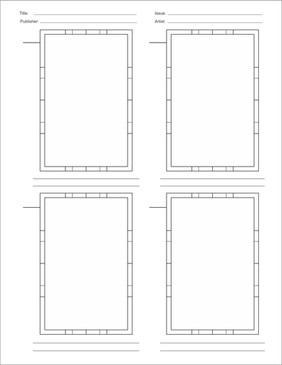
For the template, honestly, I think you should make your own. I went through the same process of searching for a pre-made one, and couldn't find one, so I just put this one together. You can see mind pretty well in the tutorial - it has information on the left, art in the middle, and font choices on the right. The info bar includes: book logo (wasn't in the tut because I didn't have the file on me at that second!), issue #, page #, art/trim/live area sizes, and my personal contact info. I always work on the 4 layers that I mentioned to stay organized, and the art area just consists of the 3 colored rectangles so that I know I'm staying in the page's live area.
Good measurements to use are (I think I have some crazy measurements listed on the tut, ignore those):
Art: 6.875 x 10.437 (these are all in inches)
Trim: 6.625 x 10.187
Live area: 6.125 x 9.687
That's really it, and the process of making it for myself made me more organized and decide what I needed and didn't need to use.
Hope that cleared some things up! Let me know if you have more questions!
-chris
👍: 0 ⏩: 1

Chris, thanks very much for spending the time on elaborating for me. That was very helpful. I shouldn't have said "original size". I think my problem cropped up when I discovered that different sources were giving me different numbers for "scale size", and I assumed that only one was the right one. I've been sitting and spinning for months. But now, finally you've made the clouds part for me! But I still want your template.
"Comic Book Lettering the Comicraft Way" is great, I'm very glad I bought it. I ordered it through Amazon, and when it arrived, it seemed a little overpriced considering the size (it doesn't APPEAR to be much larger than a comic book on first inspection), but it's filled with useful information, good pointers, and even some very specific Illustrator tips, most of which are presented in step-by-step visual examples, much like your tutorial. I still wish it was longer, but they used the space pretty well, and it will leave you with no doubt as to why Comicraft is so popular with so many creators.
It's fair to say the book collects some of the information available on the Comicraft site, that's true. But there's plenty of information you can only find in the book. I suspect that you wouldn't get any major revelations out of it, but you never know, and it's excellent for beginners. One big warning, though: if you want to learn how the pros hand letter comics, you'll be disappointed--I don't think they spent even a single page (out of 64) on the subject. That happened to suit me fine because I wanted to learn more about digital lettering, but it may not please everyone.
And a suggestion for your tutorial: you might spend a moment or two talking about how you arrange the words to fit within the balloon space--how much room is too much, when does it start looking cramped, etc.
And a question: Do you pay attention to cadence, to the delivery of dialogue? When do you decide to seperate balloons into smaller attached balloons?
👍: 0 ⏩: 1

Note me your email address and I can send you the .ai file. What version of Illustrator do you have?
Thanks for the info on the Comicraft book, I thinkn I might just break down and buy it.
I'll see about adding something about word arrangement. That's a good suggestion, and one I was considering addressing when I made the tutorial...I think I was considering that when I looked at the clock and realized I had better hurry it up! I'll see if I can address it in the next day or two (or three!).
Yes, the delivery of dialogue is always important, and it comes into play in both how you break up the lines and how the balloons are placed. Realistically, sometimes the balloons have to broken up so that things flow visually. If you've ever read a comic that's very text-heavy (Strazynski (Rising Stars, Midnight Nation, Babylon 5), for example, is awesome but holy cow, that's a lot of words on a page! Also, the last issue of Turner's Soulfire (#4) had two pages of just ridiculous paragraph long text blocks) you can feel that those huge text block sometimes make the story drag. So, breaking up text can be both communicative in that it enhances the delivery of the lines, but also a pragmatic choice by a storyteller to help out the reader. You know, the more I think about this, I think I'd like to make another tutorial talking about some of these ideas, because it's really pretty cool what you can communicate with variations on the format of a bunch of words inside an oval!
Some quick examples, though, for now:
Sometimes the balloons are written to be broken up in a certain way, for effect. In the first panel of this page the line "This isn't." is placed on this opposite side of the character's body from her first line, so that the reader's eye is directed to the knife the character has just drawn. Splitting that second line with the third line ("Identify yourself.") suggests a momentary pause in delivery.
On that same page, in panel three, there are two lines split into separate but connected balloons. This example is partially a size issue and partially storytelling. Breaking off the second line here emphasizes that there's been a slight change in tone, from expositionary ("There's only one person who carries a sword like that...") to threatening ("There's a reward for your death..."). The switch is subtle, but I think that the reader will notice, even if its uncounsciously, that some kind of shift happens there. And realistically, if both those lines were in one balloon it would probably be awkwardly large.
On this page breaking up the single line of dialogue into two balloons emphasizes the idea that the art between the balloons is instantaneous - the whole thing happens in the time it takes Arion to complete a sentence.
There's also the issue of bolding and italicizing (entire words? syllables? which words?), as well as the role of the double dash (--) and ellipsis (...) in dialogue (and both do have specific and inferred purposes), and more on how and when to break up dialogue. Part of this is decided by the writer's script, and part by the letterer's preference. I think I will put together another tutorial in the next couple days on some of these ideas.
Thank you! You got me thinking!
-chris
👍: 0 ⏩: 1

You're very welcome! Glad I could help. You know, you might end up needing some kind of appendix structure at this rate.
I found myself thinking about many surprising issues that cropped up as I sat down and started lettering my own work. I think it would be a good practice for all comic writers to do at least some of their own lettering. There are some very different problems that come into play, plus it can force you to edit your work down so that it makes more sense with the art (which probably didn't exist before the words were written). Covering great art with pointless dialogue is a crime. I often found the the art alone was already illustrating points that I had labored to establish with the dialogue.
Comics are so amazing.
👍: 0 ⏩: 1

Yeah, you're totally right. I agree with you about a writer trying to do their own lettering at least once. I know it's helped me improve both skills. Like you said, showing rather than telling is a big point (like the old stuff, where every character practically narrates his own actions as he performs them!), and my first comics script was so word-heavy it was ridiculous. Thankfully, I can now laugh at that old script and edit myself a little more realistically!
Since there were a lot of questions on that kind of stuff, I started working on another "tutorialesque" piece right now that's about some of those issues - the effects of breaking up dialogue in different ways , how balloon shapes come into play, various uses for the ellipsis and double dash...that kind of stuff. Hopefully it'll be done in a few days, it's been really fun to work on and I think it'll be pretty informative.
👍: 0 ⏩: 0

You're welcome! I'd be glad to do more if you have questions.
👍: 0 ⏩: 1

Well, since you mentioned it...
I've been to Blambot and a couple other "lettering" web pages. I'm not a letterer by trade, but I'd like to beef up my "NEVER-PAYED-A-DIME-LIBRARY-OF-FONTS!"
Besides the site you mentioned, do you know of any other with free downloads?
I don't mean to sound like a parasite, but I've got like TWO that are decent for your standard balloon lettering, and I'm looking for some additional "action fonts."
👍: 0 ⏩: 1

Hmm...I know [link] has lots of stuff, as does [link] . I don't know anything about the legality of those sites, though, I just know they are there. Blambot and [link] (Comicraft's site) are really the two best for anything comics related. There should be several really good free dialogue fonts on blambot, at least...I think Letteromatic and Web Letterer are the ones I usually use.
And if you're using any of those fonts professionally (as in, making money on a project they were used in) you need to purchase the fonts.
Hope that helps!
👍: 0 ⏩: 1

it does, thanks
I wasn't sure how it worked WHEN using them in a professional work (not that i'm doing that right now) but hopefully someday, y'know?
thanks
👍: 0 ⏩: 0

Excellent stuff, I'm planning on starting a comic sometime in the near future and want to do the lettering myself, you've made some great suggestions and points while keeping things nice, simple and concise. Straight to my faves with this!
👍: 0 ⏩: 1

Cool, glad I could help! Let me know when you get working on the comic...I like the style of the comic stuff in your gallery, and I'd love to see the finished product!
👍: 0 ⏩: 1

Thanks very much, I'll be sure to do so.
👍: 0 ⏩: 0

This is awesome! I did my own comic tutorial except for it was Photoshop... Can you use the same anchor points in PS7? I Fav!
👍: 0 ⏩: 1

Yeah, actually I just tried it in Photoshop CS (don't have 7, sorry), and the exact same process applies. It's a little more of a hassle, because Photoshop obvious isn't geared toward vector stuff (Illustrator is great because it makes creating the balloon and tail shapes so easy), but you can still pull it off! I can't remember if PS7 has some of the vector stuff that CS does, so you'll have to try it out.
👍: 0 ⏩: 1

Bravo, my friend, this is insightful and gorgeous.
DO you have any book, BTW, that you recommend to look for good-great lettering?
👍: 0 ⏩: 1

Yes, there are two main books that I know of, and I higher recommend them both:
"Comic Book Lettering the Comicraft Way" - This book was created by the same people that did [link] , and is a great resource. From what I've seen of the book, it contains a lot of the same information as the website...and that site is the single-best lettering resource on the net. I believe mentioned that he owns this book, so I was actually just about to ask him what he thought about it. I think it would definately be a very valuable resource to have on hand, even if the information is on the site.
"The DC Comics guide to Coloring and Lettering Comics" - Written by Todd Klein, this has some great information. the book is split about half and half between coloring and letter, but the lettering section is worth the price. Todd Klein is one of the best letterers working in comics (he lettered all of Sandman, for example), and he shares a lot of useful information. Part of this is about hand-lettering, which is not absolutely necessary for a computer letterer, but definately good info to know, regardless.
There may be more, but those are the two I know of. Both can be found on Amazon, and you may find the DC randomly in bookstores (never seen the other in a store, personally).
-chris
👍: 0 ⏩: 1

Your wisdom is boundless as your kindness.
Thanks, definitly look this up and start craking on some lettering
👍: 0 ⏩: 0

wow man thanks for the tutorial!
it answered alot of questions about lettering for me, such as keeping the conversation flowing and helping the reader follow the story!
Bravo! i shall be watching!
^__^
👍: 0 ⏩: 1

Glad to hear it helped! I can't recommend balloontales.com enough if you'd like to learn more. Let me know if there's other things you'd like to know how to do!
👍: 0 ⏩: 0

ilustrator eh??
hahha
i use the freehand!!
thanks for the tutorial
👍: 0 ⏩: 1

Arrr, freehand! I used freehand until I found Illustrator, which I like a lot better. I just found it easier to use and a lot more enjoyable to work with. There are pros out there that use freehand to do this, though, and CorelDraw, too. Of course, the same ideas apply no matter what program you're using, but I think a lot of this information probably translates pretty well to freehand. I hope it helped, and let me know if it's useful in freehand!
👍: 0 ⏩: 1
| Next =>


