HOME | DD
 themozack — LOAB - Crossing

Published: 2005-05-05 00:52:44 +0000 UTC; Views: 3481; Favourites: 47; Downloads: 467
Redirect to original
Description
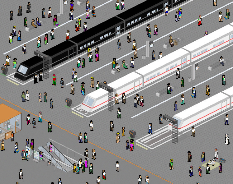
Anyone who had been watching me long enough should remember my first submission of this old scrap more than a year and half back. I wasn't able to carry on completing it before because of insufficient skills.Got back to work on this a month or two back, finally taking a stab on perspective pixel art. It turned out better than expected; much of the image is exactly as planned, including the buildings, pedestrians and vehicles (including the boat below). This is part 2 of the "life of a bridge" series. It just show the bridge surving its function, bridging two sides of a river in the middle of a city.
I'm not too happy with the buildings though, espcially the windows; it's still tough to have them fit in with the scene's perspective. I'm not too fond of the colour of the buildings either; it doesn't look desaturated enough to me.
This probably took a total of about a month's worth of working time. I don't really know for sure; I sort of lost track.

Completely done in MS Paint with 130 colours, except for image conversion, of course.
EDIT: How appropiate. It's almost 5-5-05 and my pageview just broke the 5555 barrier.
EDIT (5 May): Changed colour of bridge under ~pixelblink 's advice; fixed a few minor slip-ups as well. More changes to be made.
EDIT (5 May, again): Followed `gas13 's suggestions on the shading, shadow dropping and minor colour change for pure white.
EDIT (7 May): Added more detailed reflections on river. That is all.
Related content


Comments: 29

Hey man im making a game and i need a pixel artist think about it and reply
👍: 0 ⏩: 0

")

Man this is so much more interesting than the same old isometric crap.
👍: 0 ⏩: 0

many black borders, but i like it. good job!
and a fave it!
👍: 0 ⏩: 0

ooo man ... I was miss this work ... amazingly for me she is impressive ... I can mark that colours and vision with them are ... details and peoples and building ... sorry but no comment
👍: 0 ⏩: 0

That's a great pixel piece! And how creative! I've never seen anything from this angle, very interesting. This is the type of images you'd have on a poster as a photograph of a skyline. The buildings are definetely the favourite part of this piece for me. The buildings look huge from this perspective, which is hard to do in traditional iso style so I could see why you'd do it like this. The colors of the skyscrapers are also great and distinctive, giving each building a unique look. It's odd how you're not happy with these things. And I think the perspectives of the windows are not a huge deal, since each window is so small it's not really noticable. But I can see you succeeded in it at least of the building on the left. But I didn't even notice the lack of perspective in some of the buildings' windows.
I also like the decorations on the brigde. The one thing that I don't really like in this piece is the part below the bridge. Perhaps it's just really difficult to make water in pixelart, but I don't like the boat that much and the streams it leaves behind.
Apart from that, it's a great pixel piece with a refreshing perspective, well deserving of a

👍: 0 ⏩: 0


mother of god....
first off, only mspaint? clearly you are bordering on insane
second...this is really fantastic  (Smile)")
 (Wink)")

👍: 0 ⏩: 0

god damn boy... that must have taken some time... good work
👍: 0 ⏩: 0


I love it! Nice work on the perspective and lighting...
👍: 0 ⏩: 0

very awesome perception. Nice touch with the reflections on the water. I think you should of include more details in the reflection other then just the outlines of the buildings though. Beatiful piece though.
👍: 0 ⏩: 0
pixelblink [2005-05-05 18:31:48 +0000 UTC]
can't really remember what it looked like the other day but, the bridge does seem to blend it much better. Good job
👍: 0 ⏩: 0

Now that I zoomed in let me leave you some crits here
1. My main crit is a question. Why don't you make highlights? There are many parts here where I can see a shadow and can't see any highlight. This comes to my attention especially at the bridge.
2. Shade dropping from the building at the left is really nice. Why don't you drop same shadows on the next buildings? It would rock in my opinion.
3. Pure white (as well as the pure black) look very unreal. Dark colors instead of black and bright colors would look much better (especially that sign on the bus).
The whole scene is nice
👍: 0 ⏩: 1

1. Ah yes, shading. It wasn't a top priority during production due to colour rationing. I now have that fixed for certain parts of the image while adding some extra items a moment ago, mostly on the underside of the bridge and the riverside walkway on the lower left area
2. Had that fixed, too. Most buildings should have them now.
3. Took your advice about the pure white (replaced it with mild grey), but I'm intending to keep the outlines black because they create a cell shaded/cartoon-like pixel art. I wasn't opting for realism anyway; besides, the outlines are similar those in my initial pencil sketching of the scene.
Appreciate the critiques.
👍: 0 ⏩: 0


There are a lot of black borders everywhere, which you could change into more discreet colors..

👍: 0 ⏩: 0
")

It's realy cool! I love the reflections in the water man!

👍: 0 ⏩: 0
pixelblink [2005-05-05 04:39:58 +0000 UTC]
I think it's pretty f'n great! The colours on the buildings are perfect.. it's just the colour of the bridge that makes it look a bit weird or out of place. Still, a masterful piece that obviously took alot of time even without reading your description. +fav
👍: 0 ⏩: 0

You should include some dshh on the water.
Thats what my friends thinks anyway.
I like it, I don't like the black lines, but the rest is real nice.
👍: 0 ⏩: 1

I was sitting with my mate at the time, he said:
"the water needs more, dshhh"
👍: 0 ⏩: 2
Assuming he mentioned water, he may be referring to the lack of sparkles or waves in the river, or the lack of other floating items in the river. I'll have them added if it seems reasonable.
By the way, black lines are sort of my style, even when they look un-pretty when clumped together.
Thanks for the feedback, though.
👍: 0 ⏩: 0
Assuming he mentioned water, he may be referring to the lack of sparkles or waves in the river, or the lack of other floating items in the river. I'll have them added if it seems reasonable.
By the way, black lines are sort of my style, even when they look un-pretty when clumped together.
Thanks for the feedback
👍: 0 ⏩: 0

I love the detail inside the bridge's brickwork. A lot of insiginficant detail put into this that no one would ever notice. So well done. +fav
👍: 0 ⏩: 0

The composition, depth and variety of textures make this very eye-catching. Also like the implied sense of movement in different directions (people, boat, bus, etc.) -- lively piece.
👍: 0 ⏩: 0

Absolutely amazing. The detail on the textures is amazing, especially the clouds. The reflections are a really nice detail. This is just wonderful.
👍: 0 ⏩: 0

What can I say? Excellent pixel work. Definately quite cool and well executed. Great job with the buildings especially!
👍: 0 ⏩: 0