HOME | DD
 TheOnlyFallacy — Integral

Published: 2006-06-17 04:45:49 +0000 UTC; Views: 1116; Favourites: 17; Downloads: 286
Redirect to original
Description
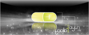
If you've changed your mind i'm afraid it's too lateWe're concerned you're a threat
You're not integral to the project
-Pet Shop Boys
---------------------------------------------------------------------------------
A little diffrent from me but I think its one of my better peices.
Comments and favs appreciated
Related content


Comments: 25

Fine work! I have picture on Integral song too... [link] )))
👍: 0 ⏩: 0

Looks like a pro work  (Smile)")

👍: 0 ⏩: 0

wow i havnt checked on you for a while, my mistake, well done
👍: 0 ⏩: 2

thanks for checkin back then
👍: 0 ⏩: 0

Oh, and I don't dig the border. White doesn't look good on this one.
👍: 0 ⏩: 0
Seriously, man, you need to work on your spelling/grammar. It's "you're," not "your." But other than that, I like it.
👍: 0 ⏩: 0

very nice very nice
just that the type is poor
fix that and it will be alot better
👍: 0 ⏩: 0

I like the background. composition is ok but needs a bit work. So does the text as well. overall not bad, but have seen better from you
👍: 0 ⏩: 1
thanks for the crit then ")
and i was just wondering, but have you sold any prints? cuz i havent.... except to myself
 (Wink)")
👍: 0 ⏩: 0


Well, when it was loading, I only saw the top half, and I thought of Coco-Cola for a minute...
Haha.
But I really like it.
Like the use of colors and stuff or lack of colors, either way.
Also love the designs with in it.
Gj
👍: 0 ⏩: 0

Ooooh, nice. As others said, the textures are sex. Colors are nice too. You changed the shading in certain areas, which really give it a great feeling of depht. Love it, great work!
BTW, keep the border.
👍: 0 ⏩: 0

amazing..i love the texture, and colors use.kidn of depressing..which is what i think you might have ben trying to get across..if not..who cares..it owns! +fav.
👍: 0 ⏩: 0

I don't like how the "g"s merge in the text, but I do love the rest of it to the maxtreme.
👍: 0 ⏩: 0

I freaking love it, the texture on the background and the fern-leaf like pattern are so awesome. +fav for sure.
Not too fond of the border though...
👍: 0 ⏩: 1
everybody must like my borders!
haha jk thanks man

👍: 0 ⏩: 1
Oh yeah, like Einhanderkiller said, it's 'you're'
👍: 0 ⏩: 2
