HOME | DD

TheOperator27 — dA Logo Concept 0

Published: 2008-10-02 20:29:37 +0000 UTC; Views: 18031; Favourites: 142; Downloads: 1
Redirect to original
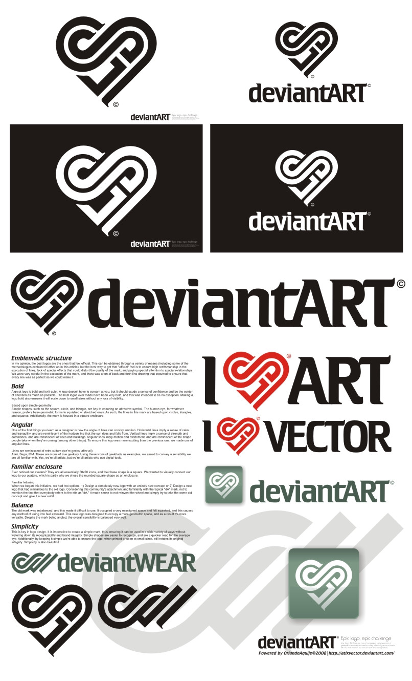
Description This is no longer the entry I am working on.
view the new one >Here<
Related content
Comments: 71

Marzone In reply to ??? [2008-10-02 23:55:24 +0000 UTC]

I've seen like 5 new dA logos with the same typography.
I really hope you change it, since this is one of my favorites so far, it has a strong mark, very dynamical.
Im gonna fav this, and watch your gallery, good luck.

👍: 0 ⏩: 0

sunsetsc [2008-10-02 23:19:11 +0000 UTC]

Thats pretty cool

👍: 0 ⏩: 0

Kata [2008-10-02 23:11:37 +0000 UTC]

I really like it! Much more than the current one anyway. good luck!

👍: 0 ⏩: 0

tbfdm [2008-10-02 23:07:38 +0000 UTC]

My favorite so far.

👍: 0 ⏩: 0

LuminonPhotography [2008-10-02 23:06:13 +0000 UTC]

This is pretty cool! The DA Snail logo!

👍: 0 ⏩: 0

scrapsaurus [2008-10-02 23:04:46 +0000 UTC]

i like it

👍: 0 ⏩: 0

dandelgrosso In reply to ??? [2008-10-02 23:00:38 +0000 UTC]

Oh this is very good

👍: 0 ⏩: 0

TheJellyBean [2008-10-02 22:50:37 +0000 UTC]

I know there aren't many submissions yet, but I like this one best so far.

👍: 0 ⏩: 0

Rosabelle334 [2008-10-02 22:48:49 +0000 UTC]

its a turtle!

👍: 0 ⏩: 1

x-it-here In reply to Rosabelle334 [2008-10-03 03:26:01 +0000 UTC]

snail. e.e

👍: 0 ⏩: 0

KaeruNeko [2008-10-02 22:48:31 +0000 UTC]

this looks way too cool |D

reminds me of a surf logo

my fave so far lol

👍: 0 ⏩: 0

Lightdud [2008-10-02 22:42:44 +0000 UTC]

This is my favorite so far.

👍: 0 ⏩: 0

frozenpandaman [2008-10-02 21:46:54 +0000 UTC]

Very curvy. I like how it has an "outline".

👍: 0 ⏩: 1

dandelgrosso In reply to frozenpandaman [2008-10-02 23:01:09 +0000 UTC]

It definitely has the retro 'Sega, IBM' feel to it

👍: 0 ⏩: 0

Draciel56 [2008-10-02 21:28:10 +0000 UTC]

I'm actually really impressed by this. I like it hah.

👍: 0 ⏩: 0

neil78b [2008-10-02 21:07:40 +0000 UTC]

weird, looks like a snail, lol.

I guess the shape is making it look out of place.

👍: 0 ⏩: 2

dramatize In reply to neil78b [2008-10-04 05:52:45 +0000 UTC]

i agree, but it represents the slow speed of the pages here lol

👍: 0 ⏩: 1

neil78b In reply to dramatize [2008-10-05 18:18:38 +0000 UTC]

haha

👍: 0 ⏩: 0

lerosenoir In reply to neil78b [2008-10-03 00:16:57 +0000 UTC]

Yes, I was thinking a similar thing. I thought it looked very much like a turtle. O_o

👍: 0 ⏩: 1

neil78b In reply to lerosenoir [2008-10-05 18:16:09 +0000 UTC]

lol

👍: 0 ⏩: 0


<= Prev |