HOME | DD
 thespyder — Respect

Published: 2003-12-12 05:29:26 +0000 UTC; Views: 408; Favourites: 5; Downloads: 98
Redirect to original
Description
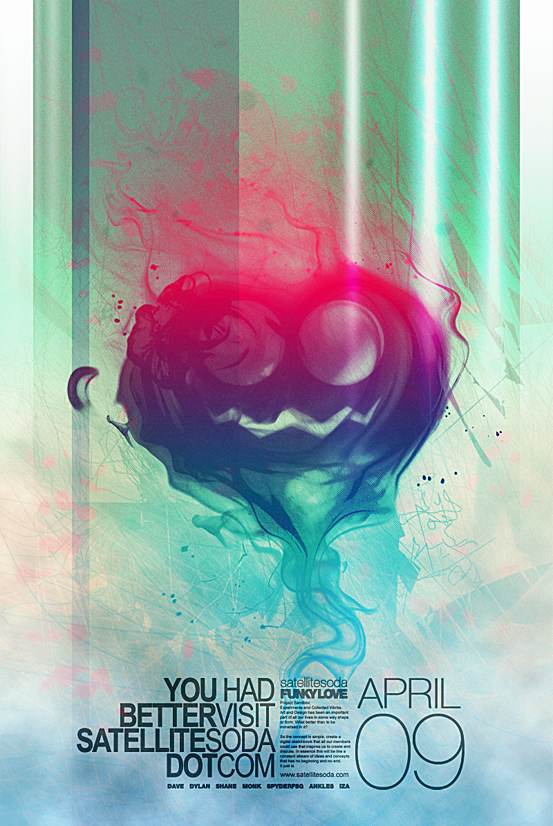
These where just some thoughts I always have in my head when I go play basketball.Related content


Comments: 10

First of all, this is worth commenting on, because it's got a great concept. However, I think the execution needs some work. Some of your type is great, some is horrible. Anything that is stretched vertically or horizontally needs to get replaced, it makes your design look amatuer. Your text needs to be either chaotic in random angles or lined up, but not both. Coming out of the top right, I see two lines that are an immediate example of being lined up. I don't think you want anything to be aligned considering the message you're trying to send. The contrast of the heavy black text and the thin white text is perfect. The texture over the blue background is nice. The picture of the basketball court should be integrated better, possibly by having the word respect coming from the backboard and that's the source of the explosion of your black text. It's a good start, but you need to take it up a notch.
👍: 0 ⏩: 1
oh, I also meant to mention the image quality. Either your final saved file or one of the images within the file is a low quality jpg and needs to be resaved or replaced respectively.
👍: 0 ⏩: 1

I see what you mean. I only have one thing to say though. I meant for some things to be linear and some not. Now you must be thinking why. The reason for this is that I was trying to express what happens in my head when I play. Sometimes I'll have thoughts just come together, like when you trashtalk and you just get a couple of thoughts simultaniously form. Then some random stuff goes in there too. Thats the reason for that.
I appreciate your comments quite a lot. It gives me something to think about for the next time. You've been quite helpful in this respect. Even so, I'm quite content with the image. As for the image quality I put it as a lower quality for the final image due to the fact that it just was too big when I would put other settings.
Thanks for the comments again. I appreciate it.
👍: 0 ⏩: 1
woops, my mistake, thought it was listed in the design category (where your opinion doesn't matter, just the message) and not the indy art category.
👍: 0 ⏩: 1

Finally someone who is actually creative and isn't into doin the same shit everyone else does  (Smile)")
👍: 0 ⏩: 1
Thanks a lot man. I appreciate it.
👍: 0 ⏩: 0

