HOME | DD
 theThirdCartel — Refraction Study
by-nc-nd
theThirdCartel — Refraction Study
by-nc-nd
#caustics #cintiq #color #colour #drop #glass #photoshop #process #refraction #study #values #water
Published: 2015-10-11 16:57:44 +0000 UTC; Views: 5271; Favourites: 207; Downloads: 0
Redirect to original
Description
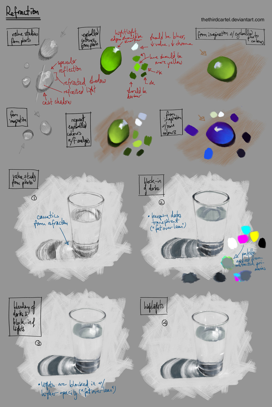
Study of refraction from photo ref.PS CS6 (mixer brush), Cintiq 13HD w/ art pen.
Related content


Comments: 12

What does "fat over lean" mean? And what are these colours doing in a b&w study? (I'm talking about the ones described as "palette mixed from subtractive primaries").
👍: 0 ⏩: 1

"Fat over lean" is a term from oil painting, where one starts with more transparent, thinner paint (in the shadows, for instance), then layer thicker, more opaque paint on top (for highlights, etc). So in this case, the highlights in the water and the glass's shadow are painted with higher opacity than the darks, after the darks have be laid in.
The water glass is not a black & white study. It looks that way because the glass of water is clear and the background is white. If you look at the darks, they're bluish. The colour blotches are the (subtractive) primary colours from which I mixed all the colours (mostly blues/greys) used in the study. I don't pick colours from the picker because I want to understand colour theory + mixing more.
👍: 0 ⏩: 1
I know I'm a month late, but thank you for your reply, I learned something new.
👍: 0 ⏩: 0

I feel I have a pretty solid technique for the colors of refraction, but not the angles (honestly it takes crazy trigonometry that wouldn't be worth the time.) Best to use ref as you have here.
I've been studying this sort of thing for the last year quite a bit. I'm still having trouble with all the Scott Robertson shadow casting in perspective etc.
👍: 0 ⏩: 1
"I feel I have a pretty solid technique for the colors of refraction"
If you don't mind sharing some pointers, that would be great! It confuses me a lot and I need ref all the time, so if there's a way to "think" it out instead, I'd love to learn.
👍: 0 ⏩: 1
First, I cover the object in shadow. Then I take the light side color and increase it's contrast:brighter and more saturated and paint that on top. You never actually let the base light side color show, only the increased contrast version.
It looks like you already understand that the lighting model reverses, but in case others are reading it may be helpful.
I have found that most linear cut jewels exhibit an almost totally random refraction and you can sort of do whatever, as long as none of the shapes are round, but the speculars will determine how you see the structure of the form.
Last, use caustic lighting caused by the refraction to add some light into the shadow. I tried my best to apply all of these in this image fav.me/d9ue0im
👍: 0 ⏩: 0

Very nice. I love the simulated traditional brush strokes.
I gotta play with the mixer brush some, can't seem to find the right combination of wet, load, and mix.
 (Smile)")
👍: 0 ⏩: 0

Nice. Thanks! Writing's a little hard to read, otherwise great tute.
👍: 0 ⏩: 1
")
Glad you like it. Congrats on the DD, btw!

👍: 0 ⏩: 1

Sure. Things like these are always helpful as a reference or a starting point for further studies.
And thanks
👍: 0 ⏩: 0