HOME | DD
 thetopcrusader — The Simple Things
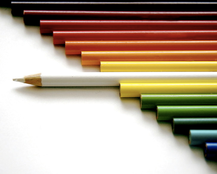
Published: 2006-07-04 18:28:55 +0000 UTC; Views: 39188; Favourites: 1812; Downloads: 1890
Redirect to original
Description
This is something I've been wanting to do for a while, and it took about 40 shots to get it right. I was using Crayola pencils, which bore the golden logo that kept shining on other pencils. In this picture, you can faintly see this in a couple of pencils towards the top - I attempted to edit it out in Photoshop, but couldn't get rid of it completely. But since this was the best of the bunch, I thought I'd share it with y'all...hope you enjoy it (Smile)")
NOTE: This photo is NOT promoting racism. Please stop with the racism comments.
Related content


Comments: 1339


There's just something about this that I love.
👍: 0 ⏩: 1

Awesome! Love the composition. I've been considering doing something similar, but have been focused on portraiture lately.
👍: 0 ⏩: 1

Funny you mentioned that - I've been trying to get around to portraiture (an area I need some experience in); I'm hoping to start shooting some next month. Best of luck with yours!
👍: 0 ⏩: 0

refreshingly simple. ahhh..........
👍: 0 ⏩: 1

Very nice! I love the simplicity of the design, but for some odd reason, I know this is going to sound OCD, the chip on the white pencil lead bothers me. Awesome shot though!
👍: 0 ⏩: 1

wow great pic
👍: 0 ⏩: 1
")

All you can really say is... brilliant +fav for sure
 (Wink)")
👍: 0 ⏩: 1

this one caught my eye the most..prolly cuz i work alot with color pencils..and i always put them in rainbow order. i think its weird that ppl were making racist comments. i mean u could stretch in that direction...but that def did not come to my mind at all.
👍: 0 ⏩: 1


Less is more, and this picture sums that up perfectly

👍: 0 ⏩: 1
ThankYOU for the awesome artwork, it's truly inspirational!
👍: 0 ⏩: 1
You're totally welcome!
👍: 0 ⏩: 0


this is a nice shot. but do you know what bothers me? that the white one is completely outa line, meaning, it split a line just vertically, so now you could not draw an unbroken line along the edges. damn, it's hard to explain. do you get what i mean? i would have put the lower pencils a bit to the right, because apart from its many emotional or intellectual interpretations this is basically also a geometrical shot, right? of course this also limits the logical interpretations of the shot, as it would not be possible for the white pencil to fit in. well i might be talking gibberish, but i had to explain myself on this one, especially since it is faved that much
👍: 0 ⏩: 0

Amazing picture, the precision of the pencils' shift is perfect. You did very well with the DOF centered on the white pencil, but I almost would have suggested shifting your focus balance to the left side of the frame, because it looks like the shaft of the white pencil is more in focus than the tip is, and the tip is where your eye is automatically drawn with this piece.
👍: 0 ⏩: 1
Thanks so much, Claire!

👍: 0 ⏩: 0

wonderful colour and composition, i competely agree with u, i think this should not be addressed to racism. i think the white colour that makes the concept works bcoz it's so conspicous. i think world seems to getting worse so people' minds are full with negative perception.
👍: 0 ⏩: 1

Hi,
classic ! However, very nice and really well done !!!
See you,
E
👍: 0 ⏩: 1

nicely done! should look nice as a desktop or even one of those pictures they sell at IKEA
👍: 0 ⏩: 0


very good job, nice picture!
👍: 0 ⏩: 1

Simple yet elegant and strong..
Great work..
👍: 0 ⏩: 0

Lovely concept. I see you worked
very hard in order to make The shot,
congrats
and how you arranged the pencils.
I was going to ask you why did you choose
the white one, but I saw a cooment of yours,
explaining everything. Very well done ^^
👍: 0 ⏩: 0

Beautiful. =B And I dont see any gold...

👍: 0 ⏩: 0

cool concept, it think ive seen this before.
👍: 0 ⏩: 0

I adore this!! AND you have earned a fav of mine!!!

👍: 0 ⏩: 1
Awww - thanks so much!!
👍: 0 ⏩: 1

Awesome concept. The picture is so sharp and clear and...simple.

👍: 0 ⏩: 1


this is really good! it's hard to think something so simple would take so many shots!
👍: 0 ⏩: 1

Hey, I've seen this picture before awhile back when you first submitted it and wanted to fav it but had to get offline! It's beautiful!
👍: 0 ⏩: 1
<= Prev | | Next =>