HOME | DD
 thetopcrusader — The Simple Things
Published: 2006-07-04 18:28:55 +0000 UTC; Views: 39188; Favourites: 1812; Downloads: 1890
Redirect to original
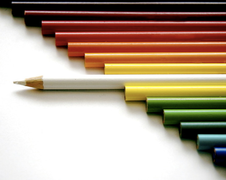
Description
This is something I've been wanting to do for a while, and it took about 40 shots to get it right. I was using Crayola pencils, which bore the golden logo that kept shining on other pencils. In this picture, you can faintly see this in a couple of pencils towards the top - I attempted to edit it out in Photoshop, but couldn't get rid of it completely. But since this was the best of the bunch, I thought I'd share it with y'all...hope you enjoy it (Smile)")
NOTE: This photo is NOT promoting racism. Please stop with the racism comments.
Related content


Comments: 1339

Very interesting. . . . I like it though. It's simple, but effective, not to mention it could hold a deep meaning dealing with a racial theme. Don't think you were going for anything along those lines though.
👍: 0 ⏩: 0

WONDERFUL set up. great picture. I love it!
👍: 0 ⏩: 1

Thank you so much!
👍: 0 ⏩: 0

This is going to sound bad. I really like this photo, but becareful people don't read into it as something else. I'll give you a hint. "Why is the only sharpend pencil white and why does it stand from the rest of the colors?"
I'm obviously white and I KNOW you didn't mean for someone to read into it. I would not be offended if you hid my comment, I just thought you should know.
👍: 0 ⏩: 1
Don't worry, you're not the first
👍: 0 ⏩: 0

thats amazing, the title goes with it so well, explains so much without reading the comment
👍: 0 ⏩: 1

The composition is awesome in this pic! I absolutely love it! Good job!
 (Wink)")
👍: 0 ⏩: 1

wow.
i love this.
great shot.
great idea.
👍: 0 ⏩: 1


👍: 0 ⏩: 1

Yes! I can see a rainbow....of colour. Nice composition. Great subject.
👍: 0 ⏩: 1

nice work, it reaaly stood out to me, such vibrant colours
👍: 0 ⏩: 0

lol, i love this one, it never gets old, and every one is different! i love the simplicity of it, a good focused point!
DR
👍: 0 ⏩: 1

Totally, totally in love with the concept and execution. Amazing work!
👍: 0 ⏩: 1


This is very cool. Guess it's true what they say about the simple things getting to you most. ^_^
👍: 0 ⏩: 1

i love the photos of crayons ^^ this one is very cool. the white one seems to have a strong personality
👍: 0 ⏩: 1

Very interesting. I like the order you put them in you must have spent quite alot of time on this.
👍: 0 ⏩: 1
Thanks
👍: 0 ⏩: 0


love the colours. i've been wanting to try out something similar. Will link ya up when i do ")

👍: 0 ⏩: 1
Awesome
👍: 0 ⏩: 0


Very beautiful and original, nice colours, good composition. Very nice!
👍: 0 ⏩: 0


Really cool. It must have been difficult to get everything lined up so perfectly. Really great idea as well as great execution.
👍: 0 ⏩: 1


That's really a cool idea! Especially that it is the white pencil (thus the center) which destructs the order. Very well done

👍: 0 ⏩: 0

*sigh* Whitey gets ahead yet again.
")
👍: 0 ⏩: 0

TOTALY AMAZING SHOT! and i love how whites out, cus really its not a color, its all the colors in light form, just like black is the absence of color. WOO HOO ART CLASS!
👍: 0 ⏩: 0

Excellent rendition of a concept been done before
The simplicity is striking!
Yes however *greenandyellow has got a point. It looks like you missed the focussing by a couple of millimeters!! At this close distance, that really does make a huge difference....
It's funny how me and *greenandyellow have similar names hahaha
Great shot all the same!
👍: 0 ⏩: 1
<= Prev | | Next =>