HOME | DD
 thetopcrusader — The Simple Things
Published: 2006-07-04 18:28:55 +0000 UTC; Views: 39188; Favourites: 1812; Downloads: 1890
Redirect to original
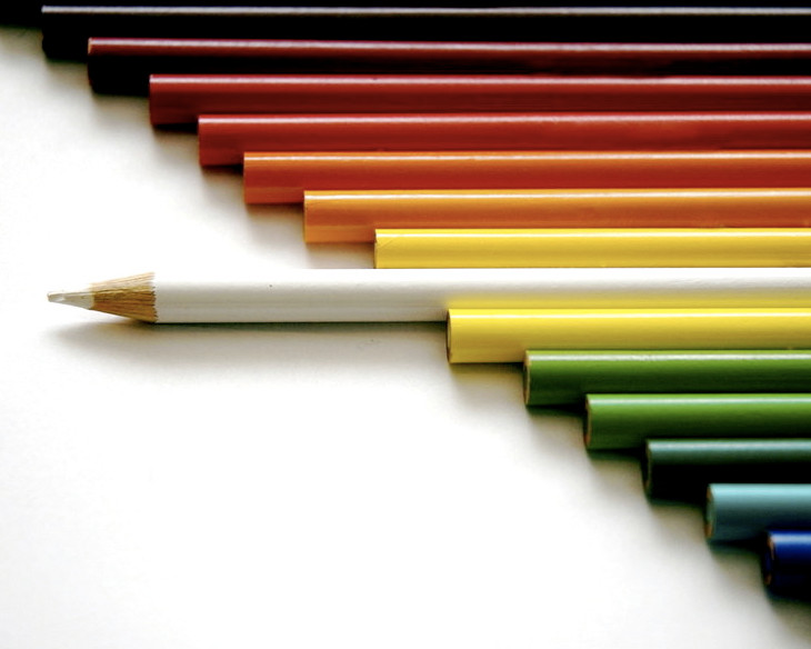
Description
This is something I've been wanting to do for a while, and it took about 40 shots to get it right. I was using Crayola pencils, which bore the golden logo that kept shining on other pencils. In this picture, you can faintly see this in a couple of pencils towards the top - I attempted to edit it out in Photoshop, but couldn't get rid of it completely. But since this was the best of the bunch, I thought I'd share it with y'all...hope you enjoy it (Smile)")
NOTE: This photo is NOT promoting racism. Please stop with the racism comments.
Related content


Comments: 1339

The concept is really great, very well thought out. For the advanced critique, I'd just say it's a pity the focus isn't very sharp on the white pencil, is it on purpose ? What camera do you use ?
👍: 0 ⏩: 1

I'm using a Nikon D70s, but my lens isn't very sharp. ")
👍: 0 ⏩: 0


👍: 0 ⏩: 1

I love this! So colourful, it's fantastic. And i'm a sucker for rainbows
")
👍: 0 ⏩: 1

lol tis remind me of my racist printer... it wont print black hahahaahaa
👍: 0 ⏩: 0


beautiful porportions and colour here; I've seen this photo before, very well done!
👍: 0 ⏩: 1

Very nice shot, very simple but effective. I was wondering if maybe it would work better with the light coming from the same angle as the camera is looking, so you don't get the shadows from the pencils? or was that intentional?
👍: 0 ⏩: 1
That was intentional
👍: 0 ⏩: 0


This is so cool! I've never seen anything like this before. Who knew (besides you of course) that colored pencils could be used for something like this
👍: 0 ⏩: 1
Actually, one other person... (Wink)")
👍: 0 ⏩: 1
Ah, I gotcha, well either way, it's awesome

👍: 0 ⏩: 0

Nice shot, very interesting.. although I have seen this done quite a few times
👍: 0 ⏩: 0

I love it! It's such a nice concept and really good Photographed.
👍: 0 ⏩: 1


I've seen this so many times
The famous pencil shot ^^
And still it is great to see (and hard to get it right)
👍: 0 ⏩: 0

I have to ask... is their any particular reason why the white pencil is the one singled out? Is it because white is "all colours"? Is it completely random? Or was it for some other reason?
👍: 0 ⏩: 1
I guess because white was the only one that was really any different from the others, because it's technically not a color...
👍: 0 ⏩: 0

wow awesome shot, i love the concept in it, to me it has a bit of defiance to the rest of the pencils, because it stands out against the others, being different. i see your dedicated to your shot which is impressive, definetly deserves a fav.
👍: 0 ⏩: 1

I enjoy the style of this photograph very much and the way you have portrayed your concept of having the odd one out is just fantastic. I think that you did a nice job of not having the gold letters in there. I don't see any. The lighting really adds to the effect and feeling with the soft shadows cast by the pencil ends. Also how you have use yellow twice is great and just keeps the colours in balance. I think that this is a wonderful photograph. Very beautiful.
👍: 0 ⏩: 1
Wow - thank you so much!
👍: 0 ⏩: 0


Awesome.....
Great concept.
Great photograph.
Great title.
It's fantastic!
👍: 0 ⏩: 0


coloured pencils may be simple but they make little kiddies faces light up
👍: 0 ⏩: 0

LOVELY !!!
SImple but powerful !!!
Love it !!!
👍: 0 ⏩: 0


that's beautiful..
did a pencilpicture as well
(=
[link]
👍: 0 ⏩: 0

Wow, a simple deviation yet so inspirating!! ")
👍: 0 ⏩: 0

I love how the picture depicts the white coloured-pencil as being the odd one out. Excellent photo!
👍: 0 ⏩: 0


I thought there was going to be a hidden message about race or something in this picture.
👍: 0 ⏩: 0

wow, a very cool picture indeed! Yeah, you've captured simplicity very well
👍: 0 ⏩: 0

Great idea and amazing realization.
Really compliments, this is a fantastic shot.
👍: 0 ⏩: 0


this is amasing!it must have took you a long time!i love the concept and love the piece itself..also i adore the colour you emphasised,lovely!!
👍: 0 ⏩: 0


love the colors and the concept.genius.
👍: 0 ⏩: 0

Great concept! Love the rainbow feel as the pencils line up. It's really awsome that the white one is the odd one out. I can't help noticing that the tip of the white pencilcrayon is chipped. Also, some of the pencils closest to the lens is a bit blurred...
👍: 0 ⏩: 1
<= Prev | | Next =>