HOME | DD
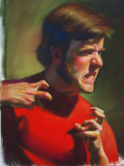
 TinyPEN15 — 2 hour portrait

Published: 2006-02-03 07:17:39 +0000 UTC; Views: 1970; Favourites: 40; Downloads: 93
Redirect to original
Description
It's been a little while. Carbethello and white pastel on toned paper. Adjusted the contrast.. looks a little too red. From heads and hands 2. Turned out aiiii.Related content


Comments: 24

Nice pastel work. I love pastels. I use them a lot! Ever tried velour paper?? I can highly recommend you try it.
 (Smile)")
👍: 0 ⏩: 0

let me get this straight this took you only two hours? how in the hell is that humanly possible?!!!?
👍: 0 ⏩: 1

well, 6 20 minute sessions, doesn't take too long, and with the low contrast medium, you can fudge a lot of the details. Smearing can be your friend!
👍: 0 ⏩: 1
thanks for the tips, i just might try out a little smudging pretty soon
👍: 0 ⏩: 0


The face is amazing! But I have to agree with another comment that the neck is a little bit skinny. That could be the angle, too, though. I did a drawing once where I had that problem, so I just made the neck a weee bit wider. It looked a lot more natural. but hey! it s your drawing and you know whats best! Way to go!
👍: 0 ⏩: 0


really great color and exsecution in the face. i do however have to say that i think the neck is to skinny in comparison to the head.
👍: 0 ⏩: 0

great, as usual. Honestly i'm almost awaiting a bad one just so i can actually leave a useful comment...
👍: 0 ⏩: 0

Amazing, the highlight on the nose is totaly realistic. And so is the lips, and well, as good as everything else aswell.
Amazing...
👍: 0 ⏩: 0


It looks great, I especially love the placement of the highlights on the face.
👍: 0 ⏩: 0

man your details are amazing
really hard to c&c on such a piece
👍: 0 ⏩: 1
ah thanks, that carbothello tends to make everything soft. Easy to get away with mistakes/laziness.
👍: 0 ⏩: 0
