HOME | DD
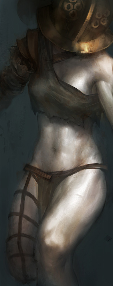
 tobiee — gold

Published: 2008-08-08 21:40:44 +0000 UTC; Views: 51915; Favourites: 2309; Downloads: 1206
Redirect to original
Description
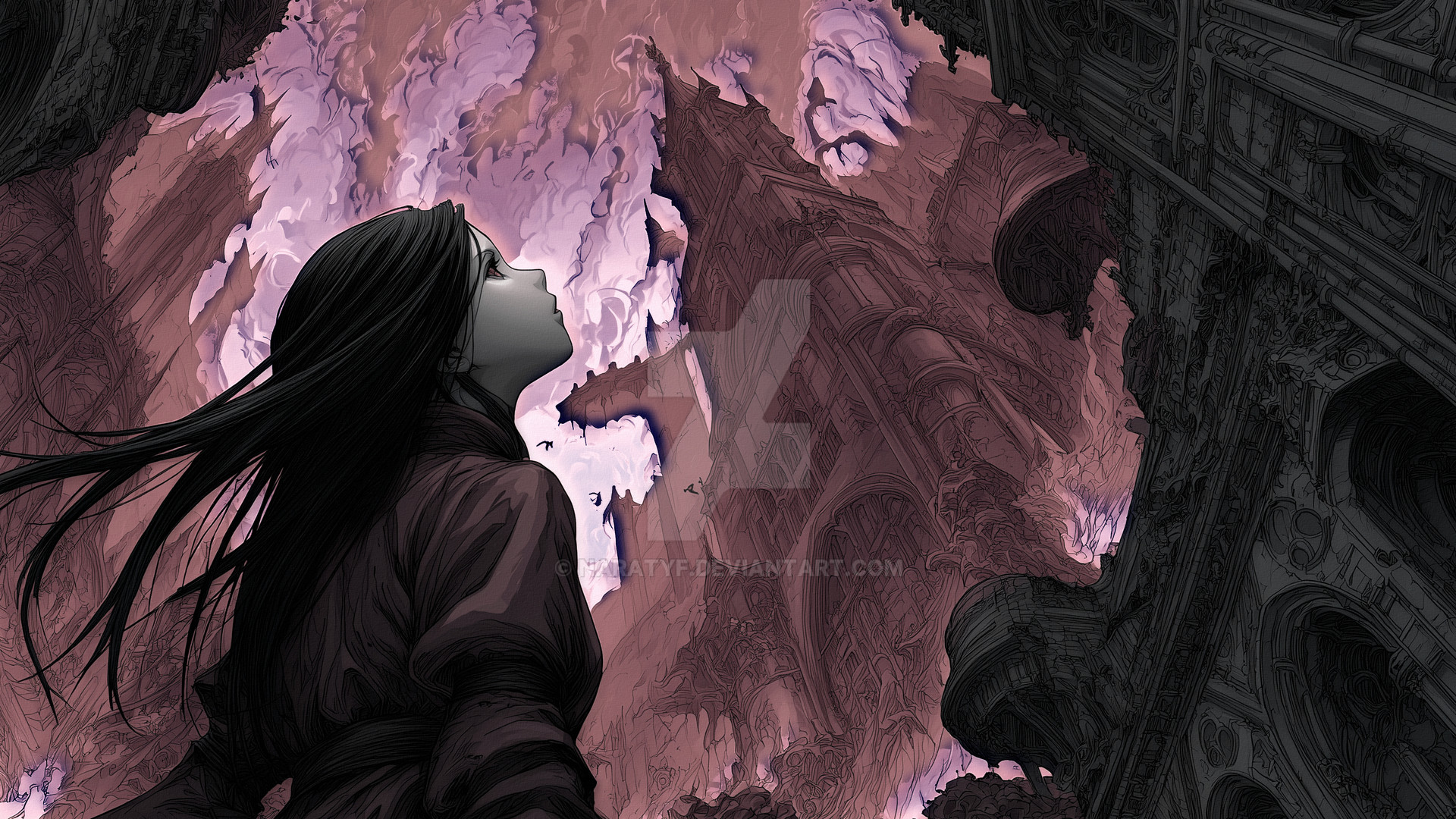
might be too dark, can't tell hahaedit: looking at this from another monitor, i just had to make it lighter. hope its not too light now haha.
Related content


Comments: 234


Great angle. I like the gold shine you gave the armor but I think you should lighten up her face a little since the top of the picture is the main focus.
👍: 0 ⏩: 0

I'm liking the scales on the armor. Her face is kind of awesome too.
👍: 0 ⏩: 0


It's a tad dark at the bottom on my screen to see the snakes and her feet, but this is awesome anyway. >3< I think it looks better this way, cause I took it onto photoshop and changed the brightness just to see everything. XD
👍: 0 ⏩: 0


LOVE IT. Not to dark at all, it looks brilliant on my screen. <3
👍: 0 ⏩: 0

it's too dark, makes the bottom of the space seem empty
👍: 0 ⏩: 1

Can you see the fluid snakey forms near the bottom?
If not, your monitor's gamma is probably too dark. Windows defaults to 2.2, Mac 1.8 (brighter).
👍: 0 ⏩: 1
nope it's just black. if it weren't for the contrast on my screen i wouldn't even see the shape.
Sorry to tell you this, but it's not my screen. It's been calibrated to match my Studio's resolution.
👍: 0 ⏩: 2

I see the snake-like things too
They look smokey and ambiance-forming-y.
Try again on a different computer
")
")
👍: 0 ⏩: 0
eh, that sucks. The bottom half of the image actually has rather nice ephemeral movement.
Not so much a contrast thing, definitely gamma. Oh well!
👍: 0 ⏩: 1
I'll have to take your word for it.
👍: 0 ⏩: 0

 (Wink)")

I like how dark it is, it adds to the pose and expression...like she's gonna squash you like an ant and doesn't care. exelent.
👍: 0 ⏩: 0


love the texture of the metal. not too dark. i think it accentuates the gold.
👍: 0 ⏩: 0

A bit more of light at the top would be good. Great as always.
👍: 0 ⏩: 0


yeah it is dark ...stop being so ignorant
👍: 0 ⏩: 2

Maybe you should stop being so ignorant and calibrate your monitor.
👍: 0 ⏩: 1
My monitor has nothing to do with it, it is well calibrated. Even the person that did this work found it too dark:
Artist's Comments
might be too dark, can't tell haha
And i think he is right.
Its is too dark if he had played a little more with the lighting it would have looked even better. Im trying to help him not being an ass kisser like you 2.
Thanks for nothing
 (Smile)")
👍: 0 ⏩: 1

even though this happened motnhs ago. I support you. heh
👍: 0 ⏩: 1
Even if it is far i thank you
👍: 0 ⏩: 0

wdf. "stop being so ignorant" ?
👍: 0 ⏩: 0


I don't think it's necessarily too dark, but I think you could exaggerate the lighting near the top a bit or something.
Either way, this is epic. O:
👍: 0 ⏩: 0


<= Prev |