HOME | DD
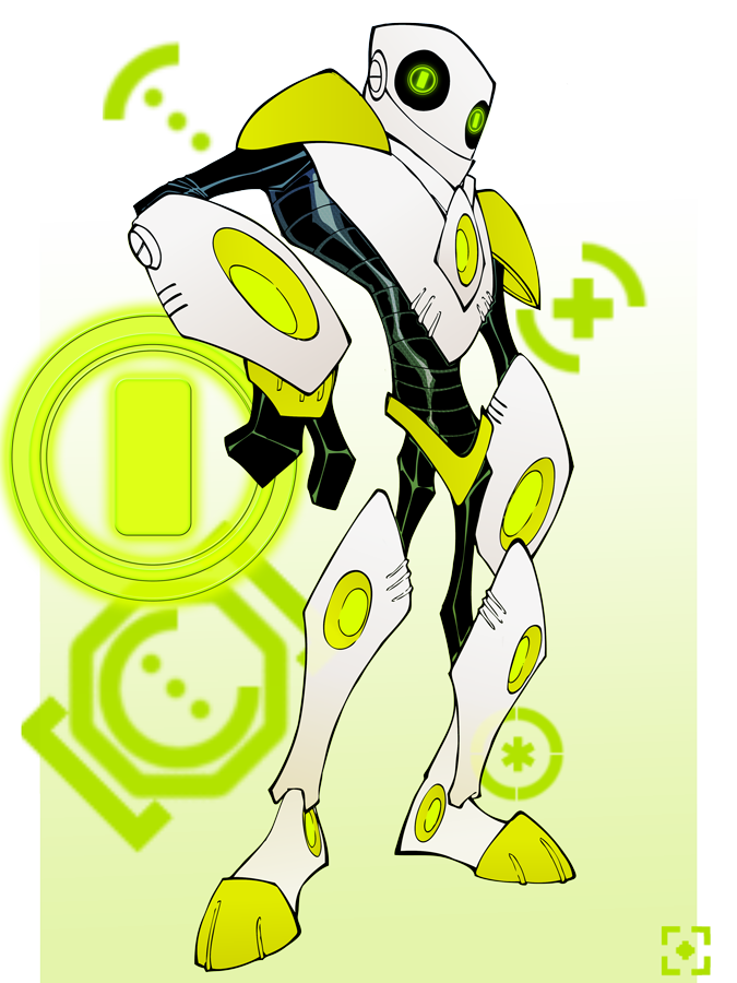
 Todd3point0 — Reject-o-bot 8000
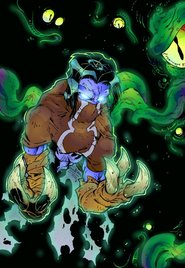
Published: 2010-07-30 04:10:40 +0000 UTC; Views: 1368; Favourites: 22; Downloads: 0
Redirect to original
Description
submitted this design (though in different colours, and without the symbols around him) for a logo/ mascot design competition, it didn't win but i enjoyed working on it so i just kept going with it.i've been told he looks like a robotic DeadPool and something from Ben 10... never watched Ben 10, but it seems to be quite popular with all those little things running around nowadays...
Related content


Comments: 8

Cool design! And I agree. It does like like something from Ben 10. It also has the Deadpool sort of look. Neat!
👍: 0 ⏩: 1

thanks dude.
i think anything that has green, black and white predominately in it's color scheme is now doomed to be "Ben 10-esque"
👍: 0 ⏩: 0

Ben 10 can suck it...
Reject-o-bot 8000 es el conquistador del mundo!!!
Areeba! Am I right?!
👍: 0 ⏩: 1
sí amigo, muchas gracias.
está en lo cierto acerca de Ben 10, ese muchacho es aburrido. loco. haha! look at us, talking in Spanish all over the place.
👍: 0 ⏩: 1
Thank god for Babelfish Altavista.
👍: 0 ⏩: 1
and Google language tools.
👍: 0 ⏩: 0

 (Smile)")