HOME | DD
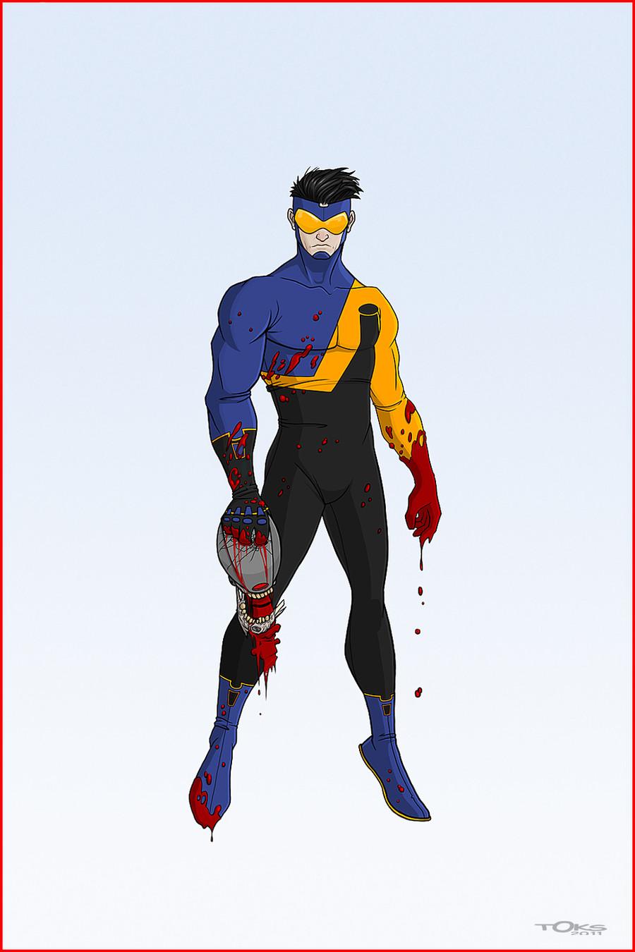
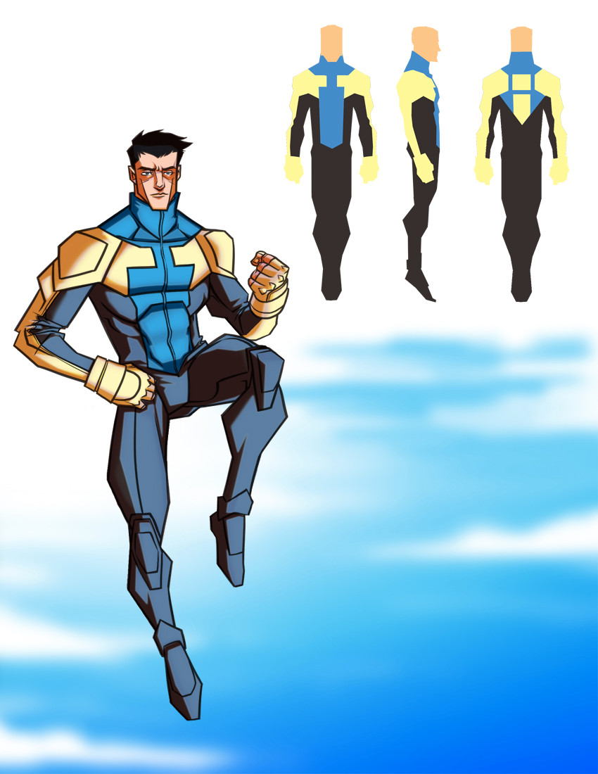
 ToksSolarin — REDESIGN: INVINCIBLE 2.0
Published: 2011-11-29 21:23:23 +0000 UTC; Views: 11334; Favourites: 166; Downloads: 59
Redirect to original
Description
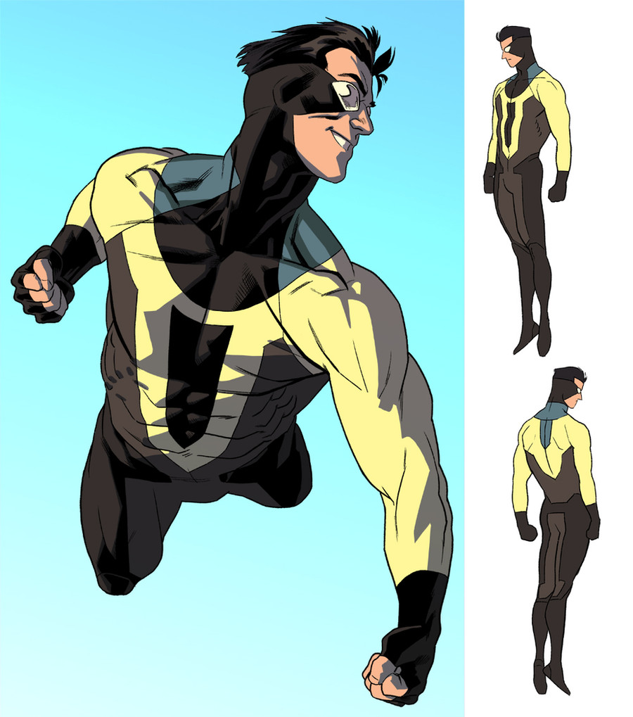
So there was something bugging me about my first redesign of Invincible so I tweaked it a bit. Hope you all digs.T
Related content


Comments: 12

👍: 0 ⏩: 0

I guess I'm the only one to notice that the I is the symbol of Image Comics, the comic book publisher responsible for INVINCIBLE. That's a damn clever thing you did, incorporating it into his uniform. I love it!
👍: 1 ⏩: 2

It always been incorporated in his costume, it just more noticeable on this one
👍: 1 ⏩: 0

well spotted! thank you for leaving a comment.
👍: 1 ⏩: 0

i see what you changed in the design, the pattern on his chest? it took me a while skipping between them to see it, got to admit this does look better like.
👍: 0 ⏩: 0

this is cool but i dunno seems like sumthins missin.
👍: 0 ⏩: 1

👍: 0 ⏩: 0

This one is much better. I wasn't feeling the last one.
👍: 0 ⏩: 0

 (Smile)")


