HOME | DD

TomParrish — Wizard Cover Inks comparison

Published: 2011-01-17 10:57:45 +0000 UTC; Views: 1483; Favourites: 29; Downloads: 0
Redirect to original
Description 
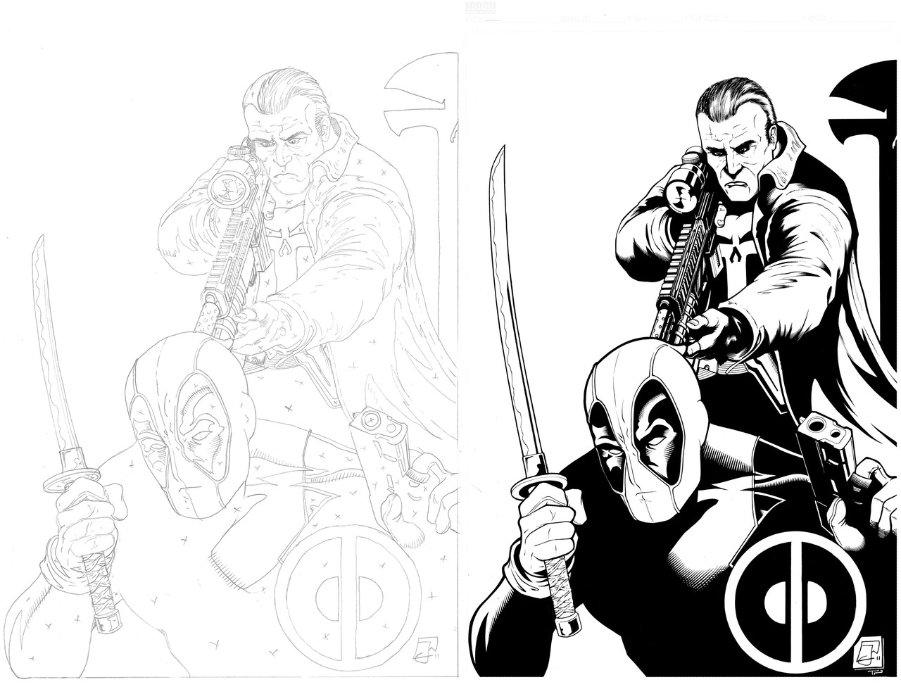
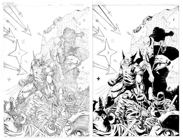
Meant to post this up on Friday, a pencils/inks comparison of the Wizard cover page pencilled by Ed McGuiness, with inks by me.
Related content
Comments: 20

Jeficus [2011-04-15 08:47:06 +0000 UTC]

Gr8 job! More people should give inkers more credit. Youre definitly not a "tracer".

👍: 0 ⏩: 1

TomParrish In reply to Jeficus [2011-04-15 09:34:03 +0000 UTC]

Ha ha, definitely! Cheers man, inkers are the silent helpers in industry no doubt - and as a profession should definitely get more credit!

👍: 0 ⏩: 0

KJVallentin [2011-01-24 17:27:02 +0000 UTC]

Fantastic ink work. Super tight stuff.

👍: 0 ⏩: 1

TomParrish In reply to KJVallentin [2011-01-25 09:47:45 +0000 UTC]

Thanks a lot dude!

👍: 0 ⏩: 0

Ellocobruja [2011-01-20 01:33:08 +0000 UTC]

awesome

👍: 0 ⏩: 1

TomParrish In reply to Ellocobruja [2011-01-20 08:59:34 +0000 UTC]

Cheers dude!

👍: 0 ⏩: 0

torch73 [2011-01-19 19:01:16 +0000 UTC]

Very nice work! Excellent job!

👍: 0 ⏩: 1

TomParrish In reply to torch73 [2011-01-20 08:59:17 +0000 UTC]

Thanks a lot!

👍: 0 ⏩: 0

LangleyEffect [2011-01-19 17:59:45 +0000 UTC]

WOW, dude!! awesome stuff!

👍: 0 ⏩: 1

TomParrish In reply to LangleyEffect [2011-01-20 08:58:54 +0000 UTC]

Cheers bud!

👍: 0 ⏩: 0

Robo-Bug [2011-01-19 17:53:16 +0000 UTC]

Very nice inks, man. Very nice.

👍: 0 ⏩: 0

UltimateRubberFool [2011-01-19 17:05:01 +0000 UTC]

Awesome!

A!

👍: 0 ⏩: 1

TomParrish In reply to UltimateRubberFool [2011-01-19 17:18:46 +0000 UTC]

Cheers dude!

👍: 0 ⏩: 0

PatC-14 [2011-01-19 16:45:36 +0000 UTC]

Nice work! I really like how you handled the explosion / burst above Wolverine's right shoulder. My only crit is on the hair on his left arm. It feels a little flat, and the illusion of line begins to form right in the middle of the arm because of how the strokes line up. Otherwise I really can't find anything wrong, you did an beautiful job!

👍: 0 ⏩: 1

TomParrish In reply to PatC-14 [2011-01-19 17:18:39 +0000 UTC]

Thanks man The hair on the arm did give me some issues, I think I changed my mind about half way through as to how I was going to render it, which led to it feeling a bit flat/lifeless. Each page is another lesson and refinement of technique though so it's onwards and upwards!

👍: 0 ⏩: 1

PatC-14 In reply to TomParrish [2011-01-19 18:42:36 +0000 UTC]

you are well on your way sir... check out how Art Adams and Jim Lee render hair on wolverine's arms... they treat it like a shadow. I'm not sure what the rule is when inking a penciller's work, if you have license to improve upon what's there, but on this drawing I would have. Good Luck my friend!

👍: 0 ⏩: 1

TomParrish In reply to PatC-14 [2011-01-20 16:49:46 +0000 UTC]

Cheers man, I'll have to check it out - and any excuse to look at Jim Lee/Scott William's work is always a bonus!

👍: 0 ⏩: 0

JonasTrindade [2011-01-17 18:47:36 +0000 UTC]

Great i think you read to do test to editors now ^^.

👍: 0 ⏩: 1

TomParrish In reply to JonasTrindade [2011-01-18 16:38:06 +0000 UTC]

Wow thanks man I'm gonna prep another few samples then get back on the submissions trail and see what happens..

👍: 0 ⏩: 1

JonasTrindade In reply to TomParrish [2011-01-18 23:08:33 +0000 UTC]

thats is the way ^^.

👍: 0 ⏩: 0