HOME | DD
 TomWilcox — ATMOSPHERE

Published: 2004-05-28 12:00:53 +0000 UTC; Views: 656; Favourites: 12; Downloads: 205
Redirect to original
Description
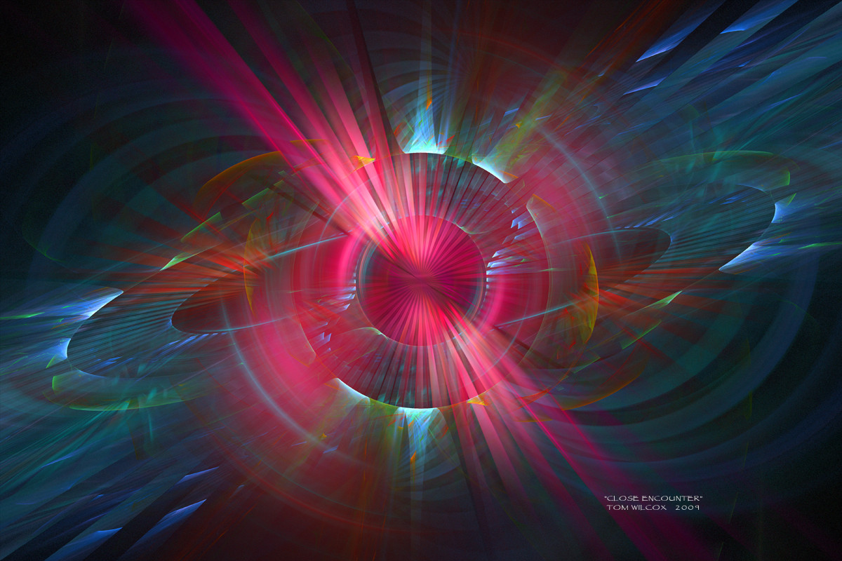
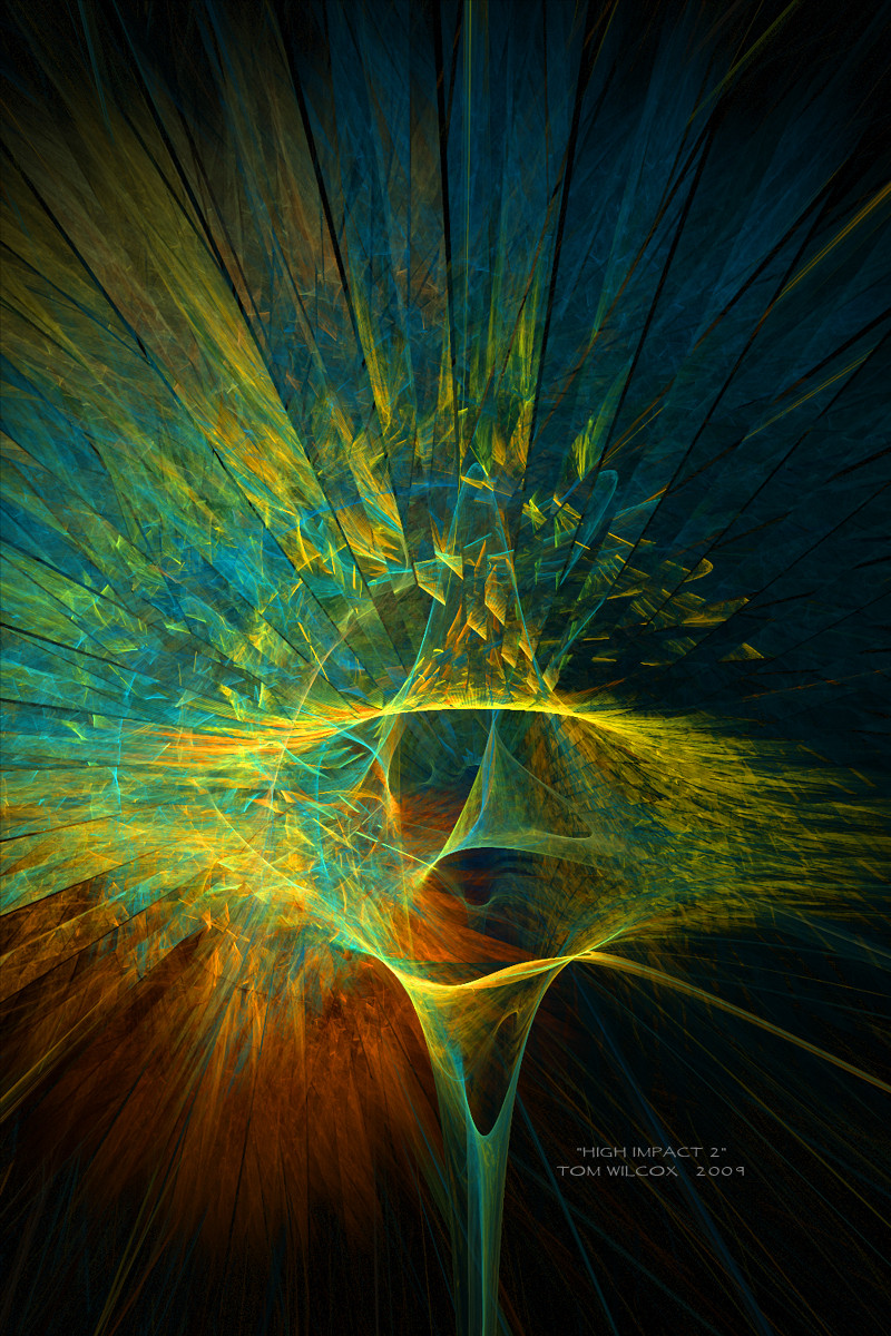
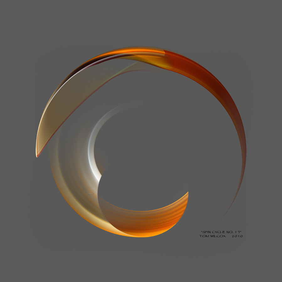
Created in Apophysis; no post work except for title and border.PLEASE FULL VIEW for great detail.
Visit my gallery of over 250 images.
Enjoy ..... Tom
Related content


Comments: 29

This piece is excellent - you don't usually see such smooth results in fractal work. However, the typography is really quite bad, the bevel is way too strong. The font is fine, in fact it's probably the best choice and matches really well with the image but yeah, take away the bevel. Perhaps try a medium gray on a new layer with blend mode color/linear burn. Or even if you just use white and give it a translucent appearance...? Anyway, looks great, if it weren't for the text I would buy it as a print.
👍: 0 ⏩: 1

Thanks for your comments. Actually, when I sell my work it is always matted and I cover the text in every case anyway. I can't see charging 375.00 for a 20x30 piece that looks like a poster.  (Smile)")
Tom
👍: 0 ⏩: 0

totally love the simplistic look of it..very modern
👍: 0 ⏩: 1
Thanks a lot. Yeah, I think it looks pretty contemporary as well. I did a second image that's even better but I lost it I think.
Tom
")
👍: 0 ⏩: 0

OH WOW! I love this! the precise softness and flow of the color and sharpness of form gives off an impresion of light reflecting off of metal or summit...true a great piece!
👍: 0 ⏩: 1
Thanks a lot for the great remarks and for the "Atmosphere" Fav!
Tom
👍: 0 ⏩: 0

This is excellent!! 
Cheers!!
👍: 0 ⏩: 1
Thanks for your comments. I do respect your opinion but need to ultimately need to rely on my years of experience working with type. The wide border was chosen for this piece to draw the viewer in. I chose, however, a subdued greytone for the border line and Copyright. I'm pleased with the overall result. I wanted a hi-tech but sophisticated look overall.
Tom
👍: 0 ⏩: 1
After a good 2nd look, I'll agree that the borders works good, i'm just no fan of thick borders that's all !
The way i see it is that you have a relatively dark image, with a pole of brightness near the center, where you want viewer attention. But then you have another pole of brightness on the text, taking away some attention from the center-peice. A more subtle tone, possibly the same as your copyright notice would fit better IMO.
Make no mistake, i find this render very beautifull, but that text is nagging me!
👍: 0 ⏩: 2
Don't worry i take no offence in you defending your choice!
👍: 0 ⏩: 0
Please don't misunderstand, I really do appreciate and welcome advice of all kinds and I know that you are sincere in your comments. I think it's always a brave thing to make suggestions on others images.
It's always a risk to appear to to be rejecting a suggestion from a viewer but, in fact, I do sincerely appreciate your suggestion. Sometimes I wholeheartedly agree and sometimes I stubbernly "hold my ground".
Tom
👍: 0 ⏩: 0

Wonderful render
but I think the text needs some work here
 (Wink)")
👍: 0 ⏩: 0

Thanks a lot for your comments on "ATMOSPHERE"!
Tom
👍: 0 ⏩: 0

oOOOo I love the softness of is one. It has a great flow!
👍: 0 ⏩: 1
Thanks a lot Laura. I really appreciate your comments.
Tom
👍: 0 ⏩: 0


Nice form and beautiful gradient. They compliment each other well.
👍: 0 ⏩: 1
Thanks a lot Jeff. Just got home and was suprised at the response. Need to explore the gallery.
Tom
👍: 0 ⏩: 0

Thanks a lot gor the great comments. Thanks too for the Fav.
Tom
👍: 0 ⏩: 0

I think this is a very expressive flame.. and all the extra black helps it..
But sorry.. I do not like the bevel in the title... to me it's a bit too harsh...
Something a bit more subtle I think would be nice.. but keep the placement..
I believe that would then acheive what you were after.
👍: 0 ⏩: 1
Thanks for your comments and for the feedback of the font. I really do take seriously all suggestions but in this case I am not convinced.
Tom
👍: 0 ⏩: 1
Your welcome...
Feedback is always good I believe...
But I also hear you in your feelings and decisions..
The font I love.. the bevel is what I didn't like...
But your art is wonderful... and is your creation... no matter how anyone else feels.. (=
👍: 0 ⏩: 0

oh spiffy swirls bro, I really like em, but that typo doesn't fit in somehow and I'm not a big fan of bevel either
")
👍: 0 ⏩: 1
Thanks a lot for your comments and feedback. I still like the font choice however
Tom
👍: 0 ⏩: 0

nice job. Loving the detail. The text is a bit too distracting. Perhaps a smaller/softer font would be better?
Nice all the same
👍: 0 ⏩: 1
Thanks a lot and for taking the time to comment. My concept on this piece was to create an art poster so I wanted the title to be an intrgral graphic element.
Tom
👍: 0 ⏩: 0

