HOME | DD
 TonyHarris — GUI Community

Published: 2007-10-03 00:01:16 +0000 UTC; Views: 9294; Favourites: 77; Downloads: 354
Redirect to original
Description
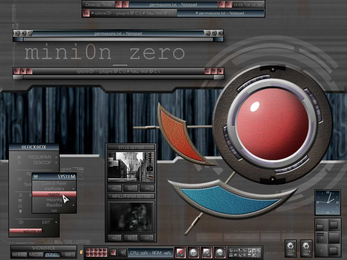
Back from Cyprus") N Battery's are topped up
N Battery's are topped up ")
Related content


Comments: 35

How the hellllll did you do this?! It's AMAZING! You deserve a DD if you haven't received one yet. Seriously. I aspire to this kind of work. I'm sure you are wayyyyy to expensive for me to afford hiring, but just out of curiosity, in what range do you usually end up charging for a design like this, or even a less elaborate (but still epic & exciting) design like this? Oh and thanks for doing your part in trying to make the web not so hideous (though web 2.0 is taking over & it sucks & I wish there were enough people like you putting work out there like this!). You rock.

👍: 0 ⏩: 0

Hey Dude. Good job. I really like it. I have a team here of about 4 that are making an Online 3D Game. We need a few more artists and you look pretty good. For more info if your interested please post something on my Deviantart page or email us at VXtream@gmail.com (its volunteer work at the moment so you won't get paid until game publishment.
Thanks.
The VisionXtream Team
👍: 0 ⏩: 0

cool enough 2 me , only needs more textures... well done (y)
👍: 0 ⏩: 0


This is very nice.. how on hell did you manage to do this?
👍: 0 ⏩: 0


 (Smile)")


 (Wink)")

déchainé !!!
trop beau ^^
speedlifes #1 of Fan ^^
👍: 0 ⏩: 0

Nice nice, but there a few jagged edges, when you repair this (above the text User Navigation), the layout will be perfect.
👍: 0 ⏩: 0


wow thats hot
hey i have a question...ive never tried this style
do u know of any tuts that give u steps on how to come up w/ this look
or u can just tell me what techniques u used
👍: 0 ⏩: 0

Orbs and vents are the thing I love most, I would work more on some areas. Nice work otherwise
👍: 0 ⏩: 0

I agree with Zeronix:
"Sorry to say this but this overall pattern distroys everything."
👍: 0 ⏩: 0


i like top header and text bg...but need more space for content..great work
👍: 0 ⏩: 0

Lots of normal photoshopped material, very little space left for content. Next time try putting down the content first and then designing around it. Make sure you design has an objective, and isn't just design for the heck of it.
👍: 0 ⏩: 0

very sexy nice to see lovely ................ gr8 job man
👍: 0 ⏩: 0


wow this is really impressive work. i like the orb most..
👍: 0 ⏩: 0


Sorry to say this but this overall pattern distroys everything.
You should remove it from some parts because its completely removing the depth of the template.
👍: 0 ⏩: 0

nice design tony. the only issue that i have with the total symmetry thing is that the light reflections will appear at opposite angles especially when compared to the light on the orbs. other than that slight niggle, its very clean and the colours compliment this theme quite well.
👍: 0 ⏩: 0