HOME | DD

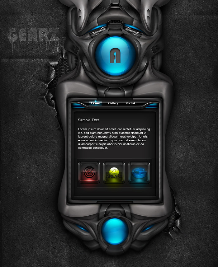
TonyHarris — Access Denied

Published: 2006-08-08 13:59:10 +0000 UTC; Views: 3917; Favourites: 19; Downloads: 129
Redirect to original
Description Had little fun with this one, sorry i forgot were i got the brushes from :S
Related content
Comments: 28

TK0920 [2013-10-27 05:35:09 +0000 UTC]

Wow!! This is wicked!!!

👍: 0 ⏩: 0

Ton-K300 [2010-04-09 22:15:56 +0000 UTC]

👍: 0 ⏩: 0

adni18 [2010-04-06 21:27:17 +0000 UTC]

Fantastic!

👍: 0 ⏩: 0

termi1992 [2007-03-20 10:45:26 +0000 UTC]

WoW, thats fantastic

👍: 0 ⏩: 0

wutwut1337 [2006-09-26 21:36:29 +0000 UTC]

omg... thats leet (:

👍: 0 ⏩: 0

zeolyte [2006-08-15 14:20:18 +0000 UTC]

this is just lovely

👍: 0 ⏩: 0

gabrielaboone [2006-08-10 19:25:34 +0000 UTC]

Nice Work

👍: 0 ⏩: 0

hilikus533 [2006-08-10 05:05:30 +0000 UTC]

this is awesome

it would look 10x better with a new font for the navbar though

love it!

👍: 0 ⏩: 0

ERBL [2006-08-09 21:14:15 +0000 UTC]

Awesome!!

I especially like the lighting on this, spot on!!

👍: 0 ⏩: 0

shark-graphic [2006-08-09 15:53:25 +0000 UTC]

wow that is great !

👍: 0 ⏩: 0

CountPanguin [2006-08-09 14:05:58 +0000 UTC]

i love it especialy how its like shiney on top.

👍: 0 ⏩: 0

Kuzaj [2006-08-09 13:18:29 +0000 UTC]

great work...

👍: 0 ⏩: 0

sympl-e [2006-08-09 10:09:38 +0000 UTC]

that design is very fantastic..
i like this very much

👍: 0 ⏩: 0

threeonesevenseveno [2006-08-09 09:38:30 +0000 UTC]

dude that's awesome man

👍: 0 ⏩: 0

Sence [2006-08-09 07:31:25 +0000 UTC]

Looks Sweet Buddy
shame about the navigation though, i dont feel it matches the quality of the header!
Nice Job all the same!!

👍: 0 ⏩: 0

bolt-slp [2006-08-08 22:54:29 +0000 UTC]

Really good... Like it! ^^
A little overloaded of 3d stuffs, maybe if you do it more simple/minimal, looks better! =]
But, anyway, great work!

👍: 0 ⏩: 0

valo69 [2006-08-08 22:41:03 +0000 UTC]

that would make an awesome GUI for a video game

👍: 0 ⏩: 0

PBSerpent [2006-08-08 20:09:36 +0000 UTC]

Amazing header.

👍: 0 ⏩: 0

DeathWhisperALullaby [2006-08-08 18:11:10 +0000 UTC]

wow, very nice.

👍: 0 ⏩: 0

pyrodangelo [2006-08-08 16:46:35 +0000 UTC]

very good man ..

👍: 0 ⏩: 0

sonars [2006-08-08 16:01:00 +0000 UTC]

hooolllllyyy sh.... awesome

👍: 0 ⏩: 0

faris18787 [2006-08-08 15:20:22 +0000 UTC]

wow 0.o great ... nice concept

👍: 0 ⏩: 0

xxmaxxttxx [2006-08-08 15:11:23 +0000 UTC]

I like the smoothness and the gel feel

👍: 0 ⏩: 0

dehaes [2006-08-08 14:33:15 +0000 UTC]

top iS great one thing i would change in this art: FONT peace

👍: 0 ⏩: 1

TonyHarris In reply to dehaes [2006-08-08 14:44:41 +0000 UTC]

Yeah i agree dam need to buy some new fonts.

👍: 0 ⏩: 0

TonyHarris [2006-08-08 14:11:41 +0000 UTC]

cheers lads

👍: 0 ⏩: 0

Synthetis [2006-08-08 14:07:36 +0000 UTC]

liek it bro
but the navi man..i think u shud change that and the typo.
but the rest is very good

👍: 0 ⏩: 0

jimmybjorkman [2006-08-08 14:06:08 +0000 UTC]

Looks nice! not your best, but its nice!

👍: 0 ⏩: 0