HOME | DD
 tonytorrid — Inception the big under entry

Published: 2010-12-29 07:59:51 +0000 UTC; Views: 2623; Favourites: 38; Downloads: 33
Redirect to original
Description
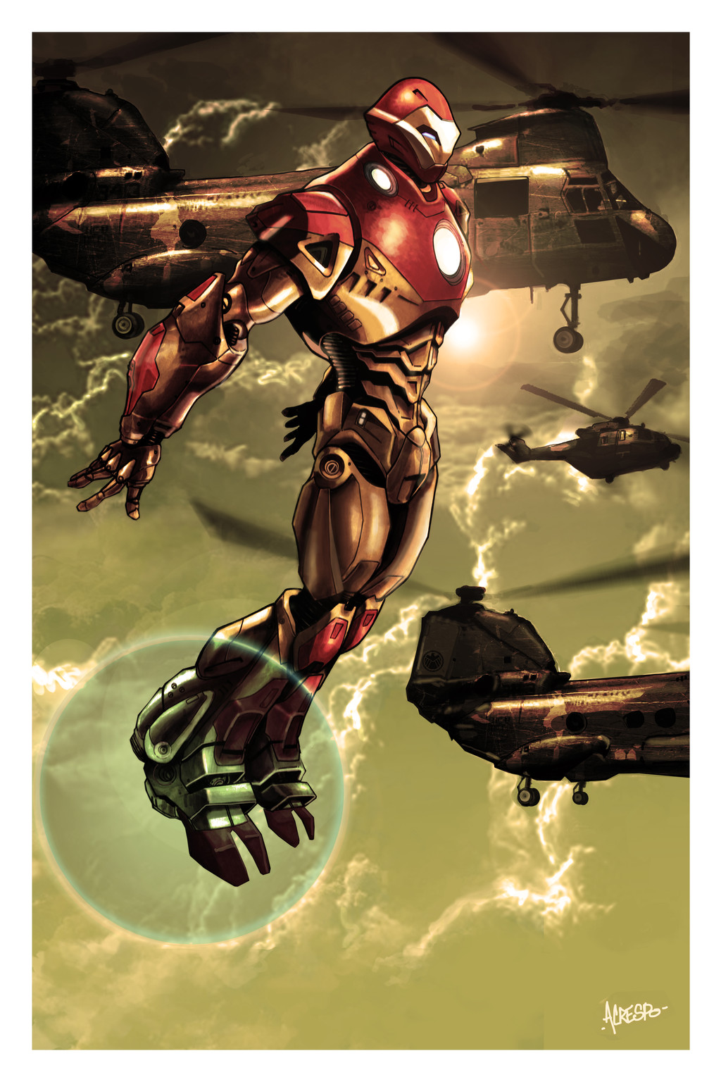
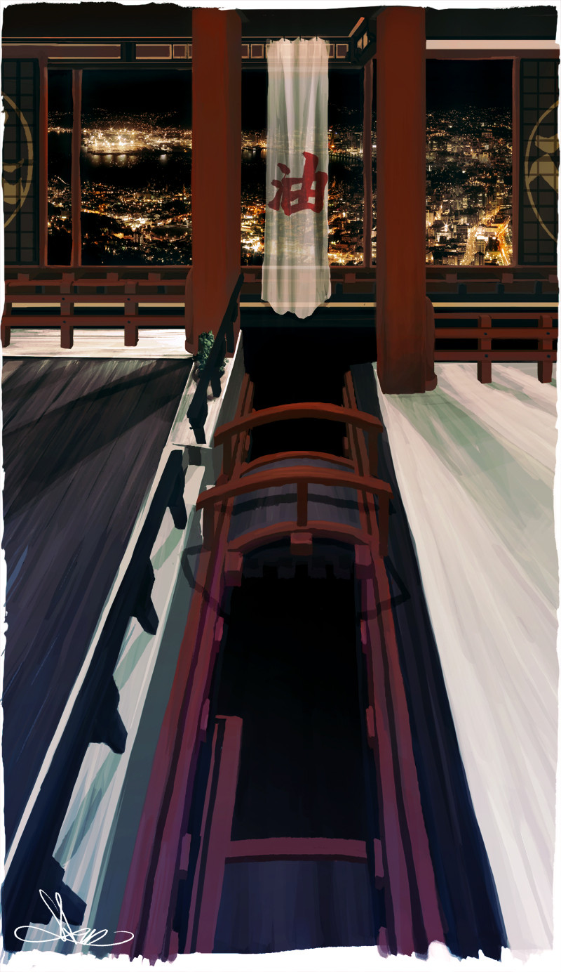
Here is my entry for the Inception comic book cover contest, wow that's a mouth full. I had two days to do it. So i went with a very simple idea which ended up being a lot more complicated than I had imagined. For the most part its from the first scene of the book where the Projections are chasing Saito. I'm really mad i didn't give draw him with the samurai sword on his back, would have been pretty damn cool.I had so many ideas for this contest but only enough time to go with one. I've just been way too busy and it didn't help that it was the holiday season. I'm happy with the execution for the most part. I had to re-upload the image because after reading the contest rules i found out you couldn't use Brand names. So i had to take out my coke advertisement and Legendary was originally some Saki brewery in japan. Everything else is made up except for Syncopy which hopefully isn't an issue since this is for Inception and they did make the movie.
Anyway I'm rambling and dead tired at the moment so I'm going to bed. Wish me luck and thanks for viewing.
Related content


Comments: 16


dude, im glad you did it... i saw the movie... one of the best flix ever!!! wish i could have did it too but my mind wasnt right. but mega man....thats a different story.
👍: 0 ⏩: 1

I really like the perspective. The colors hurt my cerebrum at first, but as I stepped back from it they all fit together nicely. Good luck bro.
👍: 0 ⏩: 1

Yeah the coloring is very in your face, a lot to take in with all that glowy stuff, but I stuck to a very strict palette(four colors i believe, with very little or no shades) to keep from blinding fools and causing headache. I've been trying really hard to pick my palette before I start. Learn this after the Marvel vs capcom hell I went thru.
👍: 0 ⏩: 0

Great job! This is really detailed; and I love the action! Good luck in the contest!!
 (Smile)")
👍: 0 ⏩: 1

Nice work. Loving the color scheme. Being that I still haven't seen the movie, I wouldn't know if that would have anything to do with the pic or not, but ah, it looks great! How the hell did you do that city? I know you got skillz, but...

👍: 0 ⏩: 2
see that shit ken. if you like the matrix... well.
👍: 0 ⏩: 0
The color scheme is the exact opposite of the movie actually, haha it used mainly cool colors or yellows and oranges when they used warm colors, but i figured it suited the logo. That and I thought it just looked cool.
The city was a pain in my ass and realize why i rarely do backgrounds but I'm definitely proud with the result.
👍: 0 ⏩: 1
yep. good stuff nonetheless~
")
👍: 0 ⏩: 0

This is a great entry. There are so many people submitting great solid works for this contest. I hope you fare well.
👍: 0 ⏩: 1
I agree, I'm been really impressed with the work being submitted. Thank you.
👍: 0 ⏩: 0
