HOME | DD
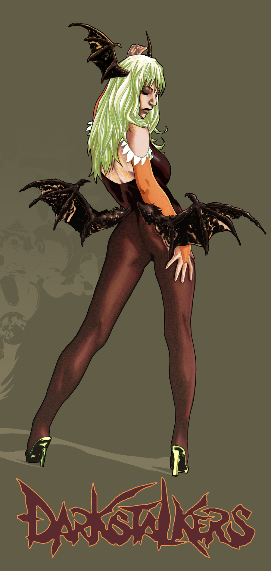
 tonytorrid — Morrigan Redux

Published: 2012-01-27 18:00:44 +0000 UTC; Views: 2545; Favourites: 62; Downloads: 84
Redirect to original
Description
I decided to rework this drawing for a couple of reasons. When i originally worked on it for the drakstalkers contest I didn't have much time and I was working alot which in turn left me working on it, on little to no sleep. In the end it was a rush job and even though I spent most of the time rendering it by hand I really rushed the photoshop phase. I spent most of that time putting together the collage for her shadow (which I cropped out in this version). I've also hadn't really drawn much up to this point nor did I really work on Photoshop so I was rusty and up until a year ago I only used to basically lay color over my already shade work. Times have change and I've really started pushing my Photoshop skills and I'm becoming more and more comfortable with it. It helps that I have a Wacom now so coloring on Photoshop is so much easier than it was when I used the old mouse.Another reason for redoing it is that it felt unfinished and like it was still in the early stages. Funny thing is I was only going to work on blending her skin because I felt like the colors on her skin (mainly her face) were too abrasive.
I'm definitely happy with the results and I hope to redo the collage sometime soon but for now here is Morrigan how she should have been presented in the first place.
Here is the Original [link]
Let me know if Ive improved or not, it has been 3 years since I did this piece so if you say no I might just cry. Just saying, that's right I played the pity card.


Related content
Comments: 6

For one, I really do like the coloring on this one!
I think both pieces are colored stylistically enough that it's hard to compare as one is better over the other. Using high contrasting coloring with white highlights and black shadows is a common style I see, along with the more softer coloring such as this current piece. It was a hard choice, but I do prefer this newer version over the old. 
The old one kinda has this gritty punky feel (which is great in itself), while this one has a sorta almost.. retro magazine look to it. Either way, I find both are nice and I think it'll come down to a matter of preference in the end.
👍: 0 ⏩: 0

Excellent work. It is rare i coment on a Morrigan fan art because i see multiple of them everyday, i think yours is outstanding though.
good weekend
👍: 0 ⏩: 1

Oh wow thanks thats awesome. I do agree on the overwhelming amount of Morrigan fanart.
👍: 0 ⏩: 1

yeah..as a fighting group admin i look for new darkstalkers fan art nearly every day..it became quite boring to see nearly only morrigans, felicias and hsien ko`s
👍: 0 ⏩: 0


