HOME | DD
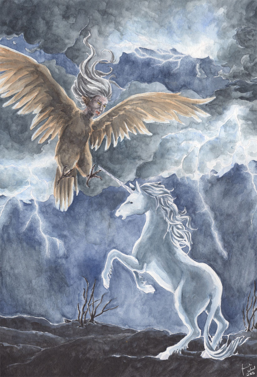
 Toradh — The Unicorn and the Harpy
Published: 2007-04-01 10:48:04 +0000 UTC; Views: 5216; Favourites: 99; Downloads: 41
Redirect to original
Description
"The unicorn heard herself cry out, not in terror but in wonder, 'Oh, you are like me!' She reared joyously to meet the harpy's stoop, and her horn leaped up into the wicked wind. The harpy struck once, missed, and swung away, her wings clanging and her breath warm and stinking. She burned overhead, and the unicorn saw herself reflected on the harpy's bronze breast and felt the monster shining from her own body. So they circled one another like a double star, and under the shrunken sky there was nothing real but the two of them."-Peter S. Beagle, the Last Unicorn, chapter 3
Like always, watercolour. My paintings still lack of clearness *sighs*.
(and damn it's hell to scan those A3+ pictures!)
Anyway… I'm really wondering if it would have been okay if I submitted it to the "fantasy" section. I always wondered it when submitting the Middle-Earth fanart paintings into the fantasy section as well. Oh well…
Related content


Comments: 28

One of my all time favorite books, and oe of the best scenes. I think it looks great. Thank you for sharing it.
👍: 0 ⏩: 1

Thanks! I'm glad if it fits.
👍: 0 ⏩: 1
My pleasure. Made me want to go dig the book out again and maybe start reading it to my older kids. I think they're about ready for it now.
👍: 0 ⏩: 1
If not, adjust it: my mother used to tell me the story of Lord of the Rings ages before I read the book on my own. She left out any parts with blood or gore in it ")
And I watched Star Wars at the age of four and it didn't harm me
👍: 0 ⏩: 1
my oldest two are 8 and 5. Two rough and tumble little boys. THe next down, and my only girl, in just 3and a half and a little sensitive sometimes, and the baby at only 18 months is deffinatly too young. lol We're workign on Narnia and Harry Potter at the moment, but Schmendrick and Molly Grue (not to montion Almalthea and Liir and that irascible butterfly) are on the list and fast approaching.
👍: 0 ⏩: 1
I'm sure they'll love your "adjusted" versions for particularly young children  (Wink)")
👍: 0 ⏩: 1
lol. More than likely.
👍: 0 ⏩: 0


Nice. Personally, I haven't read the Last Unicorn Books, but I do love the movie version of the Harpy

👍: 0 ⏩: 1
And I totally agree with you! The movie was a wonderful adoption of the book, in my opinion.
Oh well. Thank you!
👍: 0 ⏩: 1
Indeed. And I found Celaeno's line in the movie "Set me Free! We are Sisters you, and I" more appropriate than the line in the book "If you set me free, I will kill you!"
👍: 0 ⏩: 1

Wunderschönes Bild!
Ich finde vor allen Dingen die Licht/Schattensetzung sehr gelungen (mit dem Blitzlicht von hinten).
👍: 0 ⏩: 1

Naja, wie auch immer - Ich mag's jedenfalls, Kontrast hin oder hier. Hab's mir nochmal gut im full view angesehen, und bin zwar kein Kenner, aber Ich glaub so sollte watercolor auschaun. Notfalls kann mans ja im photoshop nachbearbeiten, ne?
Kopiere das ganze Bild as nen separaten layer, machs auf Multiply/Overlay und voilla :]
(nebenbei... the above is meant purely as friendly advice, in no way am I telling you how to do your thing)
peace
👍: 0 ⏩: 1
Oh weia… Sag doch gleich, dass du Deutsch sprichst *lach*.
Hm, ich manipuliere meine Aquarelle anschließend nicht gerne in Photoshop; schließlich will ich mit Aquarellfarbe besser werden und da hilft es mir nicht, anschließend digital Änderungen vorzunehmen.
Trotzdem vielen Dank für die Anregung, Tipps nehme ich doch immer gerne entgegen! Einfach mal ausprobieren, was ich beim nächsten Bild besser machen kann.
I hope it's okay if I speak german now, just tell me if you'd prefer to speak english…
👍: 0 ⏩: 1
Ah, ok, verstehe.
Wenn man mit Farben besser zu werden versucht hilft photoshoppen wohl nicht besonders. Ich z.B. kann, dank photoshop, rein gar nichts mehr vorm einscannen kolorieren, so gewohnt bin ich es in PS zu machen.
That having been said, ich weiss nicht ob ich das mit dem layer gut erklart habe... weder Deutsch noch English is ja meine erste Sprache (Angeber, eh!). Ich versuchs mal mit nem Beispiel (aber nicht hier  (Smile)")
peace
👍: 0 ⏩: 1
Keine Sorge, das hatte ich sogar verstanden. Merken werde ich mir den Vorschlag bestimmt, aber wegen oben genanntem Grund nicht auf dieses Bild anwenden.
In jedem Fall danke!
👍: 0 ⏩: 0

You have really managed to capture this dramatic scene very well. Really nice work Franzi! The unicorn and the harpy are both really nicely detailed, I love the unicorn’s mane and the harpy's hair, and that sky is amazing! It really looks powerful and fierce and frightening. The lightning is particularly good. The proportions you gave the figures is good too. I've heard that drawing horse and alike is not that easy so you do pretty well here.
I'm afraid I can't give any helpful advice about watercolours and solving this problem (which, by the way, doesn't stop the power of the piece at all so don't worry about that

👍: 0 ⏩: 1
*blushes* Thanks!
Oh and actually, it IS quite difficult for me to draw horses… (like other animals as well)
But I used references again, so it was okay.
👍: 0 ⏩: 1
From what I have heard it is very difficult drawing horse without a reference for anyone so you did a job with it!
You're welcome!
👍: 0 ⏩: 0
Clearness, bah! Overrated rubbish, I say.
I like it perfectly fine as it is, respect. Though if you're really worried about the sharpness, I'd increase the contrast, don't hesitate to work with total black, increase the shadows a bit... Then again, what do I know about painting by hand?
Man hath created photoshop for a reason
peace
")
👍: 0 ⏩: 1
I tried it, but normally I have to add so many layers of colour in order to achieve really dark areas that you can almost hear the paper scream… And then it just becomes a big mess… *laughs*
But maybe you're right and I should simply try to become braver with contrast.
Guess I have to work on this anyway… Hey, someday I'll learn!
Anyway… Thank you very much for your kind words and the suggestion! I'm glad you like it nevertheless.
👍: 0 ⏩: 1

Was mir an dem Bild hier auffällt (yay, übrigens - ich habe dieses Buch seit bestimmt 20 Jahren nicht mehr gelesen und muss dringend mal wieder!!) ist, dass es von den vielen Lichtflächen "zerrissen" wird. Ich würde bei der Planung eines Bildes mehr Gewicht auf die Komposition legen: Wo soll das Auge des Betrachters hingezogen werden? Dort muss der größte Kontrast liegen: Hell-dunkel, vielleicht auch noch ein gesättigt-entsättigt und/oder ein Farbkontrast. Ein guter Tipp ist immer: Ein Bild sollte immer auch in Graustufen funktionieren und schnell "lesbar" sein. Dann funktioniert es immer auch in Farbe. Wenn du den "point of interest" stark herausarbeitest, brauchst du im Rest des Bildes keine allzu starken Kontraste mehr.
Schwarz würde ich mit Aquarell auch nicht verwenden - die Töne, die du da drin hast, sind schon okay von der Dunkelheit her! Nur wirken sie halt noch dunkler und "poppen" mehr, wenn sie gegen Weiß oder fast-Weiß gesetzt werden.
👍: 0 ⏩: 1
Hm, da hab' ich jetzt gar nicht drübernachgedacht, was das Hauptaugenmerk sein sollte… geschweige denn, dass es stören könnte, wenn ich die Kontraste zu sehr im Bild "verteile" (zumal mir die Blitze so gefallen haben…
In s/w muss ich mir das Bild mal angucken *g*.
Danke schön, ich werd in Zukunft mal schauen, ob ich einige der Tipps angemessen umgesetzt bekomme!
👍: 0 ⏩: 1
Was für mich auch immer wichtig ist: Dass ein Bild schon als Thumbnail funktioniert. Das fällt übrigens schon auf, wenn man sich bei dA die "most popular" des Tages etc anzeigen lässt; die vorderen sind fast immer schon als Thumb erkennbar.
👍: 0 ⏩: 1
Wobei ich auch öfters mal Bilder in den hinteren "Reihen" finde, die mir sehr gut gefallen und andere, die besonders populär sind, kein Stück… Geschmackssache eben.
Na ja, und zu dem Zweck, das Bild schon als Thumbnail gut aussehen zu lassen, müsste ich es mir ja jedes Mal von gaaanz weit weg angucken *g*.
👍: 0 ⏩: 0