HOME | DD
 TouchOfWhimsy — (C) Farthingale

Published: 2012-09-15 01:05:35 +0000 UTC; Views: 867; Favourites: 18; Downloads: 0
Redirect to original
Description
This entire thing is going to be prefaced with a massive "I'msorryI'msorryI'msorryI'MSOSOSOSORRY," because deer god am I late on this commission. Part of this is because the entire summer of me becoming eternally dissatisfied with my artwork, therefore trashing all my old work and starting from scratch, and partially because I'm awful at time management. The worst part is I'm STILL not completely satisfied with my work. I'm sorry I'm so awful
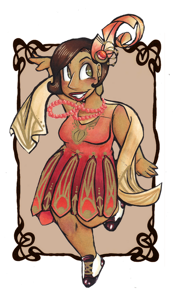
On a more objective note, this is for the lovely , of her equally lovely character, Farsingeru, relaxing after a great day of kicking ass and saving lovely noble ladies. Said lady isn't a specific character, but I based her off the godly perfection that was Josephine Baker, and I don't need a reason why, because Josephine Baker. This is also the first huge, full paper illustration I've done in quite a while, hence the somewhat wonky background. I'm going to see if I can fix it up a bit, though admittingly, I could have done worse.
Other commissions are coming soon, so hold tight!
Some smaller edits were added. Critique is still needed and appreciated!
Related content


Comments: 21

Wow, the coloring is gorgeous! I quite like how you did the tree's shadow.
👍: 0 ⏩: 0

Oh my word, I didn't even know this was up! You didn't tell me! I found it by searching randomly on DA!
👍: 0 ⏩: 2

Because I'm still working on edits! Also, because the nice big png file is on my other computer all the way back home, and I don't want to give you the ugly junky jpeg
")
👍: 0 ⏩: 1
I noticed the sword and its hilt especially -- it looks real good, just like the ref.  (Smile)")
👍: 0 ⏩: 0
So... in the end you trashed the one I saw you doing on Livestream, with the haystack?
")
👍: 0 ⏩: 1
I actually think the background is really pretty, I like the scope of it. The moment between them is sweet, and I really dig the detail of the bit of blood on her cheek, showing that the day wasn't all easy-peasy! From what I saw on your LiveStream, although this one is really lovely, I think I would have to vote for that one as superior.
👍: 0 ⏩: 0

The grassy hills look wonderful! Is it all markers and if so, how'd you keep it from getting terribly streaky? x 3x I always have a problem with that when I try and do a large area for backgrounds. D:
👍: 0 ⏩: 1
I did actually digitally edit a few things, but that's mostly in the foreground (and even then, it was more enhancement than anything else).
My tip for trying to cover large areas with markers: First thing first, try and break it up into smaller pieces, like in this case, I did each hill individually, and the larger chunks were then divided again by "natural" breakers like bushes, fences, etc. Then, you have two options:
a) Using the marker. Make sure the tip is really wet, because otherwise, you're going to be spending a lot of time working. Start coloring by working the tip in circles, not lines. It's what I used to block in the basic color before I later add in detail. If you don't mind losing some vibrancy and smoothness, you can also just lay down color and then go over it in colorless blender while doing the circle thing. It adds a little texture and smooths out flaws.
or
b) Use the ink refills and a brush. apply like watercolors. Of course, the cons of this are that you have a lot less control over the ink, and it actually uses up more ink than straight out markers. You can do a lot of cool gradient/texture stuff with it though (like that space background I did recently).
Hope that helps!
👍: 0 ⏩: 0

OMG FINALLLY!!!!!!!!!!! YOU POSTED SOMETHING!!!!
👍: 0 ⏩: 1
ITS LIKE SANTA FINALLY GOT MY LETTER!!!
👍: 0 ⏩: 0

This is absolutely beautiful! I'm sure she's going to appreciate all the work you put into this!
YES JOSEPHINE BAKER
SHE WAS SUCH A BADASS
👍: 0 ⏩: 1
Aw, you flatter~
SHE HAD A FUCKING CHEETAH AS A PET MAN. AND SHE WAS A FRENCH RESISTANCE SPY/DANCER. ALSO SHE HAD AN AFFAIR WITH FRIDA KHALO. SHE WAS LIKE LA MAUPIN'S AND FDR'S IMPOSSIBLE CHILD.
👍: 0 ⏩: 1
SHE BASICALLY DID EVERYTHING AND WAS COOLER THAN EVERYONE. LIKE, EVERYONE EVER. ALSO, I WANT A CHEETAH AS A PET EVEN THOUGH I CAN NEVER JOIN THE FRENCH RESISTANCE UNLESS I GET A TIME MACHINE.
👍: 0 ⏩: 1
AGREED.
(Dude, considering the amount of times the French have revolted, you may yet get the chance)
👍: 0 ⏩: 0

ffffffff- this is gorgeous!!!!~ i love the shading that;s comming from the tree and the background looks wonderful!
👍: 0 ⏩: 1
AW, thank you! I was actually trying to experiment with the shadows. Most of it is touched up digitally, not straight-up marker, but I think it came out pretty well, regardless.
The background still bothers me, somewhat though. I really had no idea what I was doing o-O Any recommendations?
👍: 0 ⏩: 1
only thing bothering me is that curved line and line inconsistency on it, the grass in the foreground also seems a little odd, especially the white patch . add some shading under the josephine baker look-alike, it feels as if she is floating on the grass (also maybe add a few streaks of grass along the edges of the people, to make them have more ground. im sure you can fix that up digitally) after that there really is nothing else i can suggest. I do hope my critique was decently helpful :>
👍: 0 ⏩: 1
Nah, you critique was pretty good ")
(And I really had no idea what I was doing with the skirt, and it just looks so out of place, ugh. To Photoshop!)
👍: 0 ⏩: 1
the skirt it's self is beautiful! i just believe adding a bit more texture and foreground may help the placement of the characters and in the end, add greatness to the picture. After all, grass does ruffle up against a person when they sit on it! (its also always good to look up reference of what you're drawing lol. look up some people that are sitting in a grassy field. it may help if my critique wasn't enough
👍: 0 ⏩: 0