HOME | DD
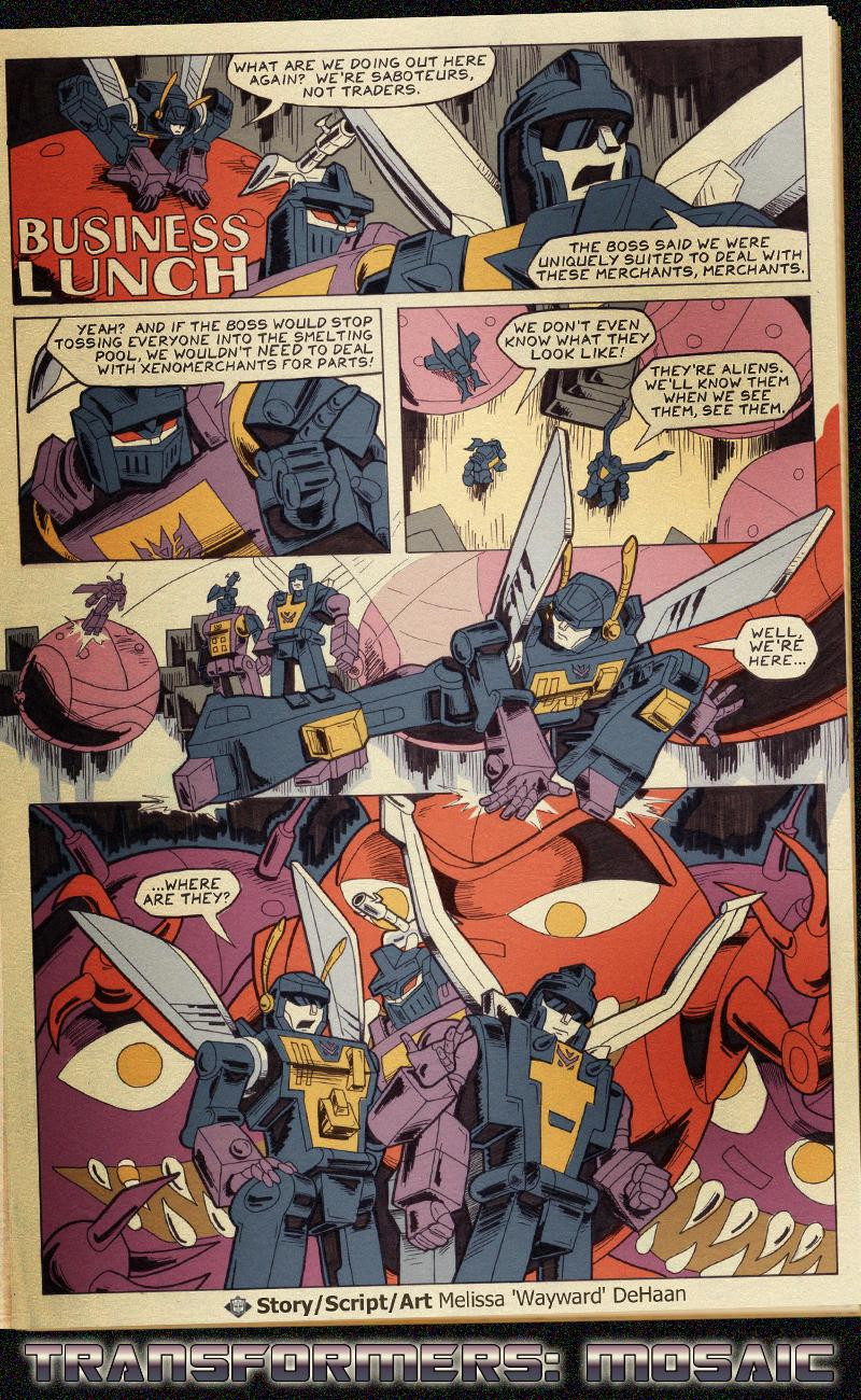
 Transformers-Mosaic — 'BUSINESS LUNCH'

Published: 2007-09-24 07:49:14 +0000 UTC; Views: 7004; Favourites: 83; Downloads: 139
Redirect to original
Description
"Business Lunch"by
Related content
Comments: 30

Aww poor Insecticons D: I always loved Shrapnel's speaking habits
👍: 0 ⏩: 0

I love the old school comic book look to it, one of my most favorite mosaics by far
👍: 0 ⏩: 0

soo cool .. from now on you go in my favourites..
keep it up..
oh.. and peace to you ,or the equivalent ..
👍: 0 ⏩: 0

heeey cool! but the Insecticons should look behind them..
👍: 0 ⏩: 0

I loved this when I first saw it on your site. So incredibly cool! I collected the old comics too...ah, a blast from the past...
👍: 0 ⏩: 0

This is my favourite mosaic, it just seems so authentic that it could have been lifted directly from one of Marvel's own comics.
👍: 0 ⏩: 0

Nice retro feel. It got me all nostalgic...I collected the 80's Marvel Comic Transformers.
👍: 0 ⏩: 0

This is awesome and beautiful. It may not entirely line up with the style of the old comics, but enough of the spirit is there. Also, the concept is great, and the title is perfect.
👍: 0 ⏩: 0

Amazing...this really hands down looks like a real TF comic from the eighties...WOW. Just...WOW.
👍: 0 ⏩: 0

Brilliant feels like an old Marvel comic and that makes me very happy!
Andy
👍: 0 ⏩: 0

I was wondering why TF Mosaic was posting an old comic page. Then I saw the artist. 
👍: 0 ⏩: 0

Wayward, you rock! Old sk00l! 

"They're aliens, we'll know them when we see them, see them."
WIN!
👍: 0 ⏩: 0

If I hadn't of known it was fan art, I would have put money on it being a scanned in comic page. Great work
👍: 0 ⏩: 0

Crosspost from my account: Stuff that's innaccurate:
- Kickback is way too agile for 80's Marvel.
- Due to how things were printed, the art shouldn't be able to touch the edge of the page.
- They talk like they did in the cartoon.
- The lettering is digital, not hand-drawn.
In each case, I chose to use the innaccuracies because I liked the way they looked or sounded ( given the choice between a normal voice and a funny accent, I will always write the accent. ) And hand-lettering is a huge pain to do, thus font.
Basically, I've always wanted to see the Insecticons versus the Mecannibals. Winner take all, loser gets eaten.
👍: 0 ⏩: 1

haha, i agree...hand-lettered comics are a pain in the wrist 
whoohoo loser gets eaten
👍: 0 ⏩: 0

That just looks like a real 8o's comic!
I love it!
👍: 0 ⏩: 0

Great! What Marvels' Transformers should have been!
👍: 0 ⏩: 0

Awesome work!!!
looks like a scan of a 80's marvel comic
👍: 0 ⏩: 0

Awesome! I am digging the retro comic motiff!
👍: 0 ⏩: 0

That's just frickin awesome. I love how authentic it looks.
👍: 0 ⏩: 0

the psuedo comic book look is amazing! did you overlay a paper texture over the colors? you even got the limited palettes and inking looking authentic. insane...
👍: 0 ⏩: 1

Several layers go into making the retro look, including a paper texture layer, yep. All colours were pulled straight from comic scans. Yomtov-style is both fun and limiting.
👍: 0 ⏩: 2

wait, no, the adaptation was Crime and Punishment. [link]
but yeah, just the whole feel of your piece is funky
👍: 0 ⏩: 0

it reminds me of this cartoonist, Rob Sikoryak, who specializes in mimicking other artists' styles and mediums. He did a Batman-style adaptation of War and Peace, some fake Snoopy strips, and a Tintin homage....among loads of other stuff.
Yomtov?
👍: 0 ⏩: 1

Yomtov was the colourist for most if not all of the Marvel run. He used maybe six colours total.
👍: 0 ⏩: 0


