HOME | DD
 trenoops — Moral Values

Published: 2005-03-16 19:53:22 +0000 UTC; Views: 2842; Favourites: 3; Downloads: 78
Redirect to original
Description
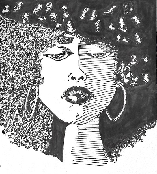
A piece I created for an Article on Moral Values as coined during the 2004 elections. The publication is one in my local area called Colors NW, covering issues on multi ethnicity, human rights, minority business people, politics, etc. This was published in their January issue, and was to be specificly a portrait of Dr. Martin Luther King Jr. engulfed in the moral value issues of today.Related content


Comments: 12


I'm not black, so what I'm about to say could hold no meaning : Dr. King was a great man. Better than Malcolm X in my opinion.
👍: 0 ⏩: 0

He was a great man... but injustice that killed him was greater.
👍: 0 ⏩: 0

The concept is very powerful. I think that is what matters, not how good it looks.
👍: 0 ⏩: 1

what do you feel about trying to achieve both an aesthetically pleasing and effectively conceptual piece?
I guess I'm saying that was my goal. I am a procrastinator, so of course I didn't use my time to the fullest when rendering the piece...I usually have troubles with conceptual pieces, so i spend a great deal of time working the concept, and researching for reference. I think personally I am most pleased with the colors, and composition. I never exactly thought about it until now though.
thanks for the comment, cause it helps a great deal.
👍: 0 ⏩: 0

It all works well except the "gay rights / civil rights" banner, where the text floats over the paper and sort of ruins the mood of the image.
Also Dr. Luther King Jr.'s pinky could have used with some fixing
I acn really see this in a magazine page, this is exactly the style of presenational illustrations featured in Reader's Digest.
Professional stuff!
")

👍: 0 ⏩: 1
Thanks, all of your crits are right on to me. I had to put that text in as a change, and they wanted it to pop...so i popped it right out of the illustration ")
the image ended up taking up 1 and a half pages so the index finger pointed right to the beginning of the article. The editor actually placed it a wee bit smaller in her layout then I suspected it, but it looked decent anyways....I was happy to get that job, it was my first pro editorial illustration. I wanted to do it in my caricature style, but I couldn't see how that would have accompanied their article...I can't wait to get a client that says..hey I luv your portraits create one for this article..... I want to rock my style....hahaha
👍: 0 ⏩: 1
yeah, caricature doesn't go well with more "serious" articles I suppose.
Good luck, well you've certainly got what it takes
👍: 0 ⏩: 1
you're way too kind. 

👍: 0 ⏩: 1
I'll suppose that's hot chocolate cause I don't like coffee.
Cheers!
 (Wink)")
👍: 0 ⏩: 1
that's funny me either, i just assumed it would be appropriate for the morning hours. I can't stand coffee...I like Chai though..
 (Smile)")
👍: 0 ⏩: 0
