HOME | DD
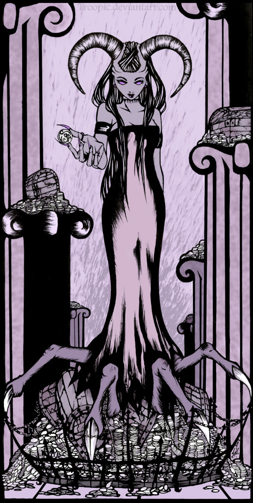
 Troopic — The Gamble 2
Published: 2007-09-14 13:17:40 +0000 UTC; Views: 759; Favourites: 16; Downloads: 12
Redirect to original
Description
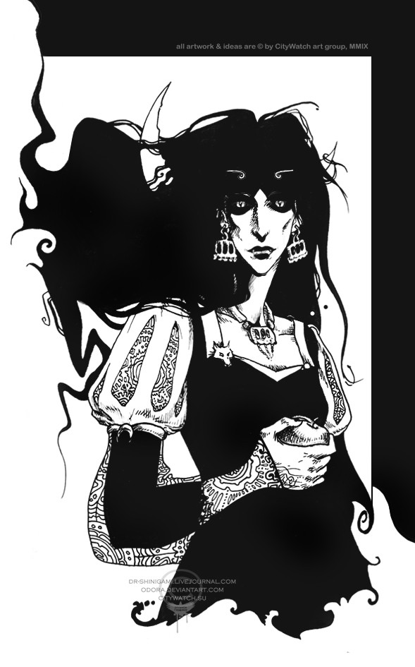
OK. end of self-diminishing (see bellow). i am happy with it now (Smile)")
---------------------------------
Well, since this ([link] ) does not apply anymore, i thought it was time to update it with a better version. the problem is: I SCREWED IT UP T O T A L Y.
i just suck at coloring!!! ><
that's it. I'm so done with coloring! (at least for now).
this version of "Gamble" (view description here---> [link] ) got a full BG made by hand (like everything else here), and actually looks more fitting than the first one. but still. the coloring is awful
")
Media: Ink. lots of it. and PSCS2 for the poor coloring
maybe I'll redo it once more one day. it feels like to good to be abandoned.. i like this one...
Related content


Comments: 23

Nice compostion, all things point to the subject and great detail
👍: 0 ⏩: 1

You'll make me like the horror that is digital art...
")
👍: 0 ⏩: 1

oh my, oh NOs!
thanx XD
anyway, the only digital-ishness in it is the purpleness ^^
👍: 0 ⏩: 0


This is wonderful; has an early twentieth century French feel for me. The figure is oddly compelling which I love, it's like being dragged into somebody elses nightmare.
👍: 0 ⏩: 1
interesting interpretation!
thanq very much

👍: 0 ⏩: 0


The drawing is awesome, but as you said.. the coloring could be better.. [=
Anyway, wall done.. [=
👍: 0 ⏩: 1
thankie.. ^^
(a! i knew that!!)
👍: 0 ⏩: 0

What the hel are you talking about?! it looks great (alought i can't see coloring too much, but you did great job in fixing via ps
👍: 0 ⏩: 1
you think?...well i'm glad ! ^^
👍: 0 ⏩: 0

ohhhh come on, don't you start crying " colorin, bla bla blaa" ...
DAMN - IT'S PURPLE !!!
NO NEED NO OTHER COLOR !!!
GR8 ... don't do another "redo" 2 this image... paint a new 1 , this one is Gr8 ... not always many colors are nice 4 ur eyes, personally i missed somethin for a long time - and u showed it : light-purple, with not much additions - and the pic is gr8 !!!
SO DON'T U PAKAPAKA on ur work...
It's GOod !
👍: 0 ⏩: 1

I think it looks great!
Purple, black and white is shweet.
And the chick is still completely awesome. Hah.
👍: 0 ⏩: 1

like she'd said, it is great and I always has the sense that you meant to make this round-game cube or something as an eyeball at first.
👍: 0 ⏩: 1
lol. naaa. but thanx ^^
rounf game cube?... thats unique.
👍: 0 ⏩: 0

Well personally, I think it is great.... both versions.
👍: 0 ⏩: 1
you do? thanq
i'm glad it's not bellow 0. ^_______^
👍: 0 ⏩: 0