HOME | DD
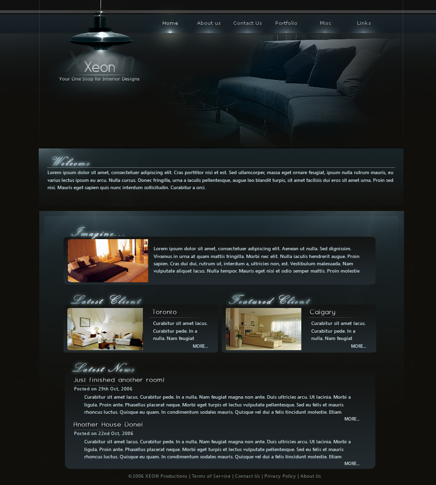
 tul — XEON
Published: 2006-10-15 03:50:00 +0000 UTC; Views: 2951; Favourites: 25; Downloads: 15
Redirect to original
Description
Thanks for all the help from #designerscouch (Smile)")
Edit: [link] here's a tan/brown version. What do you like better?
Related content


Comments: 23


Just a mockup (and it seems you forgot to actually press the 
Thanks
")
👍: 0 ⏩: 0

")


really nice! i like alot!  (Wink)")
👍: 0 ⏩: 0
spacerom [2006-10-18 06:54:10 +0000 UTC]
the navigation and the header are really nice. Good work!
👍: 0 ⏩: 0


amazing.. great job! more than the tan/brown version.. one more
👍: 0 ⏩: 0

Very solid design, I really like your idea of having the navigation rollovers resemble a lightbulb getting brighter. I'm not sure if I would agree with the color choice for an interior design website (maybe brown/tan + lighter a appearance), but this design looks very good as is, anyways. Nice one
👍: 0 ⏩: 1
I indeed had a brown/tan colour, however I asked a few people and they said they prefered the blue one. Here's the link to the brown version
[link]
👍: 0 ⏩: 1
They both look really good, I think the tan one fits the subject matter a little better. Good work, again
👍: 0 ⏩: 1
👍: 0 ⏩: 0

This is a really cool design, it will go into my Favs
👍: 0 ⏩: 0


The light is a cool touch, very well done, nice font as well GJ!.
👍: 0 ⏩: 0


Looks great man! It's not easy pulling off a website that dark, but you did it very well.
👍: 0 ⏩: 0

very nice, love the smooth, dark colours...that header fits in nicely.

👍: 0 ⏩: 0