HOME | DD
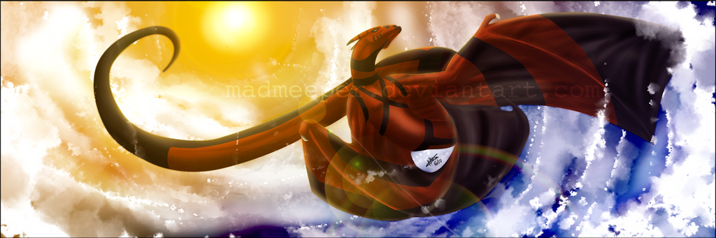
 TwilightSaint — Last Glow

Published: 2010-03-07 22:20:51 +0000 UTC; Views: 4996; Favourites: 286; Downloads: 0
Redirect to original
Description
~~~So it's pretty set in stone now that the only times I submit things are on the weekends.
 My weekly deviation submission stats are rolling with the worms...
Ew.
With that said...
It feels good to sketch again.
With that said...
More crap-shaded, shiny-highlighted, texture-lacking artwork.
 LOOK AT THAT, IT'S SO TERRIBLE. OMG.
 - :P")
(That's going to be an inside joke for all eternity. All eternity. )
It's also set in stone that, if I submit Hal, then in a little bit I'll submit Thom...Thom, Hal...and vice versa.
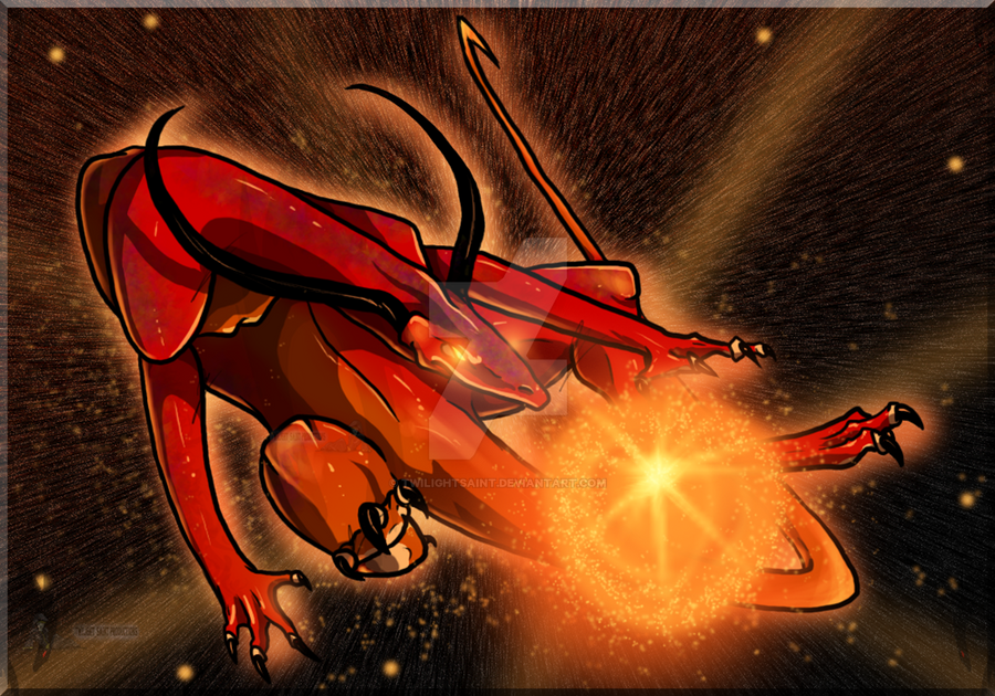
Pose/wing/shading practice. At least the shading isn't black. Sort of.
It's very orange.
...
Anyways, any and all comments/critiques are welcome, as always.

Enjoy!
Art/Chars (c) me.
Rippers will be nuked and swiftly disposed of.
~~~
Related content


Comments: 82


Well, I think this is a very very good work of art. But, like others it could also use some improvement. e.deviantart.net/emoticons/b/b… " width="15" height="15" alt="
")
First of all, this is a very attractive piece of art. The use of colors are very realistic, and that really makes this work stand out. And the pose of the dragon itself also is very creative.
Again, the pose is brilliant! The dragon really puts a lot of action into this picture. You can really tell what's happening in this scene!
But I did notice a few things in the dragon's face that looked a little off... The horns are a little too small, and it looks like one is a little crooked...
And your horizon line is a little jagged where the sun is, so you might want to straighten it out to make it more realistic.
But other than that, I really think you did a good job, and I envy this magnificent scene that you created.
I really hope this critique helps, it's my first time writing one...
Very good job.
👍: 0 ⏩: 0

Originality
Technique
I must say, out of all the images in my inbox from the dragonOC group, this is the only one I clicked on. That has merit in itself, as people want to click your image to get a closer look. It also says that you have good composition and colour selection.
That being said, I don't think there is a lack of texture more than a lack of depth. It's good that you didn't use black for the shading, but black is good for the darkest shades. It gives that extra little dimension to it. I might have also shaded the sun as well, though I'm not sure how accurate my assumption is. I love the vivid highlights and the rolling hills that you have, and it's over all a very well done picture!
👍: 0 ⏩: 0

Originality
Impact
I like how you kept everything in the same color pallet. It helps give you a real feel for the setting. The clouds were good, but don't need so much highlight. The shading is perfect as far as where the light source was. But the dragon rider needs a little more detail. The one thing that's really bugging me is those brown mountains in the front. It's hard to tell if the dragon is flying over, behind, or crashing into it. Though, from my point of view, it looks like the dragon is behind it. Other than that you did a wonderful job at giving the "You are there" look.
e.deviantart.net/emoticons/b/b… " width="15" height="15" alt="
👍: 0 ⏩: 0

I really like the pose and expression. Fantastic job
👍: 0 ⏩: 1

 (Smile)")

hi, I am new of deviantART and i thank you for getting my picture as a favourite
👍: 0 ⏩: 1


!Muchas gracias, amigo!
👍: 0 ⏩: 1

Con toda la diversión.
👍: 0 ⏩: 0
*Idracil eats orange*
👍: 0 ⏩: 1

*throws a pineapple at Thom*
👍: 0 ⏩: 1
*Thom noms pineapple*
👍: 0 ⏩: 1
*launches a fruit-nuke*
👍: 0 ⏩: 1
*launches anti-fruit-missle defense system*
👍: 0 ⏩: 1


Woah I am blown away by this amazing picture! I love it! *.* You are such a great artist! I hope someday I will be as good as you are! Keep up that great work!
👍: 0 ⏩: 1
Aw, thank you sooo much! 
👍: 0 ⏩: 0

if these one thing i like about you and your art is your ability to create really calming sunset scenes it brings quite a serene beauty to the picture very nice job with this
👍: 0 ⏩: 1
Lol, I loff sunsets... (I think once I go to the Holy Land...I'll never come back!
👍: 0 ⏩: 1

Lovely pose and concept.
I know you're experimenting, but Imma eats ur face for the white. It's not even the time of day for bright highlight XD
👍: 0 ⏩: 1
Thanks!
👍: 0 ⏩: 1
Ah okay.
Still, though. Let's see it I still have it... Nope, I deleted it. Anyway it was a chart that showed all the whites. You're supposed to use off-whites and not pure white and all that theory. I see you did, it's just the lighting (time of day that was misleading XD). White usually turns the color of whatever light reflects on it. Like when you put a white vase next to a colored object and it seems to be lighted by that certain color, though the onject obviously isn't glowing XD And if he's white, then the shading should probably be a light yellowish orange with the vesper light, not so much red bled into it, even if it is flying over the red hills with their color reflecting on it.
I like to color things like they're not, so if that's your style, keep it XD
And if you understood nothing of what I wrote, ask me again tomorrow. This hour isn't the best for me to explain anything. [/fail]
👍: 0 ⏩: 1
So...in this case, Idracil would be more yellow than anything?
I've done it that way with a couple other shots - like 'Jerusalem Sunset' and (lo!) 'Jerusalem Sunrise.' (Wow, I never noticed before how redundant those titles are... *faint* XD ) In the first, Idracil is almost completely pink, and in the second, he's almost completely blue!
👍: 0 ⏩: 1
A dusty yellow below (cause of the brownish dune and a bright yellow from the side. Both toned down and tinted with the red of the overall work. That dune should probably have a bit of light bleeding into it, but just a bit. Maybe just an outline.
Okay... The sunset work is lighted excellently, but the sunrise work is lighted wrong. The side facing us would be darkest, cause the sun is right behind it. I've read that you shouldn't place the sun in a picture, I think that's why.
You seem to be going back and forth a bit. I see your gallery and you have a few in the same painting/shading style, but sometimes the light goes back to white and sometimes it's just normal. In Sunrise/sunset, the previous is the latest, yet the lighting is better on the latter, why?

👍: 0 ⏩: 1
Ha-ha, I know what you mean about my sunset vs sunrise thing!
👍: 0 ⏩: 1
The sky isn't blank 8D It should have various shades of colors, not just one color. And you can always play with it as you please. People see shapes in clouds; you should use this to make them see what you want them to see ;D
👍: 0 ⏩: 1
That's why I always add clouds - so I can make the sky more interesting. ^^ I'm trying to minimalize cloud/spiff usage and be able to just plunk in a blank sky - like blank evening skies...but there are so many colours, they're not completely blank!
👍: 0 ⏩: 1
And it kinda depends where you see it from. Well, maybe just for me, since I'm -6 blind XD I see from the corner of my eye and everything looks different, more interesting--maybe cause it looks different from usual P=
Why am I rambling about unrelated things? XD
btw, did you notice "Where we're going: was on the front page for like... three minutes? XD
Ugh, again, unrelated. Bleh. I'm getting off the net before the coffee kills my sense...
👍: 0 ⏩: 1
Ah, that's intersting. O.o
But yeah, I've worked a 'plain' sky into a couple pictures recently - have yet to post them. One of them, the background is almost blankish...more blank than my other pics at least, lol. At first, it looks really bare, but then, upon taking a closer look, one can see the neato sun and subtle, faded mountains in the distance...
It was?!

👍: 0 ⏩: 1
Oh, sounds nice!
*stares crosseyed at her 6k deviations to look through and sighs* |D
👍: 0 ⏩: 0

That sure looks pretty cool! I quite like the shading and the orangey-redness of the whole pic, it's awesome-looking!
👍: 0 ⏩: 1
Thanks! It's...it's...peachy~~~
👍: 0 ⏩: 0


Is so beautifull Draw. Il love the sun effect with dragon and environement. Nice
 (Wink) - ;)")
👍: 0 ⏩: 1

Wow, I do not want to use this privilege too much, but I would say this would be a great as a great wallpaper. If I start asking too much of you, just tell me.
Great job by the way. I like your sunset scenes.
👍: 0 ⏩: 1
Ha-ha, would you like it?
Thanks! I think when I make it over to the Holy Land and see a real Jerusalem sunset...I might not come back!
👍: 0 ⏩: 1
| Next =>