HOME | DD
 twistedstrokes — F Lindisfarne Style
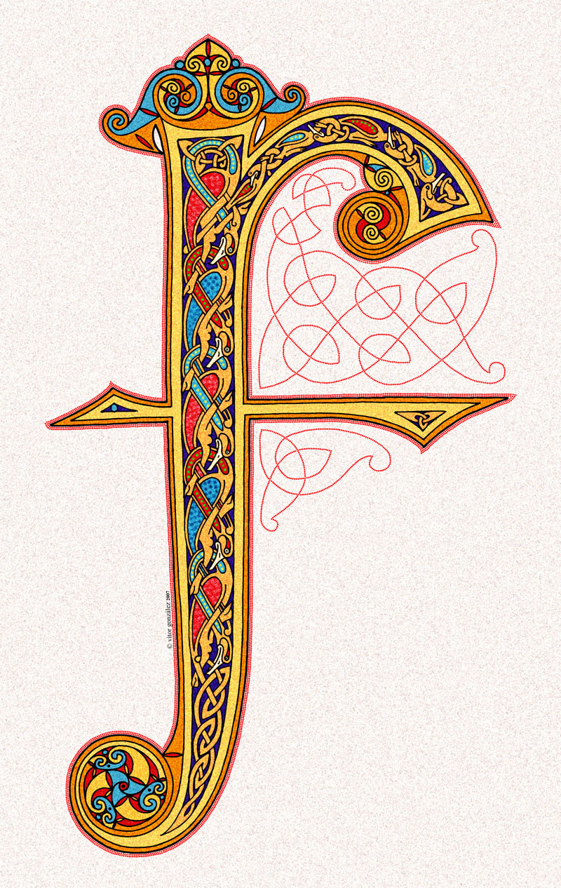
Published: 2007-09-23 21:18:45 +0000 UTC; Views: 15540; Favourites: 114; Downloads: 0
Redirect to original
Description
That's my entry for a contest. An illuminated F in Lindisfarne Gospels style, this is a manuscript produced in the Northumbrian island monastery of Lindisfarne at the end of seventh century, in honour of Saint Cuthbert.Credits: bird pattern from Lindisfarne Gospels, folio 3
Related content


Comments: 63


Lovely work! I know and love Lindisfarne greatly - i visit it regularly
👍: 0 ⏩: 0


Huy! Perdona no me di cuenta que eras español ")
👍: 0 ⏩: 1

Thank you, your words are very kind. Maybe you're right and that needs to be thicker... But it's a work done and finished
👍: 0 ⏩: 0

exquisitely detailed, per usual. great job! I do feel like I need something more from the plain red line; maybe it just needs to be thicker?
👍: 0 ⏩: 0


Although I love designing and coloring knots, I'm pretty terrible at creating authentic pieces such as what you have done. I find it ironic that such intricate art comes from a people who were known to be vicious warriors.
Can I ask how you made it? You've got it under digital, so what program did you use? Or did you scan in a drawing then color it? However you did, I bet those dots were making you cross-eyed by the time you finished.
And congratulations on winning the contest; I just saw that in The Knotters journal.
👍: 0 ⏩: 1
Thank you so much
I use Photoshop CS to add the color.
👍: 0 ⏩: 0


Increíble.. y yo que quiero aprender a hacer esto y no soy capaz
")
👍: 0 ⏩: 1
Gracias  (Wink)")
Siempre digo que es más fácil de lo que parece, simplemente con paciencia y mucha práctica se pueden hacer cosas muy bonitas. Si quieres aprender te recomiendo los libros de Aidan Meehan, publicados por Thames & Hudson, el manual de George Bain también está bien pero es más enrevesado y, bueno, el mio no está mal para principiantes... yo aquí he venido a hablar de mi libro
👍: 0 ⏩: 1

")
👍: 0 ⏩: 1
Alguno han tenido en stock, porque yo compré varios allí, de todas formas si no los tienen te los pueden pedir, de todas formas consulta su web a ver si tienes suerte. La forma más rá
👍: 0 ⏩: 1
Uy es que yo por Ebay ni zorra idea  (Smile)")
👍: 0 ⏩: 1


Just gorgeous. Your knotwork is always everything I want mine to be but never quite succeeding!
👍: 0 ⏩: 1
Thank you so much, your words about my stuff are very kind
👍: 0 ⏩: 0


Robert has introduced me to to rubrication, and I must say I recognized it immediately when I looked at this! This is absolutely stunning!
There isn't anything I DON'T like about this piece. Great job!!
👍: 0 ⏩: 1
Thank you very much
👍: 0 ⏩: 0

This is OMG incredible. I love it. I want this to win. You did the sort of style I did but carried it to levels of precision and beauty that I didn't come close to. Your rubrication kicks my rubrication's butt, wow, perfect. I love this sort of thing.
There are some other incredibly good letters that may win. But I think you've got a chance, it's awesome.
👍: 0 ⏩: 1
Thank you so much for your kind words Robert
👍: 0 ⏩: 1
You're welcome. I still love your rubrication. You've inspired me, and the next time I do illumination at all, I'm going to give myself enough time for seriously good rubrication. I space the dots much farther apart, but I like how you did it.
👍: 0 ⏩: 1
All comes from Lindisfarne Gospels. Those kind of dotted knotwork patterns can be found in the most of pages of that masterpiece.
👍: 0 ⏩: 1
That is wonderful. I've got several books with reproduced pages of Lindisfarne and also some with black and white renderings of Lindisfarne designs, and it is so beautiful. I think the rubrication patterns turned up in other manuscripts too though, that it was a widespread technique. I learned about it from an expert calligrapher in person, who liked something I was doing and then asked about why I hadn't done it -- when I hadn't known about it or noticed it on historical examples. Now that I know, I do it anytime I do large capitals or any manuscript layout in that style.
👍: 0 ⏩: 0
My God! The title of this deviation is wrong
It musts say LindisFARne and not LindisFRAne. Sorry for my typing mistake
👍: 0 ⏩: 0


Thank you so much
👍: 0 ⏩: 0


jo, entonces eran unos hachas iluminando, y tu no te quedas atras

👍: 0 ⏩: 1
Muchas gracias
La diferencia es que ellos lo hacían mucho más pequeñito, yo tengo que hacer las cosas tres veces más grandes para poder atinar...
👍: 0 ⏩: 1
jajaja, cada cual lo hace conforme a sus posibilidades...por cierto, hoy he hecho otro lacito, es chiquitin, en que lo rotule y eso lo subo
👍: 0 ⏩: 1
| Next =>