HOME | DD
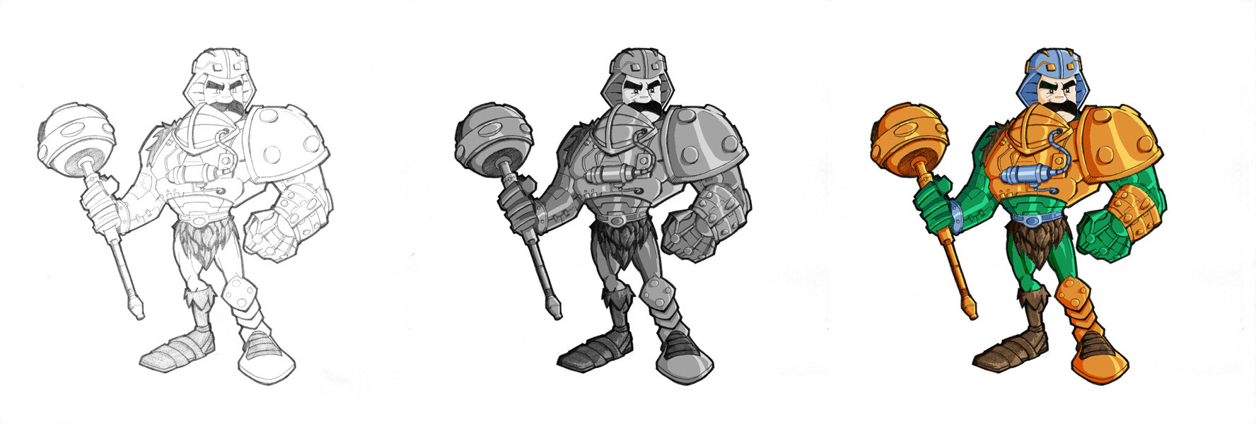
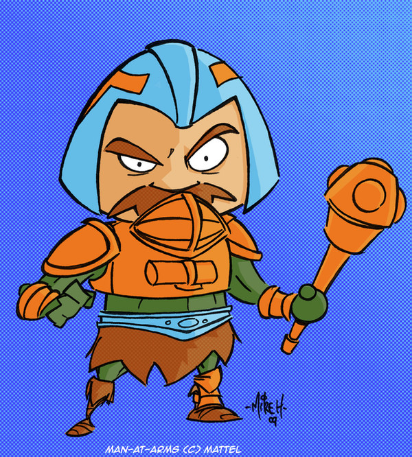
 tyrannus — Man At Arms Finished
Published: 2004-02-06 14:55:10 +0000 UTC; Views: 3144; Favourites: 38; Downloads: 1366
Redirect to original
Description
I threw some colour on my pencils and threw this together, I including a black and white version cos for soe reason i just love the look of grayscale.....anyways, sorry if its big, I tried downsizing as much as possible without losing detail. Hope you can dig it")
Related content


Comments: 30


That's definitely an original style to draw the MOTU characters.
👍: 0 ⏩: 0

great work, you've got a unique style, i really like it
👍: 0 ⏩: 0


im also a fan of greyscale...cant decide which i like better of these!...ahhhhhhh!!!
👍: 0 ⏩: 0

hey i found a crit!!!!
when you coloured you didnt quite gett he moustache right, it look a little liek a peice of clothing that goes round his mouth, maybe at a little triangular indent like un ure pencils then it wud b usual standard, perfect!! hehe
👍: 0 ⏩: 0

definetley diggin the steps from line to color, hot shit mah man.
👍: 0 ⏩: 0

Wow men....
I'm love it... parapapaaaa
Nice work
You win a +fav
 (Wink)")
👍: 0 ⏩: 0


wow man i dont know who this dude is but he looks fucking cool.....great work man!
👍: 0 ⏩: 0


I THOUGHT that looked like him!
👍: 0 ⏩: 0

HEMAN is weird, but this... this is COOL! awesome work with the color
👍: 0 ⏩: 0


yeah, i agree the gray scale does look better. its because the colours seem to be alittle too bright, maybe it might look better after desaturating them a bit.
very well drawn though
 (Smile)")
👍: 0 ⏩: 1

I thought so too, but when i went through and desaturated them (which I do in my other pics cos i prefer the more faded look) it didnt look right on this piece. So I left them bright...Ah well - live and learn hahaha
👍: 0 ⏩: 0


i actually prefe rthe greyscale
love the texture on his fure boot thing - ur colourins gettin amazing lately mate
nice one
tom
👍: 0 ⏩: 0

mate, nicely done.. very clean pencils.. and nice cuts.
👍: 0 ⏩: 0


ty this is some serious mind blowing shit a fave thru and thru
👍: 0 ⏩: 0


I dig it!!! the gray one looks cool too,
thats it mate youve made it to my favs again
I just love heman, me is from the eightees!!!!!
greetings Soulrailer
ps Ill be watching you
👍: 0 ⏩: 0

haa!! firs comment!!! excellent job man!!! just awesome.
👍: 0 ⏩: 0