HOME | DD
 UEY-S — Workaholic

Published: 2008-10-22 13:35:42 +0000 UTC; Views: 3361; Favourites: 38; Downloads: 0
Redirect to original
Description
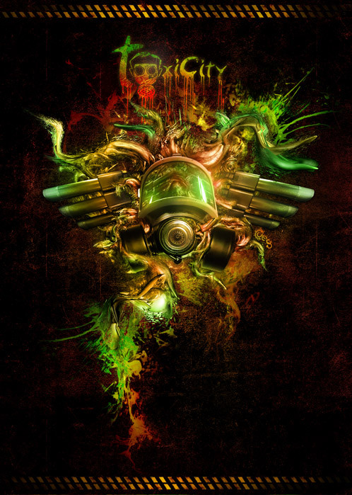
Check out a remake of this portfolio cover (Smile)")
---------------------------------------------------------------------------------------------
*Edit: this is the final version that went to print*
This is my double page spread for a magazine that we are producing as a 3rd year graphic design class of 2008 at Charles Sturt University.
Here is the Magazine cover too stadno.deviantart.com/art/Sync…
God i love working on magazines!
")

has my permission to add this deviation to their ass kicking gallery
ALL WORK HERE IS COPYRIGHTED, using this image without asking for permission is prohibited and YOUR ASS WILL BE SUED.
Related content


Comments: 34


thanks mate, this one is being re-created too. touching up a whole lot of things
👍: 0 ⏩: 1

Cool, I wanna see that when it's done.
👍: 0 ⏩: 0
woooooaah, thank man! much appreciated for the feature
👍: 0 ⏩: 1
thanks mate, cheers for the watch and all the other favs too :0
👍: 0 ⏩: 1

np, my pleasure and I look forward to seeing more of your work in the future.
👍: 0 ⏩: 1
and i'll be doing my job to put the WOW-factor in every work  (Wink)")
👍: 0 ⏩: 0


Aha! I love the new font you used. And the water effect has greatly improved too, much busier but still simple in matter. The only thing I would honestly do differently? I would splatter some on the 'camera', putting it out of focus and shining, dripping down into invisibility, and I'd muss up the spacing of the text, so each letter looks like it's falling with the flow of the 'blood', even blasted to bits a little by the force of the exit.
Also, you are madly adorable. Why must you be so cute? And so old! Shit, are you in college?
👍: 0 ⏩: 1
same font, just distorted differently
haha i'm not thaaat old, i'm only 20 and yeah i finished my 3 years of university this year
👍: 0 ⏩: 1
You're old anyway! xD
I'm still in high school.
👍: 0 ⏩: 0


haha awesome! love the way you've used red water, it makes it more original!
👍: 0 ⏩: 1
thanks man, yep, your completely right
👍: 0 ⏩: 0

Your face , you just look like you're happily expecting the worst. Good work.
👍: 0 ⏩: 1
yeah ")
👍: 0 ⏩: 1
yeah kinda.. it took me a lot of eh.. angry mumbling and winging under my breath before i could make myself delete a who bunch of stuff and use heaps more white space. thanks to suggestions by my lecturer that is..
and yeah i'm always trying new styles
👍: 0 ⏩: 1

true true^^
sometimes it is hard to accept lecturer's idea, who seems always wanting to change what is currently is. but i suppose that is for a better grade, so hehehe ^^
👍: 0 ⏩: 1
yeah, it's just hard and sometimes annoying because my style is really busy and detailed, his is VERY simplistic, minimalistic and basically just has a shitload of white space.
👍: 0 ⏩: 1

thanks man, got the idea from one of my previous works
👍: 0 ⏩: 0