HOME | DD
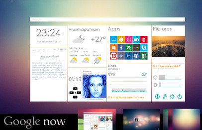
 uibox — Mail app for Windows 8

Published: 2012-02-15 20:48:10 +0000 UTC; Views: 19287; Favourites: 79; Downloads: 1635
Redirect to original
Description
Mail app for Windows 8More options, more simple.
Minimally minimal.
Post your comment ... please!!!
follow me on twitter : @sp3ncer
Related content
Comments: 21

Wow, that's exactly the type of app I want! Simple. Stylish. Nice
👍: 0 ⏩: 0

Here's where MS should hire the OS designers!!!
👍: 0 ⏩: 0

this colour make me more posotive!!!
amazing all your job!!!
👍: 0 ⏩: 0

yeah the default mail app really needs to move the inbox and other folders up top like this - nice
👍: 0 ⏩: 0

Very nicely done...
Id prefer a smaller headline. How about reduce it to the size of the START text written in the start screen? 
👍: 0 ⏩: 0

Much as I like the giant 'mail' on top, it's just losing too much space in that whole horizontal section, space which could be used for buttons or actions or something. Remember, most laptops are shrinking (13" is now the standard), whereas most desktops are getting bigger (19" is quite common, 22" is quickly increasing market share). While something like this could work on a large 1920x1080 screen, it totally would not on 1366x768.
👍: 0 ⏩: 1

Of course...
but ... at least it could be a visualization option. ^__^
In an "real" app, that header would be much shorter ... i know.
Thanks for your opinion.
👍: 0 ⏩: 0


