HOME | DD
 UltimateEquilibrium — It's not over
Published: 2016-09-28 02:56:16 +0000 UTC; Views: 1491; Favourites: 34; Downloads: 0
Redirect to original
Description
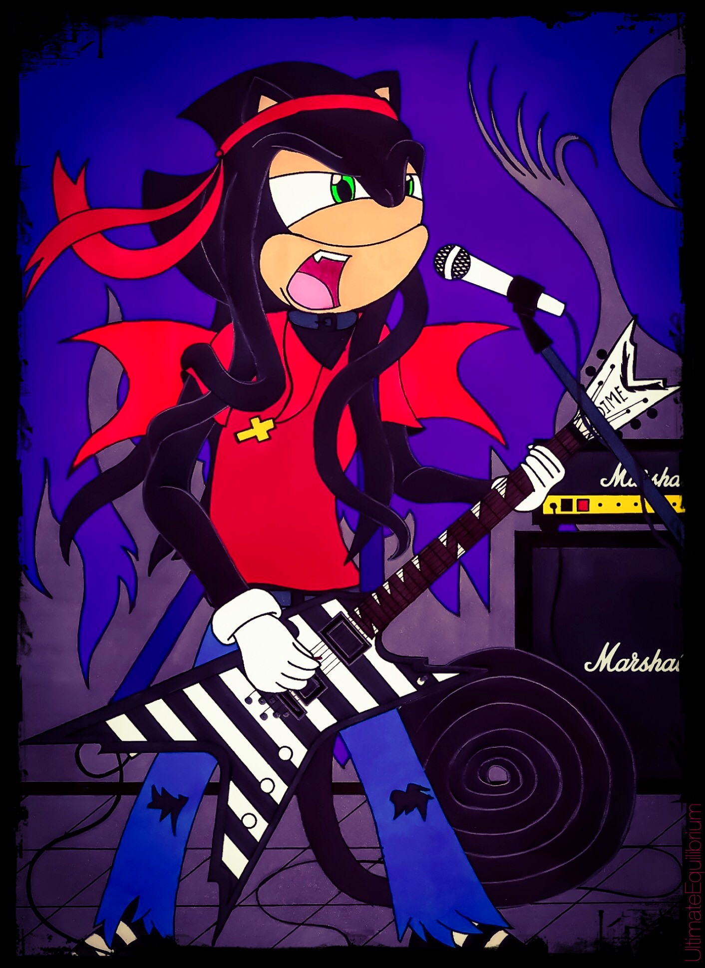
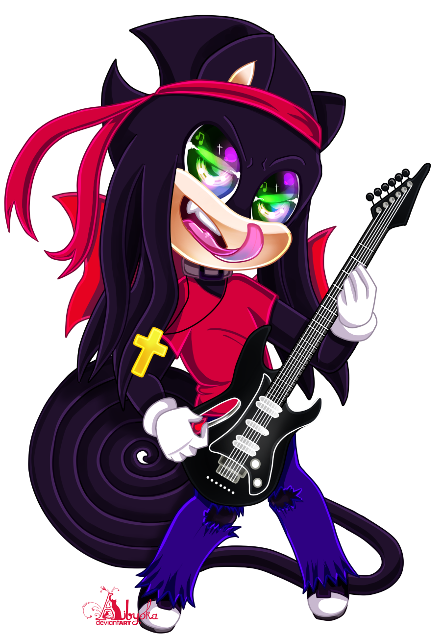
EDIT: Check out this awesome alternate colored version that did!Another music-related piece, heh. XD Not much to this, other than it being a revamp of this old pic. Still rockin' his Dean Razorback ML. This particular one is his signature model after all. Can't go wrong with Marshall amps either.
 There's nothing specific with the wall, I pretty much just started with a random pattern and went where my mind took me. XD
I also want to point out that I actually got myself a few stray Copic markers recently, in which one of them was used to color Nathan's muzzle + eyelids. Really professional markers, I'll say that. Before I only had a colored pencil of that color, and it never came out good after scanning, so I'd have to extract a droplet from it and re-color the whole thing. But these Copics give it a more natural look, and are a big time saver as well
 (Smile)")
Plus, this gives me an excuse to do this:
Just shows how dedication can result in great improvements.
Please tell me what you think!
 (Wink)")
Artwork & character ©
Related content


Comments: 37


Technique

Impact
Greetings, I'm from Project Comment!
First off I saw the improvement from your first drawing of this to now. And I can say yes you really did improve. I like the addition of the background first off. It really brings the picture together adding a background. I also like the detail in the background too. Also doing this in marker it's quite smooth. I can't see any stroke lines and everything is colored very very smoothly which adds to the overall quality of the work.
The border is a nice touch as well and doesn't stand out or distract the viewer. Finally the overall colors complement each other and come together well.
Now for some improvements. First thing that caught my eye was the line on the face. I'm not sure if this was to separate his snout from his eyes but throws off the perceptive of his face. Also I keep looking for some indication for a nose, but he doesn't appear to have one, and that also confused me.
Additionally, if that is what I believe to be his tail, why is it coiled up like that? I'm wondering if that's just how it is and if not than use some of that back ground space and give the tail more emotion to it. It's a part of him, let it help tell the story.
Overall, great improvement from your original!!
👍: 0 ⏩: 1

Thanks for your critique. It it much appreciated! ^^ I also appreciate the way you like how it was composed. Yes, this is a total overhaul compared to the original. XD
Are you regarding his muzzle? The way it was shaped was intentional. His eyelids and muzzle are the same color. And no, he doesn't have a nose. His tail is supposed to be like that because he is a chameleon, also as to why he hasn't a nose. If you look at his reference sheet, everything should come clear: fav.me/d9qirhu
👍: 0 ⏩: 1
Very welcome.
I didn't realize that he was a chameleon. In that case I would at least recommend giving him some nostrils
then. You did give him some nice little ears after all.
Additionally, give the tail a little bit of volume then. Reptilian tails are still thicker at the base than at the end
so I think that would help out a bit. And I looked at the character sheet. Amazing that he can stretch so much!
Keep up the good work tho!
👍: 0 ⏩: 1
Yes, he is. I'll take your word for the suggestions.
Thanks for noticing his abilities, though. Yeah, it makes him a one of a kind.
Thanks again
👍: 0 ⏩: 0

I believe this is the piece that you have printed to make a poster on your wall? I saw a bit of it in your video.
👍: 0 ⏩: 1
I wish it was, heh. But it’s actually this image:
👍: 0 ⏩: 1
Welp, there goes my wild guess lol. A glimpse of that guitar tricked me, ops.
👍: 0 ⏩: 1
Ah, I see. XD
Well I don’t know if my image even has a high enough resolution to be printed into a poster anyway, so....yeah XD
👍: 0 ⏩: 0


Funny thing is, I happened to be listening to the song during time of upload, and the song's title deemed me a perfect match for this drawing's title, heh. But nah, he's most likely doing his own thing here. XD
👍: 0 ⏩: 0

Hello from #projectcomment
Man, dude, I have no idea where to start with this because I really, really like this. This would be an awesome band poster!
Your usage of basic colors is nice, and your coloring is really nice. It's simple, which is nice. Sometimes I see way too many overly saturated colors in this style and it doesn't always fix because of the relaxed feeling this style has. Another thing I like are your lines, they are some of the smoothest lines I have ever seen on a traditional piece of work. Something else that I find enjoyable and pulling about your work is the movement in it. The movement of his hair, his necklace, his stance; all of these suggest that he's deep in the music which he is performing.
However, there happen to be a minor detail that I feel could be improved upon. It happens to be the only detail I can point out--the difference in dimension between Stryper and his Dean Razorback ML, as well as the microphone, and the amp. This is not bad, their lines are very crisp, and they look wonderful--but where Stryper is at a 3rd quarter stance, these props in the artwork are not. Something to do about fixing that is to experiment with shapes on scrap paper and figure out how to expand them on a 3 dimensional plane; also known as perspective. There's different points, like 2nd and 3rd--and I'll admit I don't know the exact one to offer in order to help you with the shapes, but I suggest practicing with cubes. A point on your art work is the field of perception, and you draw the cubes while sloping them to that point (I'll admit, this is hard to explain without examples, so if you have any questions I am more than happy to provide answers ^^ ). When you start messing with perspective, it really opens up a whole new world for artwork--such as foreshortening.
Overall, however, this is a really WONDERFUL piece. I really enjoyed looking at it, and I love all the details you put into it; from the rips in his jeans to his guitar. ^^
👍: 0 ⏩: 1
Hello there!
First of all, I appriciate how much you like this. It definitely would be cool to see this as a band poster ")
I honestly have no idea what you mean with the whole 3rd quater stance thing, the whole thing with perspective and all that. Are you trying to say that they should look more 3D like? Sorry, but that whole paragraph just got me totally lost. XD
Thanks for the feedback, though. I'm glad you enjoyed this piece! ^_^
👍: 0 ⏩: 1
Hello again~
You're firstly very welcome. I really do like this one. I'm not a super big fan of a lot of sonic style art, but like, you have really made it your own with this; and that's really important!
And I figured I probably didn't really explain it very well. I kept getting distracted while I writing so my bad entirely.
But, yes! I think it should look a little more 3D like--it would've really made this piece pop, and look more fluid. The guitar kind of pops out because it looks one dimensional as apposed to the character
holding it.
I hope that explains what I was trying to say better. :3
And again, you're really very welcome for the feedback! Keep up the great artwork, my friend. Rock on~
👍: 0 ⏩: 1
Thanks again! It's a pleasure to hear how I took something well known and made something more original out of it. ^^
Ah, I see. XD Now I get it.
Thanks again! I sure will.
👍: 0 ⏩: 1

Hello! I'm from and this piece was up for commenting for a while, so I'll throw myself in!
Judging by the thumbnail, I was sure it was a digital piece. Is that all done with markers? I've never worked with markers myself, even less with Copics. If that's truly all marker, then congrats on making such a uniform coloring! I can't tell at all where the strokes are. There are some texture in the purple of the background, and it contrasts nicely with the flat colors of the character. Are the wings connected to his t-shirt? I'm guessing you don't have many colors in your marker kit, but if you do, I'd consider changing the color of either the shirt or the wings if they aren't connected. It is strange that they are the same color.
Anatomy wise, I am not a Sonic artist myself, but I know characters are quite stylized. While I don't know which specie your character is, I like that he isn't super deformed like many other Sonic inspired characters out there. His proportions are much more realistic. I'm thinking mostly about the big heads, hands and feet of Sonic characters. Yours is different and a different variation on the style. What I had trouble figuring out was his lower eyelids, until I remembered that the eyes are often ''connected''. From that angle, maybe lifting the muzzle line would have helped in making the eyelids less big.
There's a lot going out in the piece and I'm not sure I know what everything is. Is that a curtain behind him? It's not clear. I wouldn't go with something much busier for the background, but it would benefits from being defined a bit more. Also, since I don't know your character, I didn't know that black spiral was his tail. I guessed from the older version of the drawing in the comment. It's a bit too much to the side and doesn't seem connected with his spine, like a tail normally would.
Like I said, I'm not that familiar with the Sonic style or your character, so take my comment with the grain of salt! Hope I was still helpful!
👍: 0 ⏩: 1
Well thanks for stopping by! XD
Thie was all done traditionally, yes. All done with markers, made with Sharpies and a few Copics.
My character is a drageleon, you can learn more about him here: fav.me/d9qirhu I try to make my anatomy more reasonable so that it looks more logical, so I'm glad you picked up on that. I see what you mean woth his eyelids. That's because his muzzle has a differemt shape to it, there is no "bump" in the center which would separate them, which is why it kinda looks big here.
The background is just a solid purple wall, with a grey design lining the bottom painted onto it. Yes, that is his long, coiled tail. XD Like I mentioned above, you can see the link about his reference, which should make things come clear. His whole body is partially turned to the side, but I understand if it may look a little too off to the side.
Thanks for the feedback! I'm glad you enjoyed this image.
👍: 0 ⏩: 1
No problem!
I read quickly though your character bio, and it's clear you thought about him a lot. The tail makes a lot more sense now that I know he is part chameleon. I'm not really familiar with Sonic style characters, so while it may seems clear to a fan what specie is a character, I'm just looking at them and trying to guess.
👍: 0 ⏩: 1
Thanks. ^^ I had him thought up back in late 2012, and a lot of revisions and tweaking shaped to how he is now.
Not part chameleon, part dragon. XD But I see what you mean.
👍: 0 ⏩: 0

Hmm, I can see some experimentation going on with you on Nathan's muzzle. It looks "enlarged" if you know what I mean.
Colouring is top notch and shiny.
And yeah, this is def. an overall improvement from 2014.
👍: 0 ⏩: 1
That's because his head is partially lifted upwards, thus revealing more exposure to his muzzle. XD
Thanks
Right? That old one is starting to look pretty junky now. XD Although, I do remember you stating how it had "awesome sauce" all over it when I posed a WIP of it from long ago LOL
👍: 0 ⏩: 1
Ah, gotcha'.
You're welcome!
XD Lol, well, I was praising you because of where you were at that point in time. Now you've only gotten better since then! I'm so happy to see that!
👍: 0 ⏩: 1
Yeah. ^^
That's true XD And I sure have! I'm glad you're eager about that. ^^
👍: 0 ⏩: 1
Absolutely. That's one of the reasons I love being in this site community. To see others improve overtime with their creativity and techniques.
👍: 0 ⏩: 1

Hell Yeah! Nathan looks badass!!
I really wish I was there to hear the music cause judging from his expression he's giving one hell of a show or recording a track. Either way I would like to hear it
I can honestly say I don't know much about guitars but the style of that Razorback looks sick!
You did a amazing job on everything the colors to the line work looks really clean. Also the background design, for just a random pattern it works very well.
👍: 0 ⏩: 1
Hell yeah indeed!
That'/ no studio, so he's likely blowing the crowd away.
Right? I wanna own one myself. They are a real guitar btw. The brand name is Dean.
Thanks so much Alex! I'm glad you dig it. ^_^
👍: 0 ⏩: 1
Right on!
DANM IT WHERE IS MY TICKETS!!
I know you said so in the description, honestly I looked it up right after I saw this and boy oh boy do they cost a pretty penny.
You are very welcome Nathan! It's my pleasure to admire metal at its finest
👍: 0 ⏩: 1
Haha XD
Yeah, they can be pretty pricey alright.
")

👍: 0 ⏩: 0

Good to see Nathan playing the Razorback. Always thought it was a cool-looking instrument. It's great to see how your background work has evolved over the last two years. XD
I love Copics. I've used them for years now. ShinHan came out with a similar marker (Touch markers) but I don't like the way they handle so I usually just buy blank Copic markers and fill them with Touch ink XD
👍: 0 ⏩: 1
Thanks! Yeah, it is a really cool instrument. I'd totally love to get one for myself, haha. XD
I would agree, I think I'm starting to get much better at doing backgrounds.
I've heard a lot of positive reviews about them, so I'd figured I'd give them a try. What a good choice that was. XD
Heh, who knew that markers were interchangeable. XD
👍: 0 ⏩: 1
I wouldn't be able to play one...although I'd like to give it a shot one day XD
Keep at it! You'll just get better!
YES. I started with Prismacolors but I wish I had gone with Copic at the beginning.
👍: 0 ⏩: 1
That would be interesting to see. XD
Thanks!
I see. I actually own a set of 12 Prismacolor colored pencils, but ever since I switched medias, I hardly ever use them anymore. :/
👍: 0 ⏩: 0

Judging by his face, the sound must be loud as heck! That's awesome xD Comparing this to the old version, you sure did improve a lot~
Also, i want that guitar!
👍: 0 ⏩: 1
It would definitely be loud, that's for sure. XD Thanks!
Yeah, me too. XD
👍: 0 ⏩: 0