HOME | DD
 UltimateEquilibrium — Triode
Published: 2016-08-16 00:14:52 +0000 UTC; Views: 779; Favourites: 19; Downloads: 0
Redirect to original
Description
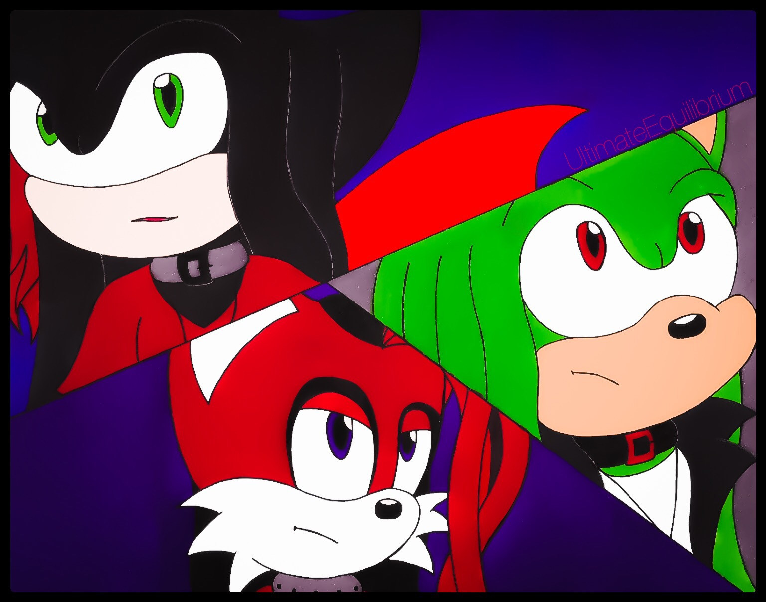
Just a little something to make differ from the asks' answer sketches. Nothing much to this, just felt like doing a little 3-way image of my guys. I also changed the shape of their irises/pupils, giving them an almond shape. I'll probably just stick with regular shaped eyes instead. XD
Artwork & characters ©
Related content


Comments: 20

Man this looks badass. They all are so well done.
I only have two very small bits of criticism. Nathan looks a little pale and Hysarian nose looks a little short but that could be the angle he's on. Other than that I love this man! I should do something like this.
This reminds me of another one you did.ultimateequilibrium.deviantart…
👍: 0 ⏩: 1

Thanks Alex! ^^
Yeah, I would have to agree with Nathan's muzzle there. Kinda looks like an off-white, it should be darker. Oh well.
Haha yeah I remember that one XD

👍: 0 ⏩: 1
Your welcome Nat!^w^
Heh that would be my thought process. XD
👍: 0 ⏩: 1

Hey, I found this on and recognized you! This definitely appears to be one of your better drawings. The anatomy looks both internally consistent and similar to that of official Sonic characters: you've got down the typical dimensions of their faces and the color schemes that tend to be used. If you'd like a bit of advice on their designs, the red character looks a little too much like Tails, so I'd suggest altering his facial geometry a bit: perhaps smaller or narrower eyes, bangs, a longer nose, visible teeth, ears that flop down or are taller, something like that to distinguish him.
As for the color schemes, while they look fine individually, having so much white, bright green, black, and bright red in one picture is a bit garish and makes it a bit difficult to tell how the bottom and top-left characters relate (e.g. if that double-helix thing is hanging down from the top character). I would suggest placing them each in a certain environmental light or in different settings to make their colors vary a little more and be easier on the eyes, which would also alleviate the kind of strange indigo background.
About that background, a simple one like this is alright as a still from a comic or cartoon, but as a standalone piece I would suggest some kind of simple scenery behind each of them. This would also have the effect of establishing a direction for light to come from (e.g. from the sun or a light inside a building or on the street), so you could place shadows on the characters.
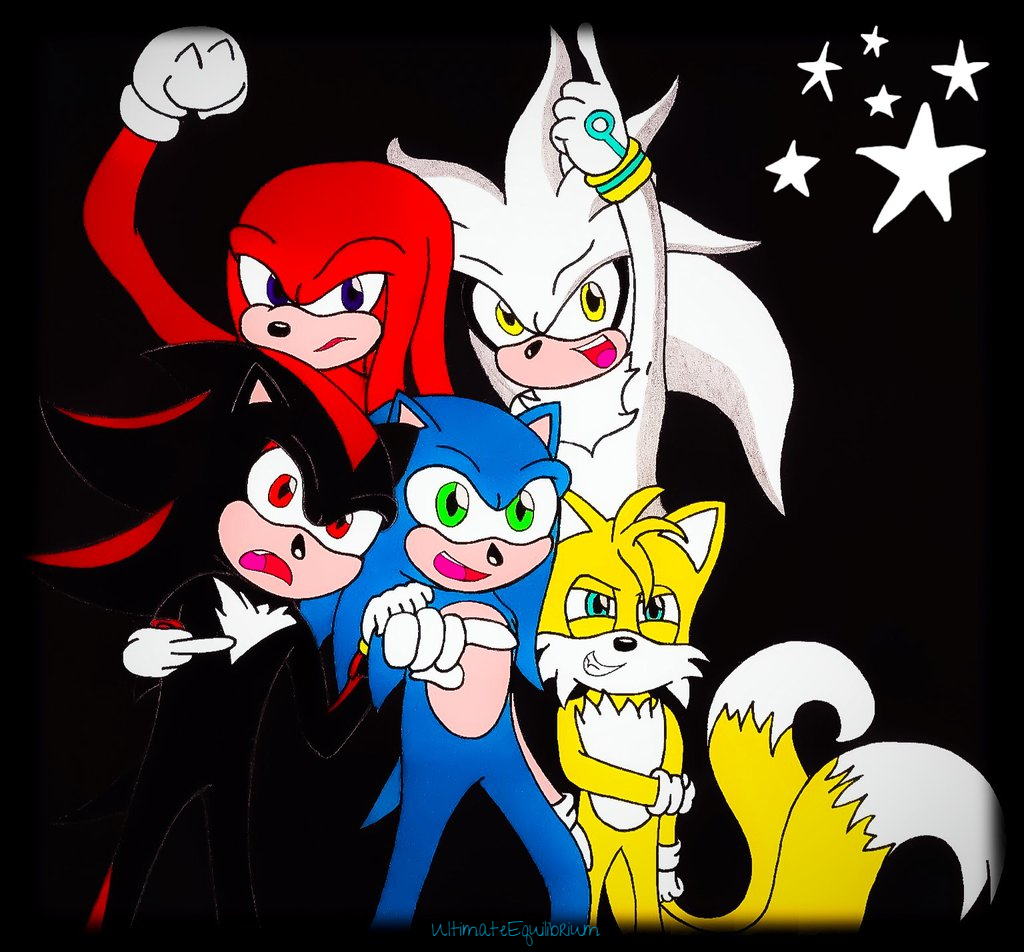
The linework looks fine - but have you considered experimenting with line weights? I like to use thicker lines for parts of characters' bodies and inanimate objects that are (1) closer to the camera, (2) more in-focus and emphasized, and (3) around the edges of the characters. You can see that on the pic I drew of Blaze, Vanilla, and Cream on the ride: those main three characters have decently thick outlines, the ones sitting behind them have thinner ones, and the backdrop doesn't have any outlines at all. Line weights can help a picture "pop" more.
One last thing before I let you go here: I would recommend thicker bars for separating the panels of the three characters, to match the border around the whole image - and white might work better than black. Still, it's good to see you understand the use of this technique in serial visual media. Good luck!
👍: 0 ⏩: 1
Ah, thanks for recognising me! Haha XD That would be Hysarian you're talking about. Perhaps you should take a look at his reference sheet, since there are quite a handful of characteristics that differ him from Tails, his bangs being one of them. His eyes are supposed to be more round, since Tails' eyes seem to curve inwards a little bit towards each other. fav.me/d9r03ja
I see what you mean with how the colors can be a bit garish with my characters. I can kimda see it myself, perhaps I should change their clothing schemes a bit, especially Nathan's (black chameleon) shirt. That "double helix" are actually the two ends of his headband that you see. A better showing of it can be seen here: fav.me/dabd03v How does the indigo color specifically look unusual to you?
I haven't experimented with line thickness, no. You do have a point, there. I guess I can try making thicker lines for closer objects and such to the "camera", to put it that way. Yeah, I probably could have used thicker bars, but I don't see how white would work. Oh well XD
Thanks a bunch for the big comment! Much appriciated.
")
👍: 0 ⏩: 1
I dunno, the indigo works as far as background colors go. I just prefer there being an actual scene behind them, even if a simple one, that's all.
You're welcome!
👍: 0 ⏩: 1
Ah, I see. Everyone has their preferences.
^^
👍: 0 ⏩: 0

Are these Sonic Characters? Please let me know so I can give you a better comment.
👍: 0 ⏩: 1
These are my characters, yes.
👍: 0 ⏩: 1
In that case! I love the designs! Great work! I used to have a Sonic OC (I have to bring him back) but my older bro does Sonic stuff. You should check him out!
galvastorm.deviantart.com/
👍: 0 ⏩: 1
 (Smile)")
You're welcome my friend!
👍: 0 ⏩: 0

ProjectComment
There is a nice energy to this piece. The splits are well done and the faces places so there is a good balance of the image. I think you could improve on the lineart and the colours, to really bring the characters in to focus. At the moment, it feels like there isn't any hierachy in the imgae, like the background is just as much attention grapping as the charakters. Noe way of bringing the charaters forward is by line weight, the lines having various thinknesses. I have experienced making a thicker linke around the character brings it forward, and focuses the eye. You can also use tchicker lines like under the chin, or an arm that is in front of a chest to give a sense of depth. With the colours I think you could variate the values or nuances. For instance, all the red is the same red in this piece, or are very close in value. I would recommend this video about choosing colour www.youtube.com/watch?v=9kQllL… . good job and keep at it!
👍: 0 ⏩: 1
Thank you for the nice comment. What exactly would you suggest to change in terms of color to bring the focus on the characters?
👍: 0 ⏩: 1
Vary the value. Either make the background lighter or darker than the characters. Do you know how to check for values in a drawing program?
👍: 0 ⏩: 1
This piece was done with traditional media, so no.
👍: 0 ⏩: 1
Oh, well that does make it a bit more difficult to change colours. I thought it was digital. Then I think you should use the thicker outline
👍: 0 ⏩: 1
It's happened before XD
👍: 0 ⏩: 0
