HOME | DD
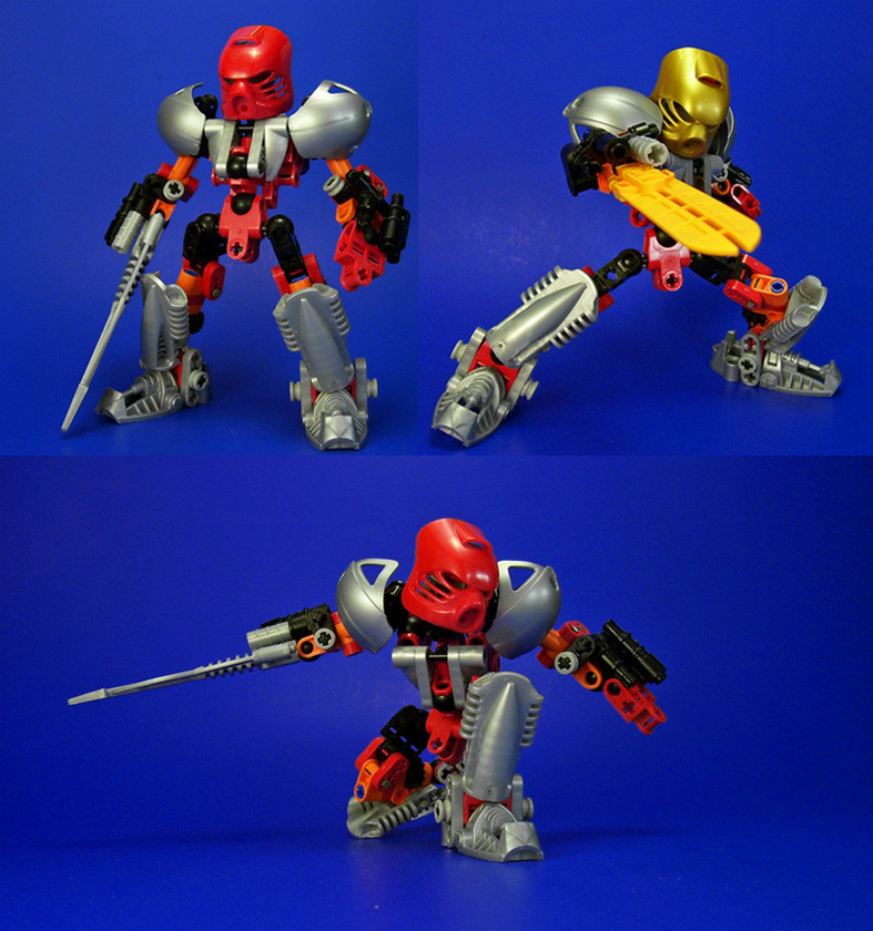
 Ultimo10 — Pohatu Nuva 2016 - My colors
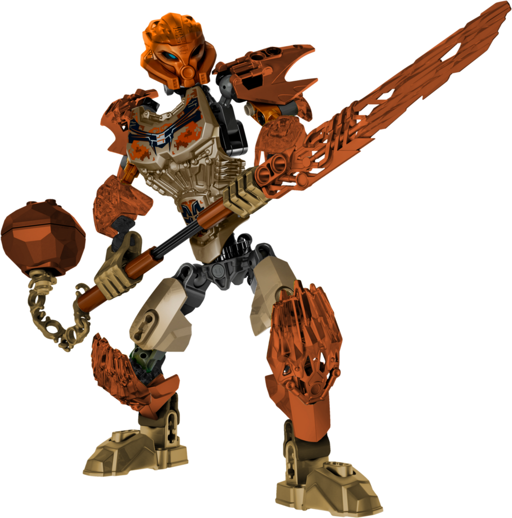
#bionicle #nuva #pohatu #stone #toa #uniter #bionicle2016
Published: 2015-11-27 15:55:08 +0000 UTC; Views: 2199; Favourites: 38; Downloads: 5
Redirect to original
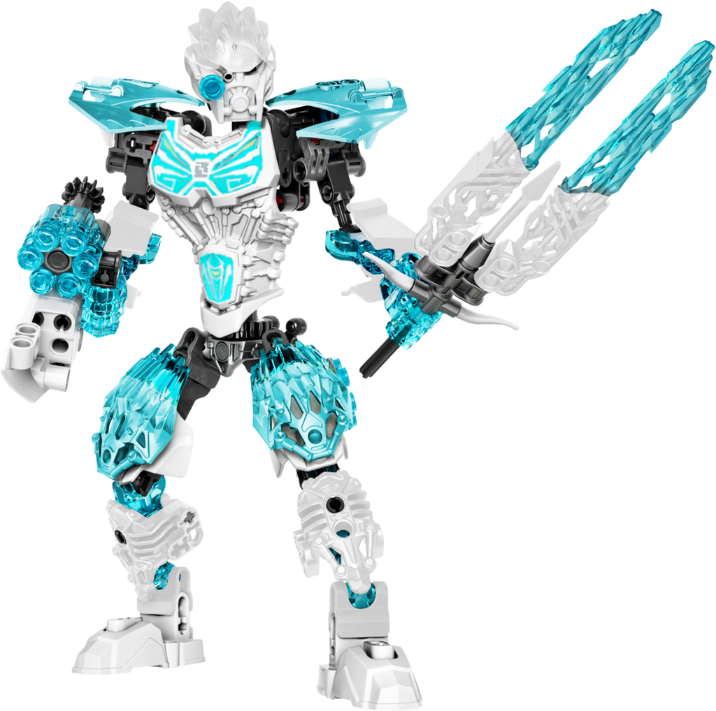
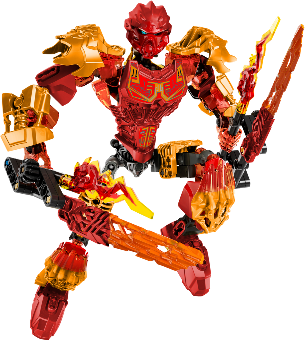
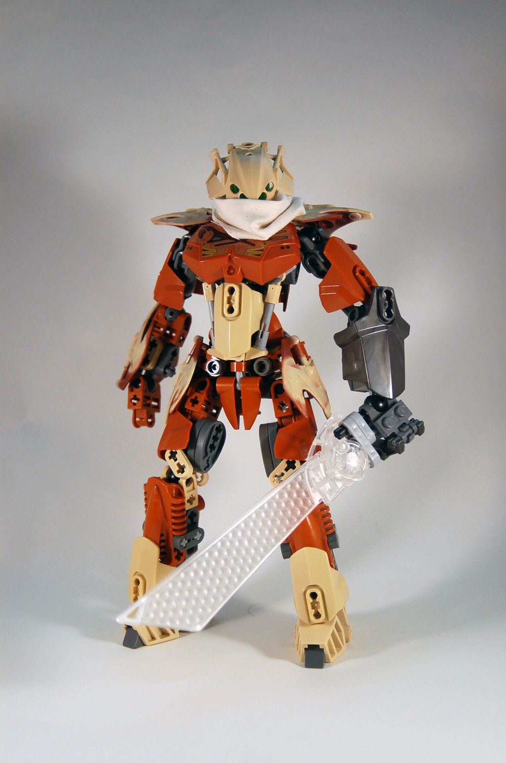
Related content


Comments: 7


You know what, of all that I could choose to complain about with BIONICLE of this year and last, I would have to say it is the fact that the most common reoccurring pieces are the ones we get practically NO recolors of.
The only Toa to get feet in their actual color in 2015 were Onua and Kopaka, the rest got silver and gun metal... Just freaking what? Onua had black hands, Kopaka at least had translucent blue hands, then the wast just have silver ones. I can sort of excuse the first year, but what really irritates me is this year is doing it so much worse. Tahu has gold, Onua has gun metal, Kopaka has white, as expected, THE REST HAVE SILVER. Kopaka was originally going to have white Skrall armor, they gave him silver, pohatu has silver mixed with way too many other clashing colors, We got orange with Gali, but also tons of silver, what the heck is with LEGO and these freaking metalic colors?? Fantastic, we have tones of different metals we can work with and then we can add accents of what should be their primary color.
Heck, the masks are really nice in a lot of ways, I absolutely love Pohatu's since it looks so Mayan, and it's more thin and curvy to where it could be convincingly used as a female MOC's mask... Except it comes in only one color, which is very scarce both in BIONICLE G1, and CCBS parts, and has FREAKING SILVER SMACKED ON THE TOP. BIONICLE G1, even if some of the sets were a bit simple in the first 3 years, they did something right, we got so many pieces in so many different colors, especially the masks from the blind boxes. Metalic colors were rare and scarce, and I actually kind of liked it better that way, now there's so much of it on the figures that it's getting more and more difficult to tell them apart other than what little of their primary colors are on them.
The sets are fun, really, but the silvers, golds, gun metals, it's so damn annoying for those that make MOCs with the parts, not only should we have these darn feet of theirs in their primary colors by now, granted red, black, Lewa's green, and white already do exist, but we should get both the feet and hands in those colors, along with the orange brown and new Blue in the sets, along with some limbs and more armor/weapon recolors. I don't care if we keep getting returning molds, I just want LEGO to realize we want actual colors, not metals with color accents. I swear, LEGO better add more primary colors to the next waves of sets, otherwise I am worried that 2017's sets are just going to look like they are made out of metals.
To sum up the end of this wall of text, if the sets had the color scheme you've given them in these pictures they would be absolutely perfect in my opinion, and offer a lot to use upon purchasing.
👍: 0 ⏩: 1

So essentially you want brown crystal armor that looks like shit .
That why I don't like edits , they spam one color in every single damn place (Just look his Gali edit ) .
👍: 0 ⏩: 1
"Spam one color in every single damn place"
The example you gave had two colors that work well together, also, I think this "spamming" you're talking about is complimentary consistency. Sure, maybe with most of the armors being replaced with colored variants, the bones themselves could have been black, or silver, but overall that is a consistent appearance, and far better than what we got color-wise.
The Crystal armor, I can at least see your point, those at the very least could stay the same, or have one of the two colors as the body, and the crystal could be metallic or something. However, while you have your opinions, Having consistent colors that work with each other is far from shit. If consistency was a bad thing, then the colors of the Toa Mata would be the most hated of all time, while they are some of the more favored.
I'll give you the benefit of saying not all of this guy's edits are that fantastic, Tahu just felt off to me, but otherwise if LEGO just made their colors more focused, and less based around three metallic colors with their elemental colors being accents, I feel that could have helped them more.
👍: 0 ⏩: 1

This looks great. I'm a bit tired of seeing grey and an orange-ish yellow for the Stone types. This brown reminds me of Pewku.
👍: 0 ⏩: 0

 (Smile)")