HOME | DD
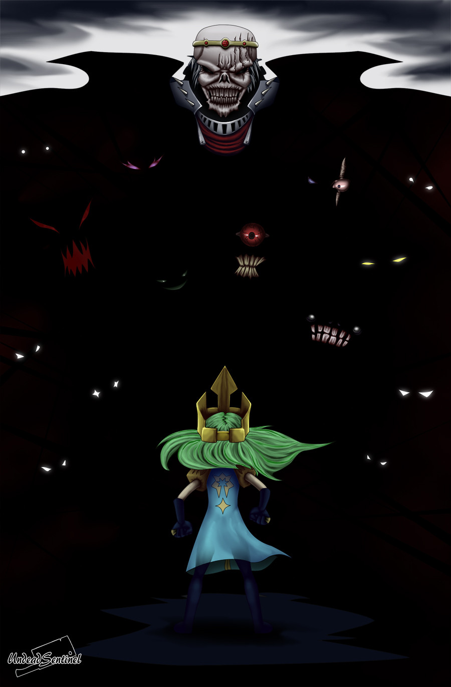
 UndeadSentinel — For the Crown
by-sa
UndeadSentinel — For the Crown
by-sa
#dark #oc #zoey #armor #aura #crown #cyclops #darkaura #darkknight #darkness #demons #evil #eyes #ghostgirl #ghosts #glowingeyes #glowinthedark #horror #king #originalcharacter #phantom #redeyes #royalty #ruler #skeleton #skull #specters #spirits #teeth #undead #armorfantasy #undeadskeleton #evilcorruption
Published: 2016-05-07 05:02:21 +0000 UTC; Views: 1148; Favourites: 25; Downloads: 0
Redirect to original
Description
Being number one isn't easy, with rivals in all directions, most don't stay for long~Related content


Comments: 19

I just want to say that the composition of this piece is quite nice, and simple enough to not be cluttered. The amount of eyes and dark space is great! The red gradient really helps define that the eyes belong to malicious owners, too. There aren't many things I can say that could use work, but there are still a few.
The number one thing that stood out to me was the heroin's hair. You did a great job laying out a base for it, but I felt as though it could use lighter shading and more detail. Hair is made of individual pieces that form small locks, which I can tell you were trying to convey. My tip for making it look more realistic is to make the base like you did, and then lay out a few lines for flow. When you have these first lines down, fill the rest of the hair with smaller color lines until you have convincing segmenting. From there, use a gradient of a dark (in this case, green) color by the scalp, and then shade the little segments as needed. Add a little bit of light and a few stray hairs, and you have a nice head of hair!
Though the sky you have is quite menacing, it might be more fun to try a redder sky or tornadoes and such. Lightning can serve as a great warning for danger too, I recommend trying it some time!
Overall, I noticed that you used a lot of black shading. While the main color you have here is black, black should never be used to shade a painting like this. It can make the art appear almost dirty and less fun to look at. Instead, try using a burgundy or dark blue. It will have a great effect on your painting, I guarantee!
ProjectComment
👍: 0 ⏩: 1

I should look into that hair technique, I can never have too many of those~
Though where did I use black for the shading?
👍: 0 ⏩: 1
Ah, I thought the hair was shaded with black! ;w; It might be my eyes playing tricks.
👍: 0 ⏩: 1
No worries, I intentionally made my style super intense on the darker side, mainly because I draw too light~
👍: 0 ⏩: 1
Oooh, gotcha! I have the same problem, honestly.
👍: 0 ⏩: 1
Ya, my professor pointed that out in my art class, so I decided to fix that in my digital art style~
👍: 0 ⏩: 1
That's awesome, I'm glad to hear it! They sound like a good teacher.
👍: 0 ⏩: 1
Ya, he was an awesome teacher~
👍: 0 ⏩: 0

Project comment
The global idea and composition is awesome. Every pair of eyes is different, and all are menacing. You could imagine the image as a video game cover, with all the mini-bosses and culminating with "skullhead" at the top as the main enemy. Good storytelling here.
Weak points are found in technical aspects. The drawing is clean, well-proportioned and detailed, enhanced by a high quality shading, nothing to say here. However, I find your color choices disputable, as you have too many and too different contrasting colors (blue, yellow, green and red are all present), which impairs the coherence of the image. Yellow, notably, could be replaced by gray/white (crowns would be silver), and would create a clearer distinction between the "hero" (who would have only cold colors) and "skullhead and friends" who would use hot colors.
On a side note, the character's gloves and leggings are dark blue and get lost in the background, but it may actually be a better that way. Was that choice made on purpose?
In the end, it seems to me definitely a good impactful image with a strong storytelling that could get a few colors tweaks to make it even better.
👍: 0 ⏩: 1
Ya, it was a choice to make the gloves and leggings dark blue, I also made them less detailed so they wouldn't take away attention from the main focal points. Thanks for the feedback~
👍: 0 ⏩: 0

Seeing this, kinda feels like a cover for an older console game like castlevania or ghost n ghouls.
But it looks realy great, nice job!
👍: 0 ⏩: 1
Thanks man, I appreciate it~
👍: 0 ⏩: 0

Really? I don't think it is very clean~ XP
👍: 0 ⏩: 1
Thanks yo, getting out of my art block was a pain~
👍: 0 ⏩: 1

I bet but it was worth the wait to see this badass picture.
 (Smile)")
👍: 0 ⏩: 1
I'm proud of my dental work~
👍: 0 ⏩: 0