HOME | DD
 Uriak — Calling spirits

Published: 2013-10-06 18:49:56 +0000 UTC; Views: 1777; Favourites: 77; Downloads: 30
Redirect to original
Description
The detailled versionRelated content
Comments: 14

Justice has been served.
And also been painted.
👍: 0 ⏩: 1

Haha thanks ^^
For the watch too
👍: 0 ⏩: 0

Wow! Amazing work! Love it!
I was wandering if you could let me us this image for an Android game called "Kingdoms of Myth", it's turn based strategy game based on a fantasy World. You can find a little bit more info in this rough website made by my colleges lifeisinfinity.eu5.org/infinit… (Sorry for the bad English). Of course you will have full credits of your work and link to your webpage if you want
Lot of thanks for your time
👍: 0 ⏩: 0

This looks like it would be a neat place to visit if it were real.
👍: 0 ⏩: 1

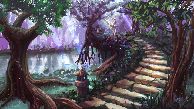
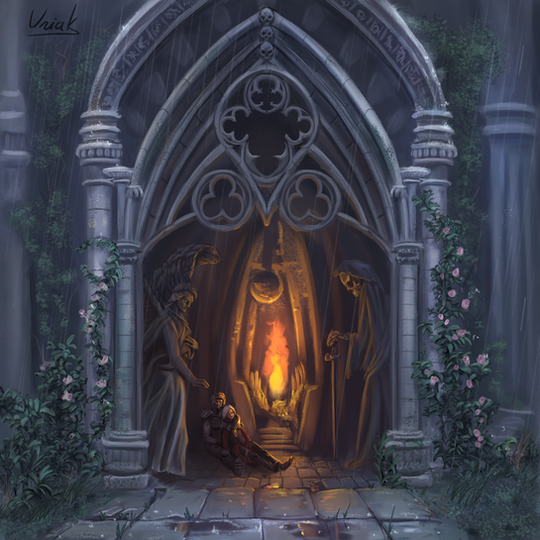
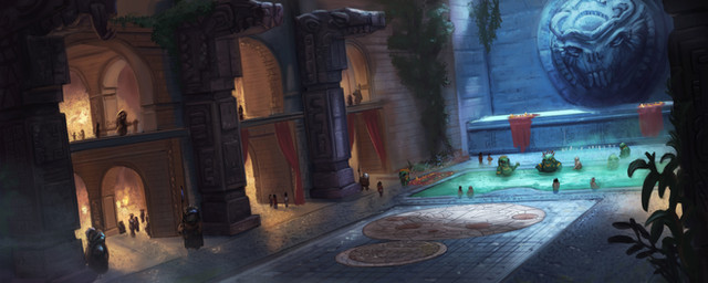
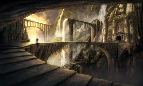
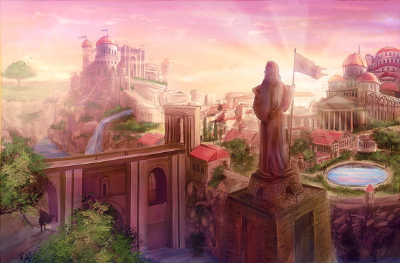
Thank you! It was supposed to be a view of the "realm of balance" and I wanted it to feel peaceful and welcoming.
👍: 0 ⏩: 1

Actually, it was supposed to be the intro panel for a project of mine, but I've been quite sidetracked since... partly because I couldn't nail the next artwork. Hopefully I'll return to this soon enough.
👍: 0 ⏩: 1

Artists can gain insperation from everywhere, you just need to be open to it. It will come to you.
👍: 0 ⏩: 0

Thats pretty cool, and very atmospheric work. You know, I like when I feel the mystery coming out of fantasy landscapes, thats what makes em so damn attractive for me. And thats whats coming out of your work
👍: 0 ⏩: 1

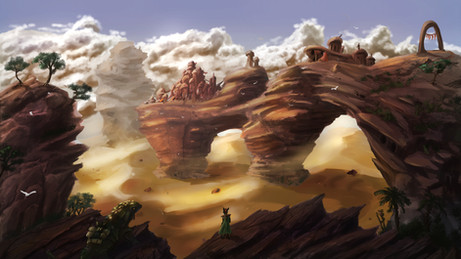
I like the details. The columns in the middle of the round part seem to be kind of floating though. It ended up nice and sharp, which is good. I think you could push it even farther by increasing the contrast on the left by the figure and ground. Just make the ground and arch a bit brighter, they fade into the background.
👍: 0 ⏩: 1

wow that's quite a critic!
To be honest I've faded the background to make it stand apart, it was way less distinct from the bridge beforehand. But I don't think I should ramp up the contrast even more, the roof and bridge are already really bright and they would "burn" the composition imho. I have a pretty bright and contrasted screen though, so it way look different for other people. I've found out that way than many of my artworks were really dark in the past
Which part are too transparent for your taste? I use some sharpening filter when resizing usually but I shouldn't have to. Working without transparency set on pen pressure doesn't work well for me, so I've tried to use marquees to at least get solid edges on most elements (everything "man made", such the roof, the collumns, the fabric..) I think I should have done so for the bridge too. At the same time, looking at many artworks, it seems good brush strokes work well without any need for cleanliness... it varies from artist to artist though.
👍: 0 ⏩: 1

Another thing you could do for contrast would be to darken the background a bit, maybe you just tinted it a bit too much. I just thought maybe brightening certain parts of the ramp would work better since you don't want to dull out the whole picture, but it's up to you and your artistic direction with it. Yeah it might be the differences in screens. HMM, not much we can do about that I guess (though I know there are screen calibration tools out there).
The transparency is not really an issue now that I've seen the final image, it was just in the beginning that it concerned me in your WIP, but you've taken care of almost all of it! What I mean is that sometimes I see edges in your work that don't look "finished" like I can still see some of the transparency and round brushstroke there. I think I see a little bit in the mountain on the right, but nothing glaring. I used to leave a lot of those edges there when I was mostly doing digital painting and I never really noticed it, but now that I've been doing vector art for the last few years they seem to stick out like a sore thumb!
👍: 0 ⏩: 0
