HOME | DD
 ValerianaSolaris — Vintage Collage Update 2

Published: 2009-02-17 22:26:29 +0000 UTC; Views: 4097; Favourites: 33; Downloads: 222
Redirect to original
Description
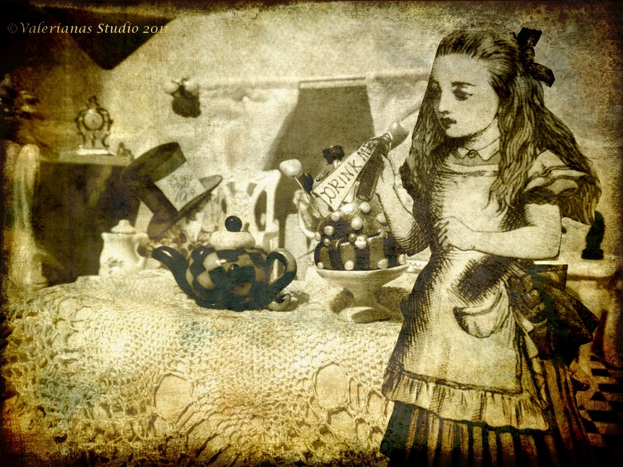
Well, this one was really giving me a headache (Smile)")
Not sure if I should just replace the former version, but I would like to keep the process online to see the change.
Version 1
Version 2
Trying to implement ´s advice, I reduced the grungy look a bit and made the child bigger. I feel the piece is more harmonious now.
What do you think?
EDIT: Changed the opacity of the roses a bit!
Credit:
Graphicsfairy
Related content


Comments: 21


This is beautiful! I love vintage roses and pearls, myself! Each version improves greatly!
If I may, the child is 'framed' on the top and left with the flowers. As there isn't such a strong 'frame' on the other two sides, bottom and left, perhaps you could lay the strand of pearls along the bottom and upward on the right; you have it that way, now. I just wonder what it would look like with the strand moved in closer towards the child more, like between the text and the child.
Ideally, you don't want something in an image drawing the eye right off the side of the piece, which is kind of what the pearls do now.
It's lovely as it is, though.
👍: 0 ⏩: 1

Thank you for your thoughts on this
👍: 0 ⏩: 0


From
Well, I think the picture has improved a lot since the last wip - looks awesome! The necklace looks good where it is, and the roses are pretty. Bravo!
👍: 0 ⏩: 1


From
This looks great, hon. Huge improvement. Great job.
👍: 0 ⏩: 1
Thank you
👍: 0 ⏩: 0
Wow. Changing the opacity made an even bigger difference than I thought it would!
Great job!!!
👍: 0 ⏩: 1
Hehe, yeah, I had to try that, too, and in fact, it did! Thank you again!
👍: 0 ⏩: 1
You're very welcome. Even I was shocked by the huge difference it made. very great work.
👍: 0 ⏩: 0

Nice.
Really love how the flower cuts the photo in its arch and how the photo's background is color while the baby is black and...light brown? (love how it goes with the flowers) I dunno...@_@

👍: 0 ⏩: 2
Thank you very much for your feedback! Yeah, I added a light brown layer over the girl. Glad you like it!
👍: 0 ⏩: 0
Forgot to add: love the border. It emphasizes the oldiness (I HAS BAD VOCABULARY) and grace in the flowers. ^^
👍: 0 ⏩: 0


Thank you very much!
👍: 0 ⏩: 1
