HOME | DD
 VectorIce — TrendyEar Website Logo
Published: 2007-02-04 15:29:42 +0000 UTC; Views: 3369; Favourites: 1; Downloads: 1422
Redirect to original
Description
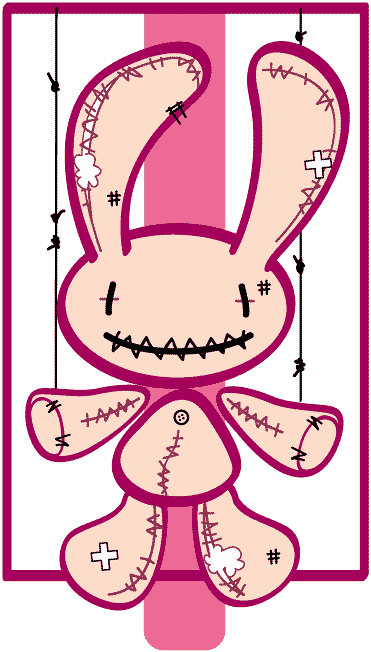
Hey guys, it's been a long time since i update my DA. Happy new year 2007!A list of 7 logos upcoming for my Trends Website. It features anything that is hot and trendy, from head to toes! And we will be recuiting journalist writing reviews and style doctor, providing every readers the best advices in dressing!
Kindly give ur comments, good or bad, and pick the one you like
 (Smile)")
Related content


Comments: 11

I’d go with No. 3, just because most of the remainder of them read as “trend year”.
But what does “trendy ear” mean, anyway? Is it a site for music trends?
👍: 0 ⏩: 1

Thanks! It's actually Trendy + Year, so we feature wht's the year is fancy about. Somthing like that.
👍: 0 ⏩: 0


Thanks man, appreciate it
👍: 0 ⏩: 0


I'm actually finding ait a bit difficult to pick... b ut theres some i would definitely not use.
#1 I like the way you have treated the colour in this one, though the verticle line isn't quite working for me.
#2 I honestly am not sure about this one. it probably is one of the better functioning logos, but still is a bit awkward
#3 is allright, but i'm really over the kind of brushed/worn down type trend. (u need to pick a logo that wont go out of trend since the site is based on trends)
#4 no, i don't like the font choice, it gives me too much of a "space" theme font.
#5 definitely not, as i first read it as "trend year" the logos that segregate the 2 words better with colour or space work better
#6 i do like this logo, i think it's quite cute, it's definite shape will allow it to work in many design situation comfortably. i think i am leanign towards this one.
#7 This logo isalso quite nice, it's compact memorable, does the job.
I definitely think the choice is between the last 2 logos. They fit the requirements of a logo much better than the rest and have elements that are more timeless compared to the other designs.
Goodluck with the site!
👍: 0 ⏩: 0

")