HOME | DD
 videa — Reptil Encounter
Published: 2005-06-30 17:19:08 +0000 UTC; Views: 4682; Favourites: 119; Downloads: 1234
Redirect to original
Description
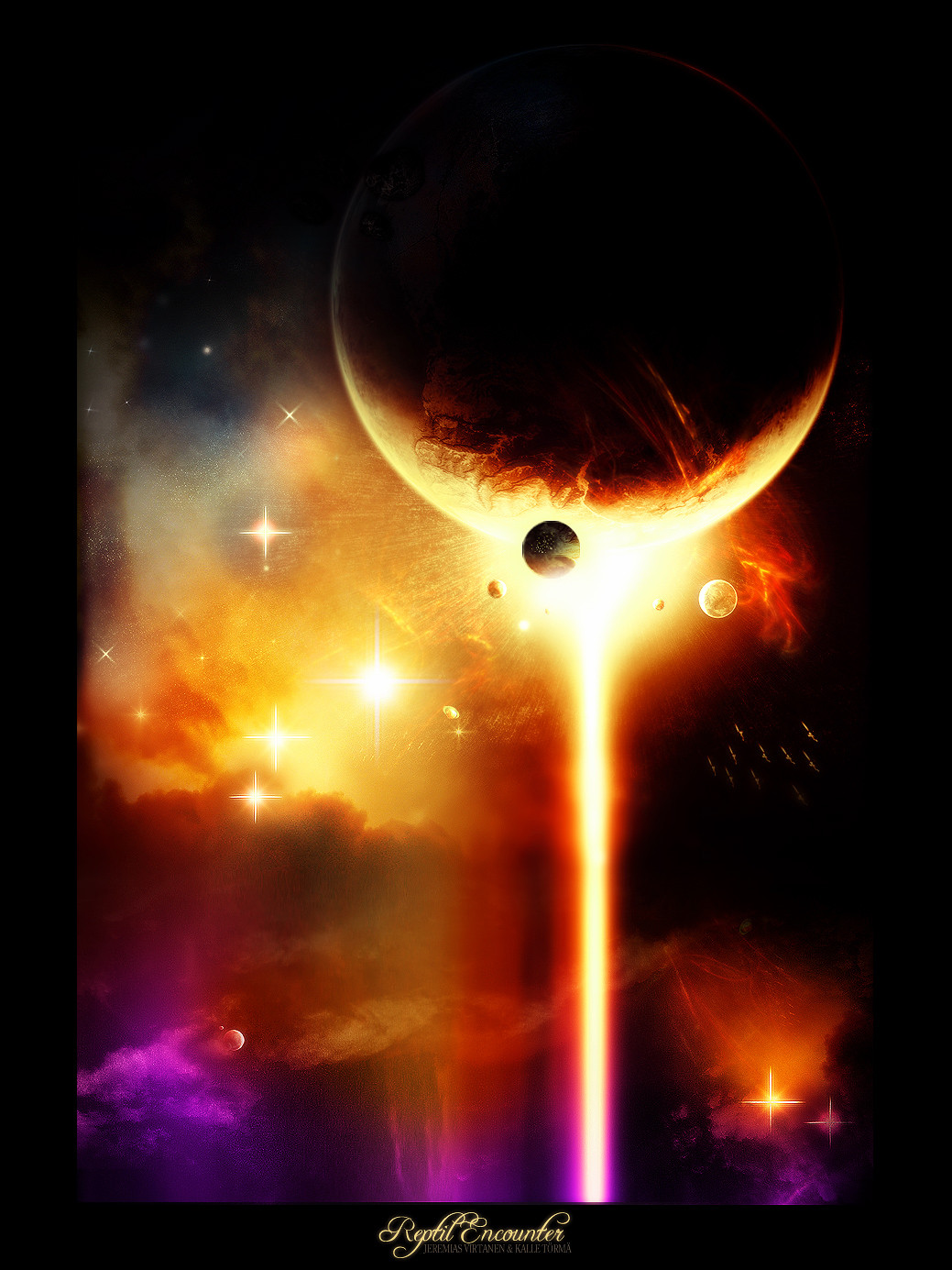
Reptil Encounter&
saw my irl friend's new image, and thought I could show
him how to improve it... but I went too far, and It turned to collab lol
 (Smile)") .
.I like it , you might too
.. ORIGINAL IMAGE HERE
 cloudstocks by resurgere

Related content


Comments: 49

sure you have just won the Internets and this is a wtf boom in the makeing
👍: 0 ⏩: 0


👍: 0 ⏩: 0

Awesome collab! You really made it into something special here. XD
👍: 0 ⏩: 0

You really turned that into a work of art.
It looks amazing.
👍: 0 ⏩: 0


very nice, i love the colors you used here
and that planet is sexay!
👍: 0 ⏩: 0

Oh, the color just screams " 
👍: 0 ⏩: 0

LOVELY! aww but the sparkles kinda ruined it... if only the sparkles weren't so obvious as sparkles... perhaps as sparks of light... well, great work nwez
👍: 0 ⏩: 0


Go back to your old style, this is not how I know you and your work..
Top is bit nice, but the rest looks bad
")
👍: 0 ⏩: 0


yeh ")
👍: 0 ⏩: 0

Is that Your version of "The War of the Worlds"?! D
👍: 0 ⏩: 0

Badass colors, but the lens flares of the stars look a bit weird :/
👍: 0 ⏩: 0


awsome again mate, but it does not look anyhting like the orig ")
👍: 0 ⏩: 0

")


Looks ok guys..I dont really like the twinkle lights, but the colors are nice. I guess i've just seen to much of these space scenes in the last year. Good job though.
👍: 0 ⏩: 0


excellent
👍: 0 ⏩: 0

pretty good lookin space art, the planet in the front is kinda messed up
👍: 0 ⏩: 0

videa ... this is a awesome piece... love your use of colors and the texture on the main planet is just great!
👍: 0 ⏩: 0


That's fantastic. The vibrant colours are really similar to some antique glass I'm using for a dragon window. I love yummee colours
👍: 0 ⏩: 0

Nice job, I like the colors and it looks very nice all together.
+fav
👍: 0 ⏩: 0


realy nice ..... awesome work
i like the colors

👍: 0 ⏩: 0
spritek [2005-06-30 18:13:00 +0000 UTC]
Awesome ")
 (Wink)")

👍: 0 ⏩: 0


__.
pretty nice indeed, finally something that is not white-pink-blue abstract
👍: 0 ⏩: 0
