HOME | DD
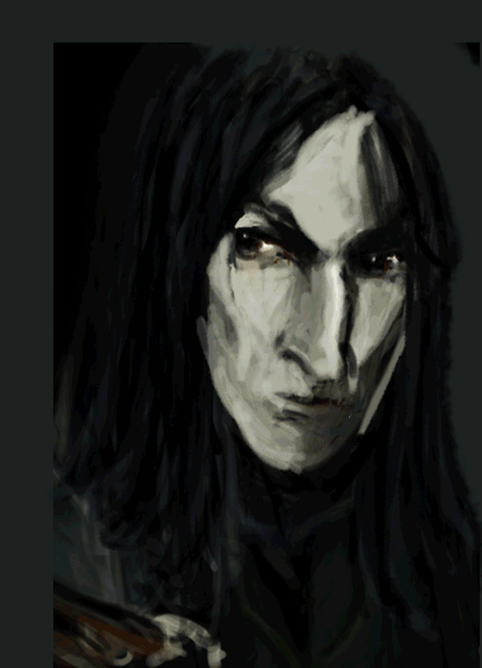
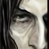 Vizen — HBP24 A Library Book

Published: 2009-01-07 23:47:06 +0000 UTC; Views: 15299; Favourites: 248; Downloads: 0
Redirect to original
Description
UPDATED (after a lifetime in storage)Still, same problem of lighting and with Harry and, you know, he doesn't have the easiest profile in the world (to draw).
---
If you ask for my opinion, I'd say that it oddly smells like a lifetime of detentions to come...
---
Still JKR's.
Related content


Comments: 148


I keep trying to come up with an appropriate complement on the perfection of your Snape here. That profile is divine, and the look on his face just enhances the whole of the picture. That hooked nose, the lank hair, hollow cheeks, that look in his eye... it's just fantastic. I know Harry's in the picture, but I can barely stop looking at Snape long enough to notice! (Harry's eyes, full of wariness are very good.)
"Snape comes first and eats the whole pic, mercilessly" -yes. (And rightfully so!)
👍: 0 ⏩: 1

Wow, this is cheerful to read. Poor Harry, definitely, then XD
Honestly, I like this Snape: it is one variant of him I find interesting (different from my other Snapes) but I think that the face is too (!) sharp and hollow. Strangely, though, sometimes visually a better realism is not the best variant, at least to my eye. So, I don't know yet, if I should try to rework again on this Snape or not.
👍: 0 ⏩: 1
He is different than your other Snapes, yes, but by no means lesser. I think he has a very Snapish quality here... there is something in that expression that just rings true. He is very sharp and hollow, but it works, at least in this picture. (It works VERY well in this picture actually!) You're right, sometimes bending the realism leads to a better visual. If you do choose to rework this Snape, that is of course, your right, but I like him as is.
👍: 0 ⏩: 0

Merci!!! (c'est déjà un vieux fanart, çui-là!)
👍: 0 ⏩: 1
 (Wink)")

Yes, finally. Still not satisfied with it, but I'm interested in what other people think
👍: 0 ⏩: 1

I love the textures here, 'couse I hate this popular smooth-photography-like-"realistic" style that many even skilled artists use. The fact is there's a huge field for experiments in digital drawing (see, for instance, katiger, joeyv's digital works, sayu's new "linoleum engraving" style that you can hardly tell from the almost similar toerning's traditional drawings, etc., etc.). Expell-HUN, on the contrary, had great textures in her traditional art, but when she turned to digital, in my opinion, she lost many of her merits, though her interpretion of Snape was still great (I believe she just didn't have enough time to train her skills in digital drawing and then was distracted by real life issues). I love you usual style with these large strokes of yours, but that's also an interesting experiment.
👍: 0 ⏩: 1
I really think that you can have a specific style in digital painting, and also that the good realistic style is not that easy to get -personally, it is a challenge for me. It's hard for me to stop "stroking about" and keep a defined lineart and to color something neatly. I confess it frustrated me - my mind is not pleased with soothed and clean surfaces. And even on Snape's face here, I could not help but add some not-realistic strokes. but you know, a profile is not that easy to paint, because of the volume and shadowing it implies. I still think it could be improved.
👍: 0 ⏩: 0

It's interesting how Harry looks older than Snape here 8)
👍: 0 ⏩: 1


His FACE - his beautiful, haunting face! Of course he knows. OF COURSE he knows, Harry!
Do you know, I bet he let Harry hold onto it, because he was actually learning something for once in his life, from SNAPE (which might also have tickled Snape's sense of irony)!
I love this picture. I really, really do.
👍: 0 ⏩: 1
It's an old one I've been trying to update for a while, but I don't know how to improve it - it's quite hard actually. The composition is very quickly unbalanced between the two heads in the middle of that dark colour and if I give more shadow to Snape, well...It's less interesting. If you have suggestions for some improvement of the piece, I'll take it!
👍: 0 ⏩: 1
Um. Suggestions. Hmm.
It seems a little close on the left side. If you gave it a little more room between Snape's profile and the left edge of the picture, it might help the eye to circulate through the piece more fluidly. Also, maybe some low-key background details, to help draw our gazes around the composition. Maybe. I don't know. I like it, however it may be. Your Snape always gives me jitters. Good jitters.
👍: 0 ⏩: 0

Ok, seriously wanting a lifetime of detentions now...
👍: 0 ⏩: 1
The place is taken, I'm afraid
👍: 0 ⏩: 1


nice improvement ")
👍: 0 ⏩: 1
"defined featured" are always challenging for me, so I'm glad, at the moment... (thanks)
👍: 0 ⏩: 0

It is an improvement... looks less out of focus.
👍: 0 ⏩: 1
Actually, it's still the problem... Snape is in the background, so he could be out of focus but not as much as before, but when I repaint over the more blurred version, it looks too sharp and the eye is badly caught by his face. And I don't remember which brushes I used then. It is one work, which makes me think that my technical skills need improvement (and some tutorials). And the damned profile is still a hell to draw (proportions, shadowing etc).
👍: 0 ⏩: 0

What an awesome snarl! You illustrate perfectly what you mean to portray if that makes any sense..
👍: 0 ⏩: 0


... or somebody missing the last match of Quidditch and kissing Ginny xD
Cool work, Bea
👍: 0 ⏩: 1
I think as you do and I have the same problem in my last pics, because I stopped using the wet brushes and started using the soft ones. It's better for the lightening/shadowing, and was a good change with my bad habit of making millions of strokes for a single detail during dozen of hours... but as a result, it's too blurred for my eye. And see, with the lineart visible in the upper layer (in Snape's mouth etc), I think the product isn't enough naturel. A proper face wouldn't be so soft, anyway.
But I don't know how to fix it. It's quite frustrating - I still don't know which brushes I should use with my style of painting. And here, I tried to add some filter or something, but it wasn't good at all. It looked like a very bad photography, or a bad digital hybrid, well...Not good.
If you have any suggestion, I'll take it.
👍: 0 ⏩: 1
Ok, wait; I'll look at the picture better.
Right. I suggest you do the lines again with medium flow and opacity, in black. Also, you could try the tool to focus, and then some soft brushes (only that hardened like in a 50%), because the focus tool will focus too much and in not a really nice way
")
👍: 0 ⏩: 1
which one is the focus tool ????
I can try
👍: 0 ⏩: 1
Right below the eraser!
Let me take a look when you're done pur-leeeease :3
👍: 0 ⏩: 1
The sharpen tool ? it doesn't work very well for me
I have something else "on the fire" for the moment - but I'll try to improve this one asap.
")
👍: 0 ⏩: 1
What, Snape hexing powerless James? lol
No, I mean that you use a soft tool, only that you harden it a bit. 50% should do it.
👍: 0 ⏩: 0

Does he look like this mystery man you've met recently?
👍: 0 ⏩: 1
No
Actually, this is a different Severus again.
👍: 0 ⏩: 1


Ah, another sleek, sexy, sensual, skeletal Snape! Beautiful! 

👍: 0 ⏩: 1
My Dear, actually...I had my head all alive with your fic - I read all the chapters now, apart from the two last edited ones. I'll try to comment in your gallery as soon as possible.
Thank you very much. Actually, I think I won't have enough time for a birthday present to him, but I'm glad of this new face - it comforts my 'snaper soul' !
👍: 0 ⏩: 1
OMG, that's so exciting! Thank you so much! 
👍: 0 ⏩: 1
YOUR Severus is gorgeous.
And he's not alone. All your characters are really really interesting. I should fave your whole gallery actually.
👍: 0 ⏩: 1


 (Smile)")
👍: 0 ⏩: 0
| Next =>