HOME | DD
 Vladimiravich — Blame Silicon Life
Published: 2007-01-08 03:47:57 +0000 UTC; Views: 3116; Favourites: 11; Downloads: 38
Redirect to original
Description
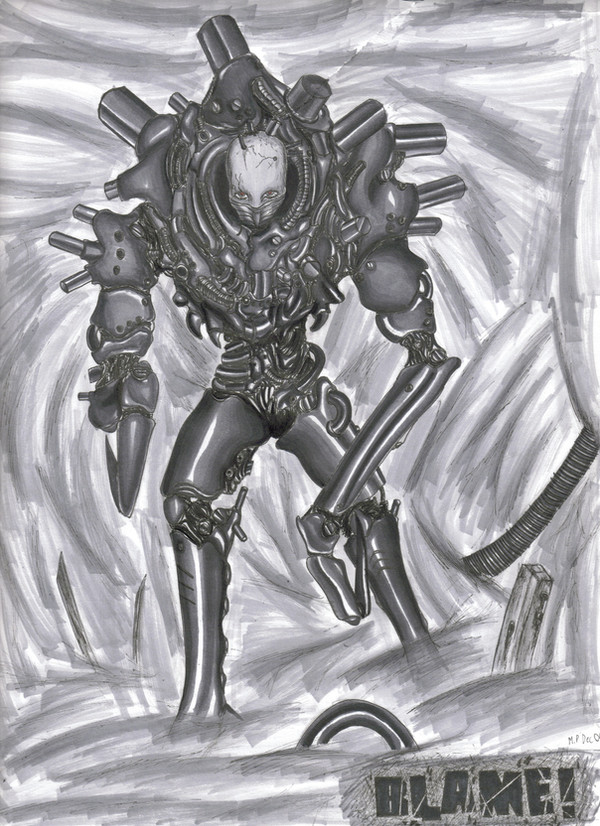
I guess I spoke to soon when I said I wont be uploading any thing too soon.This... as most of you fellow die hard Blame! fans will recognize as the Alternate World Silicon Creature from Vol. 5 I gota say, he is probebly my number one favorite of all the Silicon Life, my second favorite is Schiff. (hes the black ninja guy with the skull face and two blades that come out of his forarms. Enough said I cant make this long cuse this computer is going to die on my any second.
Related content


Comments: 30


This is amazing dude!
You should try and colour some of these pics!
👍: 0 ⏩: 0

looks like a neckron.. or however you spell it.. from warhammer 40k, it looks pretty amazing ")
 (Smile)")
👍: 0 ⏩: 1

Close but not quite, Nekrons always have the skull showing. But these guys usualy have a gass mask or large goggles.
👍: 0 ⏩: 0


wow, looking f'ing good
The details on the SC are great and the background is nice and simple to compliment it
👍: 0 ⏩: 1
Yup... stays true to the original!!!
Thanks!
👍: 0 ⏩: 0

Daaaamn, you've improved a lot since I last looked through your stuff!
👍: 0 ⏩: 1
Thanks!
This one took me a LLOONNGG time to finnish! But with a little thinking and patience the finnished results were well worth it.
👍: 0 ⏩: 0

You are right about backgrounds, they don't matter too much. It is the main subject that matters. It is good, but looks better on paper. This computer distorts it kindof
👍: 0 ⏩: 0

Urg. So sorry it took me so long to get a comment up. x3 I've been busy. Anyways, it is a really well-done pic.
I must agree with some of the people above, though. The smoke looks a bit sloppy if you stare at it for a while, but it was hard for me to notice because I was too busy staring at the subject of the picture... that um...Silicon creature thing? ")
I give you a thumbsup and a well-deserved fav. ^^
👍: 0 ⏩: 1
Yeah I know! Since I now have a book on perspective, ile start trying out backrounds.
Silicon Creatures are freaky! If your woundering what they are, ile tell ya the story. The Silicon Creatures (or Silicon Life) are a race of humans who have given up the physical bodies and minds to exist as digital data inside an organic silicon based body. They are an evil machine race from the BLAME! universe. I would rather not explain thier history.
👍: 0 ⏩: 0

It took me about 6-7 hours. and about 4 art sessions to finnish it.
👍: 0 ⏩: 0

Great work on this one!
You composed this figure quite well.
I like the detail and the tones on the armor.
What did you use for the color tone?
The highlights seem to be in the right place.
I got to agree on the last comment about the background though, I'd suggest putting some smoke effects and a few details, wires, tubes, debris perhaps. Minimal backgrounds works well with this type of composition.
👍: 0 ⏩: 1
In most of the referances I used, the Alternate World Silicon Creature always had a thick cloud of smoke surrounding it. Currently I dont realy think that I am capable of doing any smoke effects, because I dont have the art supplies or know the art techniques for it. Not to mension no photoshop or photopainter. That explains the minimal backround!
As for what I used to highlight this, it was done in copic markers. Grey shades N1-N10 and two taps of Crimson red for the eyes. When my parents are willing to do so they might buy by watercolor penciles and possibly a full box of all 500 Prismacolor markers.
👍: 0 ⏩: 1
You handled that marker quite well. Keep it up, it's a good medium.
It does take time to learn new techniques, don't rush it, keep it at your own phase.
Nihei Tsutomu's works are great reference materials, good choice.
Looks like you're on the right track, keep it up and enjoy the field.
👍: 0 ⏩: 1

Hmm, it looks like something that I would expect out of a Warhammer 40,000 concept. O'well, it looks pretty good. I especially like the lighting/shading on the armor, it looks like it is actually metal.
👍: 0 ⏩: 1
Warhammer 40,000 now there is some thing no one realy compares my drawings too.
The Lighting/shading on the armor is prety much the point of this drawing; and as far as I can tell it looks great.
👍: 0 ⏩: 1
The reason I think that is because of the whole organic fused with cybernetic implants and armor kind of look with this.
👍: 0 ⏩: 1
Kind of like what the Chaos Space Marines have right?
👍: 0 ⏩: 1
Yeah, like their breserkers.
👍: 0 ⏩: 0

Great job Misha!!
I've gotta say, this is a real leap in your talents. The use of the markers to make the background really improved the image if it was just only random lines and such.
The sharpness in the picture is very well done, and it simply gorgeous. I just really love your use of value in this. The reflections were each done nicely, and even the shades into the recesses of the armor are done great!
You've outdone yourself with this picture :3 *fav*
👍: 0 ⏩: 2
lol thanks!
Thats what I tell my art teacher. ("Ive out done my self again")
What do you mean by sharpness?
👍: 0 ⏩: 1
The picture has a nice clean edge, instead of a fuzzy line. It just looks sharper than your other pictures. :3
👍: 0 ⏩: 0

I love the drawing exept, i disagree... i think the background is a minus it looks like you got lazy, anyways nice one and all the rest!
👍: 0 ⏩: 1
Well... I cant nessisarly say I got lazy, because the backround wasnt realy my main concentration and at that point. I just desided to do a scrible backround just to enhance the image slightly. Backrounds come when I finnaly learn perspective. (which I got a book for by the way)
👍: 0 ⏩: 0